A few months ago, digital media monolith Adobe introduced its first foray into hardware with Ink and Slide, a stylish stylus and ruler combo with forward-thinking features and a sleek design. AppleInsider was able to take both for a test drive.
Adobe products have for many years been artists' go-to choice in drawing, image editing, movie making and more. In 2013, the firm announced plans to dabble in hardware with Project Mighty and Napoleon, a cloud-connected tablet stylus and unique digital drafting ruler designed for iPad, a project ultimately culminated in Ink and Slide.
Design
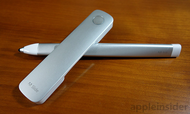
The Ink and Slide set was created in partnership with Ammunition, an industrial design firm founded by former Apple Director of Industrial Design Robert Brunner. Targeted at iPad users, Adobe's take on the modern stylus unsurprisingly involves a lot of brushed aluminum, soft curves and a minimalist user interface limiting buttons to one per accessory.
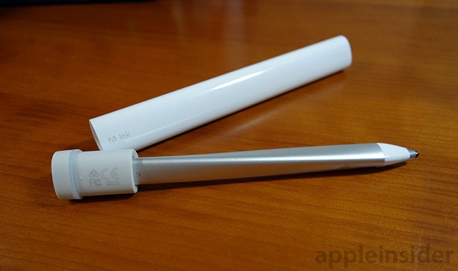
For Ink, Adobe hydro-formed an elongated triangular prism with a gradual counterclockwise twist running down its length from tip to end. Users who apply a "standard" grip should find the design ergonomic, allowing for extended drawing sessions without the fatigue associated with thinner, round styli.
Unlike other art-minded digital pens, like FiftyThree's Pencil, Ink's fine tip is made of smooth plastic, offering little resistance against an iPad's glossy screen. The stylus makes up for a distinct lack of tactile feedback by offering multiple levels of pressure-sensitive control using Adonit Pixelpoint technology, another partner in Adobe's venture.
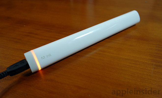
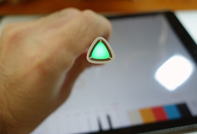
A single multifunction button on the tip end operates on/off controls, syncing, brings up a radial menu in Adobe's drawing apps and can be used to invoke cloud-connected functions like capturing and sending a sketch to Creative Cloud. On the opposite end is an LED indicator bordered by silver electrical contacts that magnetically connect to Ink's USB charger case.
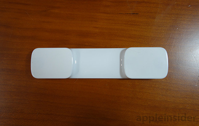
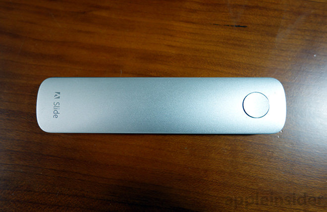
Slide, the other half of Adobe's accessory duo, is a small rectangular "digital ruler" crafted from plastic and topped with the same aluminum material as Ink. Taking on the shape of an elongated arch, Slide cleverly hides three magnets in its two feet — two in front, one in back — to create a multitouch input that activates a special ruler user interface in each of Adobe's three drawing apps.
Unlike Ink, Slide is completely battery-free. Adobe's apps recognize Slide's capacitive points, one on each foot, while a single button on top closes an internal circuit, activating a third point of contact that pulls up ruler-specific app commands.
While constructed out of fairly sturdy materials, Ink and Slide's plastic bits are prone to surface scratches. Ink can be carried safely in its charging case, but unless users tote around a separate bag, Slide's facade will quickly accumulate a battle-worn patina.
Setup and use
Getting started with Ink and Slide is a process similar to FiftyThree's Pencil. Pairing the Bluetooth-enabled Ink is accomplished completely in-app through a "tap-and-hold" gesture. From there, users can personalize their stylus by selecting grip style and drawing position for palm rejection settings. Adobe also lets users choose Ink's LED display color, a nice feature for workplaces using more than one stylus.
Ink
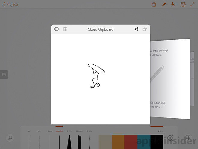
Being a cloud-connected device, Ink needs to be associated with an Adobe account to reach its full advertised potential. Syncing with a free account, Ink can pull in content from Adobe's cloud clipboard, color palettes from Adobe Color CC (n�e Kuler) and transfer personal settings to other iPads.
With a fine-tip nib, Ink performs much the same as other styli in its class, smoothly gliding over iPad's glass. In our experience, however, other stylus/app combos achieve greater precision. For example, we were able to wiggle Ink's tip back and forth across a span of nearly half an inch before Adobe's apps registered the lateral movement.
Lag was also a problem, often hindering fine line work or detailed inking. Applying slower motions helped things considerably, but we were disappointed that we had to adapt our drawing style to let Adobe's hardware keep up.
Pressure-sensitive strokes work as advertised, but distinct levels are vague, making it difficult to gauge anything besides hard and soft strokes. Compared to professional kit like Wacom's Intuos or Cintiq systems, Adobe's Ink is left wanting.
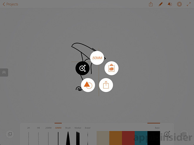
Despite a few shortcomings, we were impressed with Ink's cloud connectivity, especially saving projects to clipboard. Pressing Ink's button brings up a contextual radial menu for picking brushes and specialized app tools, sharing options, color palettes and accessing Adobe cloud assets. Press and hold the button, then long tap on the iPad's screen to automatically send whatever is on the canvas to Creative Cloud's clipboard.
Slide
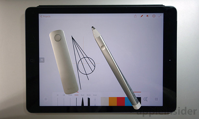
Slide is a unique tool for interacting with Adobe's apps; a secondary accessory largely foreign to digital artists. With Slide, users can easily trace straight lines, scalable shapes and more with unparalleled accuracy.
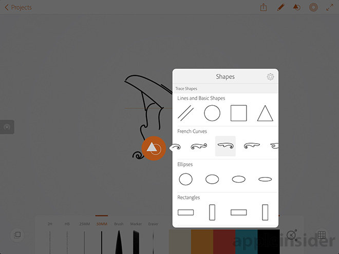
As Slide makes contact with an iPad's screen, traceable guide lines present themselves to either side of the ruler. Depending on app settings, Slide's GUI lines can snap to other objects or points in a drawing, a feature particularly useful when laying down geometric shapes.
Clicking Slide's button cycles through preselected shape packages like french curves, iconographic line drawings and other simple but useful forms. French curves are particularly well suited to creating detailed line work.
Apps
For now, Ink and Slide owners are limited to three apps: Line for creating rich line drawings, Sketch for putting down quick sketches and paintings and Draw for inking and fine detail work. Each app boasts a unique assortment of tools, for example Line includes drafting assets and automatic adjustable grids, but all three feel too stripped down for professional work.
Each app supports sharing features tied to Adobe's Creative Cloud platform, which actually comes in handy when switching between iPad and a proper computer. Sending out drafts for revision and editing in Illustrator as vector paths or inclusion in Photoshop projects is seamless, but of course a subscription to Adobe's app suite is required to fully tap into Ink and Slide's potential.
Conclusion
Ink and Slide represent an interesting step forward in accessory design. Ink's cloud-connected capabilities have the potential to bring immense flexibility to a piece of hardware often seen as a "dumb" or dispensable tool, but as it stands, Adobe's restrictive ecosystem is more of a handicap than a feature. Once Adobe gets its mobile software suite going, we can see Ink and Slide playing a more substantial role, just not at this time.
Slide is a novel idea, however, and we enjoyed being able to draw straight lines and, more importantly, accurate curves with ease. Its physical form factor makes for a more natural drawing experience when compared to software driven line tracing solutions. Adobe needs to focus on how Ink and Slide interact on-screen, however, as it is at times difficult to determine where a line will start and stop without a cursor or other visual indicator.
For $175, Ink and Slide is not a cheap investment by any means and the package looks less attractive when stacked against competing styli from Wacom or even Adobe's partner Adonit. Adobe's accessories are perhaps best suited for casual artists, as the system is likely not accurate or intuitive enough for pro users. At least not with the current set of available apps.
Score: 3.5 out of 5
Pros:
- Well designed with premium materials
- Slide digital ruler is an intriguing concept
- Cloud connectivity enables multi-platform use
Cons:
- Limited app selection
- Lack of precision, noticeable lag for Ink
- Expensive
Where to buy
Ink and Slide is available for $174.99 from Adobe's website, with orders processed and fulfilled by Adonit.
