After months of anticipation, the Apple Watch is here. But as pre-release hype wanes and units trickle out to early adopters, it's now a question of whether the Apple Watch delivers on its promise of being the company's "most personal device ever."
Like other first-generation Apple products, Apple Watch is both aspirational and, in many ways, restrained. It's a well designed and functional beginning to a new product category, but still very much "version 1.0."
On hardware design and new technologies, namely the Digital Crown, Taptic Engine and Force Touch, Apple Watch delivers. It's nice to look at and fun to interact with. In regard to third-party apps and integrations, however, it leaves something to be desired.
Just as the iPhone and iOS slowly influenced OS X, so will the Watch affect the ways in which we interact with the rest of our Apple devices. The device introduces us to new methods of interaction and input, but more importantly lessens reliance on the iPhone by moving data consumption to the wrist. That freedom may be Apple Watch's strongest selling point.
Hardware & design
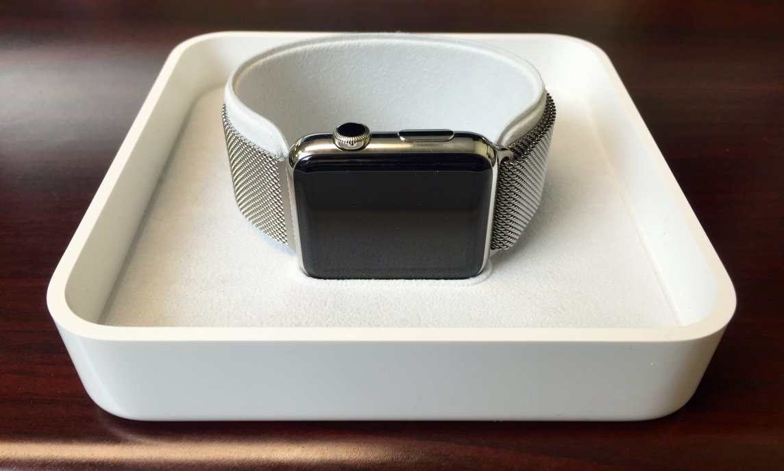
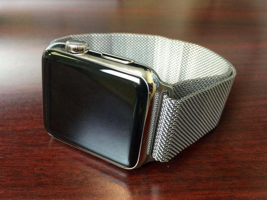
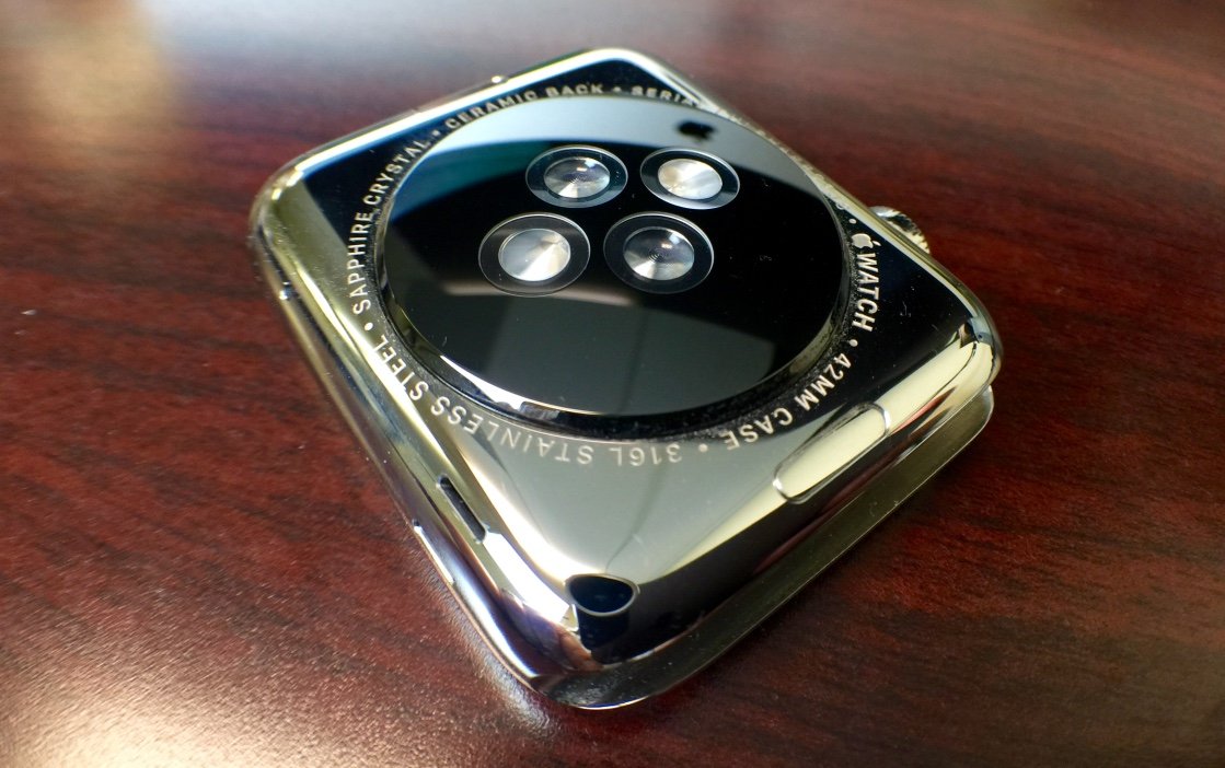
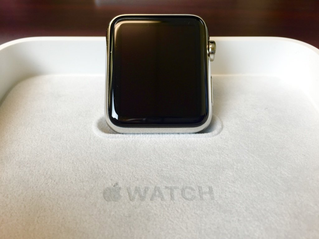
The rounded rectangular body of the Apple Watch is nice. We've been using the 42mm stainless steel model and enjoy how it looks, while comments from those who have seen it have been generally positive. Without ever using the Watch or seeing what the software is capable of, people say it looks desirable.
For those with larger wrists, the thickness of the 42mm size is fine, though several others (both male and female) who tried on our unit said it was too large and are considering the 38mm. The stainless steel model does have a slight heft as well, but we got used to it in the first day. Seeing Apple's history, the device will surely slim down with future models.
Milanese Loop & other bands
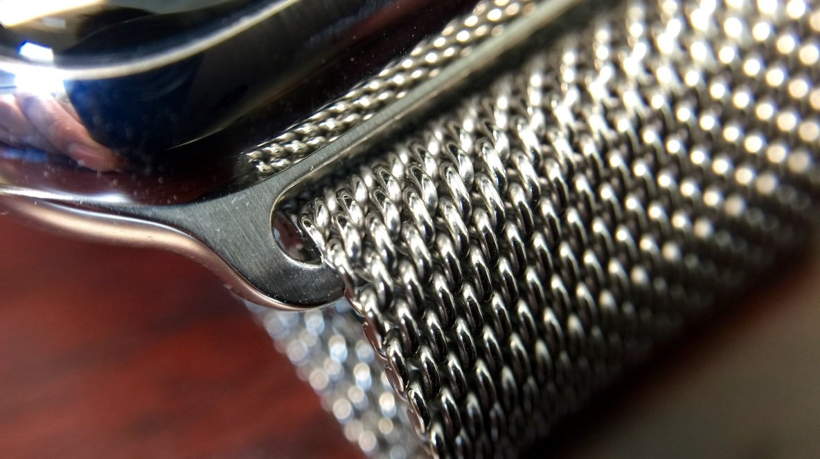
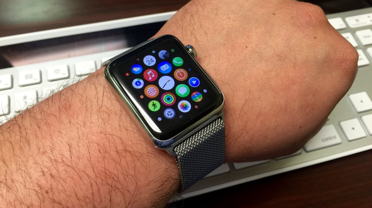
We paired the 42mm stainless steel model with the Milanese Loop band and have been pleased with the results. The Milanese Loop is comfortable and its infinitely-adjustable nature comes in handy. The magnetic clasp is very strong and we never fear it falling off during the day.
Living in Central Florida, it tends to be hot. Spending several hours at a T-Ball game and going to an outdoor kid's birthday party, we found the loop gets slightly uncomfortable when sweating — Â unfortunately, we didn't have a sport band to test.
Removing and switching bands is quick and has almost no learning curve. Bands come out easily by pressing the release button and sliding out the pin on the top and bottom of the Watch. When inserting a new band, it's best to look closely at the alignment of the Watch groove and band insert to ensure the correct angle.
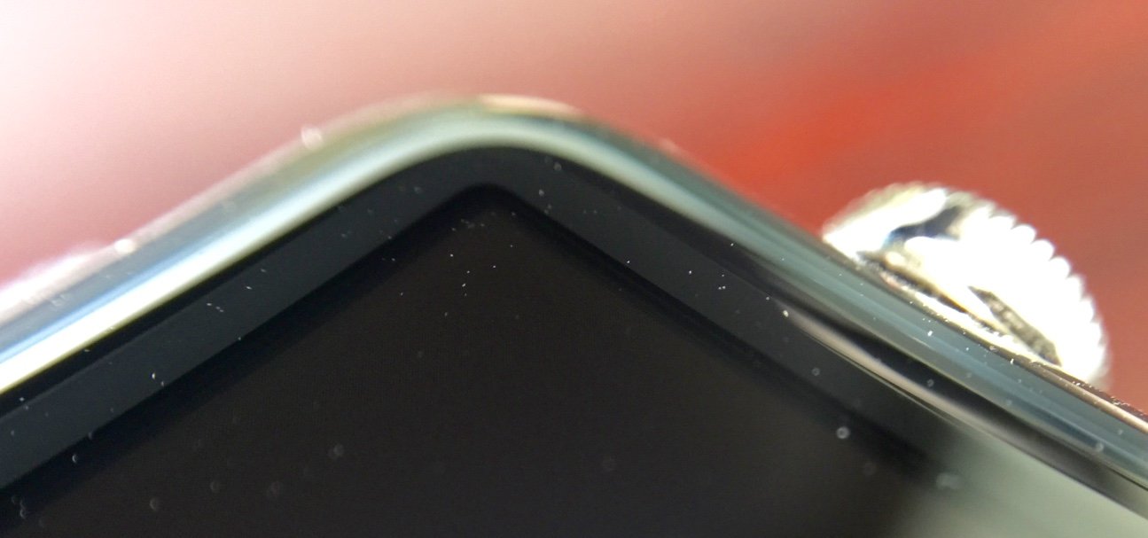
The screen is beautiful and functional. Text is clear and crisp, app icons are colorful and easy to see and even photos look good, albeit small. Even on a sunny day at a baseball field, we could see the screen without issue on two-thirds brightness setting. When in direct sunlight the square OLED screen shines beneath the rounded sapphire top, but text and apps are comfortably visible.
Expert Raymond Soneira of DisplayMate Technologies claims the sapphire cover "significantly affects the optical performance" when viewing the screen in high ambient light and at large viewing angles. Outdoors we did notice at extreme angles the screen is barely viewable.
We did not have a Sport model to compare, but there was never time we could not see the screen. In a recent video from Consumer Reports, the sapphire Watch models fared significantly better in the scratch test. Even at the hardness of 9, one level beneath diamond, the sapphire display could not be scratched. We would prefer a more resilient material than slightly better visibility in sunlight.
Usage
As advertised, users can make phone calls and listen to audio messages reminiscent of Dick Tracy. Keep in mind that the built-in speaker is tiny, and even at full volume can be hard to hear. Taking a call outside with any kind of environmental noise would be difficult, and even being in a quiet room we had to hold the Watch up to our ear.
Of course the most speculated technical aspect of the Watch was its battery life. Over the weekend we were using the Watch pretty heavily so this may not be indicative of day-to-day use, but in general it got us through a solid work day.
Setting the Watch to Activate on Wrist Raise will most likely be the common (and is the default) setting. Three out of four times the watch turned on when we attempted to look at it. Sometimes the motion was too subtle and the screen did not turn on. Other times we would notice the screen stayed on unintentionally.
During our 45 minute commute we found the screen stayed on a majority of the time, with the watch apparently mistaking turning a car's steering wheel for a wrist raise. In order to have the screen turn off we had to lower our wrist or switch hands on the wheel which may have led to some battery life drain.
In normal use, Apple's "18 hours" of battery life appears accurate. It's worth nothing that the 42mm does get slightly better battery life according to Apple.
Ever since Continuity features brought cross-platform compatibility in iOS 8 and Yosemite, it seems that an unnecessary number of devices alert us to every phone call and iMessage. Noises come from our iMac, iPhone and iPad, all at the same time.
Getting a tap on the wrist rather than a ding is preferable. Not having our iPhone screen turn on during a meeting for every notification is also an advantage. We feel a tap on the wrist and choose to ignore it, while everyone is none the wiser.
In future models, hopefully the Taptic Engine will be stronger. Understandably in a device this small it may be difficult to achieve a stronger mechanism, but even on the highest setting there is a chance we will miss a tap. There is an option for Prominent Haptic which will "pre-announce some common alerts," but it does not make the taps any more forceful.
To quote Apple, "The Digital Crown is an integral part of the Apple Watch experience." Scroll wheels are not new of course, but a device as small as the Watch does need a way to interact with content on the screen that's not your finger.
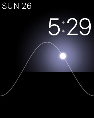
As a piece of hardware, the Digital Crown is very fluid and enjoyable to use when scrolling through messages, zooming into photos and maps, and playing with things like the Solar watch face. We find it less useful on the app home screen where zooming out only makes apps untouchably small.
Even a 2-year-old child immediately tried both scrolling and pressing the Digital Crown as a button. It feels like the right "tool" for the job as oppose to finger swiping when it comes to navigating most of the Apple Watch's software.
Adding a new way to interact with a touch screen will always complicate things for the wearer, and in addition to the Digital Crown users must master Force Touch to fully take advantage of the Watch. Much like the "long press" that Android has incorporated since the beginning, Force Touch is not immediately evident.
Once you know Force Touch exists, it becomes easy to use. When we first saw it demoed and shown off before actually playing with an Apple Watch, we were afraid it would feel like you're damaging the Watch's screen. Thankfully that's not the case.
It does not take a large amount of pressure to engage Force Touch yet it is still distinguishable from a tap. Whether it's to change your Watch face or begin a workout, Force Touching has never failed for us.
Once people who are not in the "early adopter" category get their hands on the Watch, it will be interesting to see how quickly Force Touch is discovered by the average user.
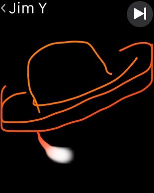
As only a few people in the world have Apple Watches yet, we had limited access to test Digital Touch. One friend did receive their Sport model on launch day and we've exchanged a few taps and drawings.
Tapping is fine, although a stronger vibrator motor would help. Drawings are fun, especially with someone who is actually good at it. But whether Digital Touch becomes a long term form of communication remains to be seen.
For now, however, it's a novelty. Something new and fun, but after a few taps and drawings we haven't felt a desire to try it again. Maybe between teenagers and kids this will be used more often. It would also help if sending a Digital Touch were easier, but as it stands you have to press the side button and send it to one of your assigned favorite contacts there.
There is no way to send a drawing from an iMessage conversation (even if they are in your favorites), and they disappear as soon as you view them.
Software
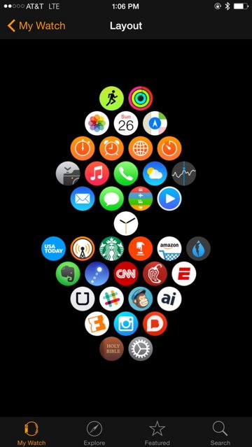
Before diving in to the actual Watch software, we must address the Apple Watch app on iPhone. Unattractive icon aside, the app can be overwhelming. The deceivingly simple pairing process which takes mere minutes precedes the cumulative hours you will spend making granular changes to the Watch through this app.
Thankfully there are granular controls for things like Notifications and for choosing which apps actually appear on the Watch. It's even welcome that users can rearrange how the apps appear on the Watch through the iPhone app (attempting to rearrange them on the actual Watch is a test of patience). But for all it can do, it feels like the new "iTunes for Apple Watch." Just as the first versions of iPhone were tied to iTunes for syncing content, so the Watch is now tied to your iPhone.
Some streamlining needs to be done, for instance: Tapping Notifications will display a list of all the apps available for your Watch. In addition to that list of apps, scrolling the main screen of the Apple Watch app will also list every app available to install on your Watch. It would seem these could be combined somehow.
Glances can be added, removed and rearranged here, which you will do often. General settings, Brightness, Sound, Activity and a host of other options will require your attention. To go through each Menu item would be a daunting task, but keep in mind a few tips: Limit notifications, be mindful what is "Mirroring iPhone" and what is a custom setting to the Watch, and plan on returning to this app often. It lived on our first home screen for the weekend.
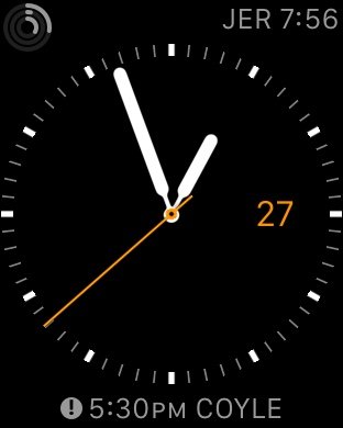
The first interaction you will have with the Apple Watch's software is the clock face. One of the more enjoyable tasks on the Watch is choosing, customizing, and changing the clock face you prefer.
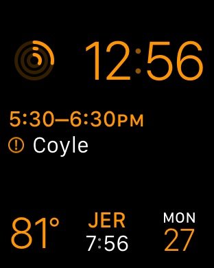
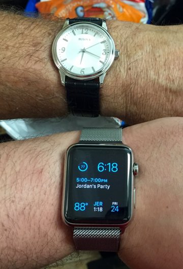
Learning how to customize each clock face takes a few tries. Some faces, like Solar and Astronomy, do not allow customizations. Others, like the Modular and Utility face allow several facets to be changed. Force Touch on the clock face to choose a face, and tap Customize below it.
Once in the "editing" view, users swipe left or right to edit either color, complications and details then scroll the digital crown to make those changes. Again, it takes some getting used to, but once you've mastered how to customize these clock faces, you will spend a good amount of time playing with it.
Users can also add multiple, customized versions of the same clock face, for example several "Utility" faces with different complications. Swipe up on a clock face to delete it. For the record, we prefer Utility most of the time, Modular when we have many events in the day, and Solar for after-hours.
Being first and foremost a "watch," its ability to tell time is important. Not being regular watch wearers previously, we found having glance-able information, in addition to the time, very useful. We regularly communicate with people in the Middle East — having a different time zone as well as upcoming events and the date all visible at once was very functional.
Also being a watch, it's expected to be able to check the time consistently and discretely. Obviously just looking down at the Watch as your arms are folded will not activate the screen. Nor will slowly turning your wrist to glance at the time during that coffee date. For someone coming from rarely wearing a watch, this was not a huge frustration, but those who have been watch-wearers their entire lives might roll their eyes when attempting to check the time.
Tapping the Digital Crown from the clock face will bring you to your world of apps. You will have to scroll around with a finger here and the Digital Crown only zooms in and out. After organizing our apps using the Apple Watch iPhone app, finding the app we wanted was easy enough. (Tip: Keep your most used apps on the edges for less chance of miss-tapping.)
Attempting to cram a large number of apps in the interface seems like a bad idea. On iPhone there's always Spotlight for finding an app buried inside a folder; no such luck here. You can ask Siri to launch a Watch app for you, though.
Only a handful of times did we miss the app we were intending to open. The screen (and our taps) seems surprisingly accurate. Scrolling around is also fluid and quick, making find the app you're looking for less of a chore.
We did find ourselves swiping downwards and upwards on the app screen to pull up Notifications and Glances respectively. Unfortunately this can only be done while viewing a clock face.
Tip: From inside an app or while viewing the app screen, double tap the Digital Crown to quickly return to the clock face or the previously used app.
One of the features were were looking forward to most on the Watch was activating Siri with only our voice. Raise your wrist, say "Hey Siri," and that's it. In practice, it works O.K.. Seven out of ten times Siri would actually activate when we said it.
Unlike Siri on the iPhone or iPad, there is no audio feedback on either initializing or receiving your command. Siri also takes a moment to show up on the screen, so at times we were unsure if Siri actually heard us.
There is a tap on the wrist to let you know Siri is listening and another tap once it has received your entire message. Dictation is very accurate and only a few times did we have to abandon our message because of butchered words.
Once your message is ready to send, there is no way to send it with your voice. You have to physically tap the send button on the Watch. And since there is no audio feedback from Siri, she can't ask you if you're "Ready to Send."
Siri is able to do many of the same functions as on the phone, like setting timers, reminders, scheduling events, directions, and more. Hopefully in a software update Siri will see some improvements, especially in sending Messages and emails.
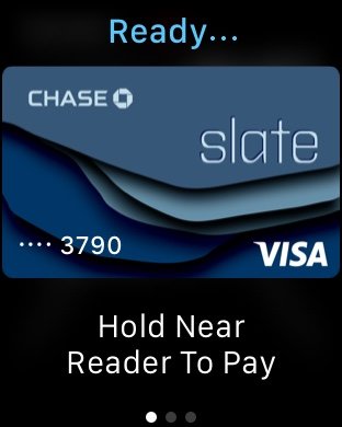
One of the more "magical" uses for Apple Watch is Apple Pay. Over the weekend we successfully used it at a vending machine and Walgreens, and each time seemed futuristic.
Cards that have been added to your phone are not automatically on the Watch, so you'll need to set those up again using the Apple Watch app. Once they're set, a double tap on the side button will activate Apple Pay. You can swipe to choose a different card, hold it up to the reader, and you're done.
Despite the speed and convenience of Apple Pay on the iPhone, it's even faster and more convenient on the Watch. It's one of the few things that genuinely seems like it's "from the future."
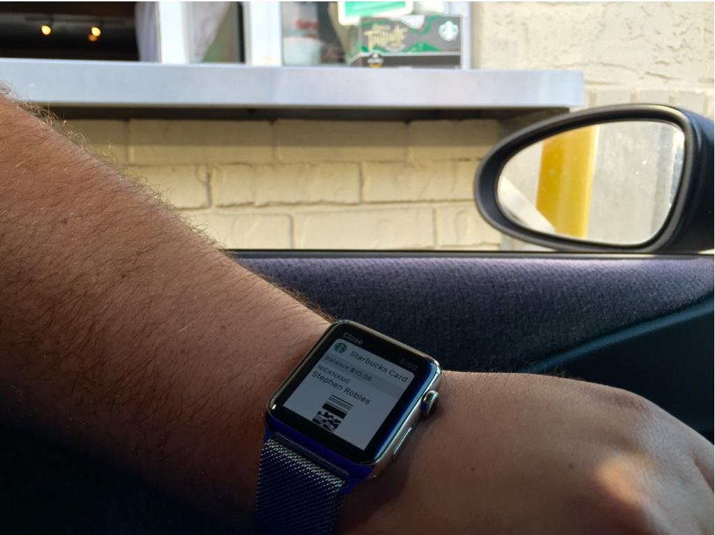
Passbook also works well and those cards are added from your iPhone automatically. Using the Starbucks Card pass several times, we held out our arm in the drive through, got a strange look from the barista, and after we said "trust me," they scanned the Watch perfectly.
Surely this will be interesting to use with boarding passes and game tickets, but there is a downside. Passes on the iPhone usually appear on the lock screen when needed. A swipe across the screen and the pass is ready to be scanned, one handed.
Passbook on the Watch is not as easily accessible. You can ask Siri to open Passbook, or tap the Digital Crown, find the Passbook app, tap that, then try to tap the card you're looking for. It would be ideal if a complication could be added to the clock face that went straight to Passbook, or if the Watch (like the iPhone) knew when you needed a pass and automatically placed a shortcut on the screen.
In this first generation Watch, there are no native or local apps. That being said, there is a noticeable difference between launching a built-in app, such as Messages, Weather, or Calendar, and any third-party app.
Sometimes a third-party app will launch in a reasonable amount of time, especially if you were recently using it. Other times you may wait for 10 to 20 seconds. In addition to the launch time, it's hard to find real usability in many of the apps.
Examples of apps we have found useful over the weekend are Overcast, Dark Sky, IFTTT's Do Button (though one of the slowest to launch), and Breaking News. Scrolling Instagram on the Watch is a chore more than it is enjoyable (and incredibly ironic that they would support the Watch before building a native iPad app). Other news apps with long blocks of text are overwhelming on the small screen, and some apps seem to have little purpose.
This seems similar to the first weeks after the iPad launched. Apps rush to update their interface for the bigger screen, but didn't yet know how to fully take advantage of it. In the coming months we will probably see the Watch equivalent of Garageband for the iPad. An app that proves its and the device's usefulness. But there aren't many of those in the Watch App Store right now.
In contrast, the built-in apps make more "sense." The camera remote button, viewing events in the calendar, and controlling Apple TV with the remote app (one of our favorites) all bring value to having the Watch.
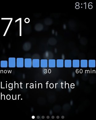
While we didn't have the chance to really test the workout features, the Activity app and "rings" are a pleasant way to track your movement. And the stock weather app is actually very good.
Understandably, many developers did not have a physical Apple Watch on hand to make their apps. As they slowly deliver over the next several months, we expect better quality, more useful apps to hit the store. One of our most-used iPhone apps, AnyList describes why they didn't even try to develop a Watch app before owning a physical Watch.
From the clock face, a swipe upwards will bring your app's "Glances" into view. A glance is supposed to be a quick look at content from an app, be it today's weather forecast or the latest trending topic.
Managing the glances carefully in the Apple Watch iPhone app is a must. We found that many third-party glances were not great and slow to load. Scrolling through glances there would occasionally present a blank space, which was actually an app attempting to load its glance.
We were looking forward to the built-in "Now Playing" glance, which promised to control whatever app is playing on your iPhone (Spotify, a podcast app, etc.). In normal use it could certainly pause or skip something that was currently playing, but once stopped it frequently "let go" of whatever app was active and could not re-start a song or podcast.
The Settings glance allows users to mute the Watch, turn on Do Not Disturb, enable Airplane mode, and ping your iPhone if lost (in the house). This glance, along with the battery level, heart rate, and weather glance have been the ones we use most often as they're the most reliable.
Another high expectation of the Watch was its Notifications. Notifications can make or break the Apple Watch experience. Too many, and you'll want to take the Watch and throw it in a drawer. Not enough (or the right) notifications and it will seem less useful.
Finding a balance is important, but once you do, Notifications seem to deliver the promise of Apple Watch better than many of the other features.
Yes, we're talking about getting notified of your upcoming meeting, getting a text on your wrist, seemingly mundane activities. But for us, and for those who have been tied to our phones day in and day out, it's a breath of fresh air.
Before receiving our Apple Watch, we knew there was never any chance we would lose our iPhone. Mostly because it was either in front of us on the desk, in our hand, or maybe in our pocket.
Now with the Watch, we get home, put our iPhone on the dresser, and don't see it again until we go to bed. It's liberating.
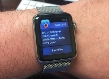
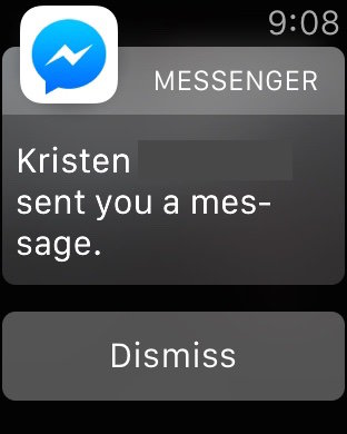
It can also be frustrating, like when we get a Facebook Messenger notification on the Watch but couldn't read anything since the app doesn't support it yet. Or we get an email and can't even reply with a "yes" or "no" because Apple Watch doesn't support that either. But we know those frustrations will be addressed in the coming weeks.
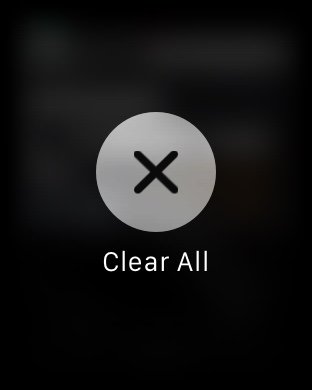
It also bears repeating, the Force Touch "Clear All" command on the Apple Watch is sorely needed on iPhone and iPad.
Conclusion
Interestingly, when people saw us with the watch, they would exclaim, "Oh, you got the watch!" Not the Apple Watch, the iWatch, or some other variation, just "the watch."
Then, nine times out of ten, people would follow up with the question, "what do you find useful about it?" People don't ask that about smartphones or tablets anymore. They understand the value, and probably own one already. But when asking about the Watch, they want to know if there is actually value there.
Also over the weekend we did a couple Periscopes for Apple Watch Q&A. People asked about battery life, haptic feedback and apps, but these questions were consistently asked:
"Is it worth it?"
"Do you regret buying one?"
Those are hard questions to answer, especially when someone is hinging a $350 to $1,000 (or more) decision on your response. But those are also the most important questions to answer. We'll start with the second question.
We don't regret buying one. Nor do we regret buying the original iPad, iPad 2 or iPad 3. We're early adopters, and in general really like Apple products. We believe the Apple Watch has huge potential, and very real benefits right now. But if the decision is to buy a Watch now or wait until the next generation, and you're not the typical early adopter, maybe you should wait. Or at the very least, buy the cheapest Sport model you can.
For the question of, "Is it worth it?" I will speak from my personal experience. I have two young boys, both wanting our attention and equally distracted by a variety of things. As we put them to bed, inevitably my iPhone was in my pocket. If something dinged or beeped, I would check it and fall down the rabbit hole, disengaging from the moment.
Then one child wants to play a game on it, the other asks to see What Does the Fox Say? for the thousandth time, and everything is now about the phone, again. Last night, there was no phone in my pocket. It was laying on my dresser since we got home. We read a story together and shut out the light.
I showed our boys the Solar clock face and we huddled around the Watch. My youngest turned the Digital Crown and watched the Sun go up and down for a few seconds. Then we sent an audio message to the grandparents, from the Watch, and went to bed.
There was no game to play, no video to watch, no five inch screen to illuminate the entire room. I got to be physically and mentally present, without distraction, and without my phone. That was worth it.
Score: 3.5 out of 5
Pros:
- New, intuitive technologies for interaction
- Hardware design with great band options
- Notifications and good built-in apps
- Apple Pay integration
Cons:
- Sluggish third party apps
- Clunky Apple Watch iPhone app
- Passbook not as useful as on iPhone
- Siri needs improvement, audio feedback
- No third party clock faces
Where to buy
The Apple Watch is currently available exclusively through Apple's online store, with new orders advertised to ship by June at the earliest. Try-ons are available at Apple's retail stores.
 Stephen Robles








-m.jpg)


 Brian Patterson
 Charles Martin


 Malcolm Owen
 William Gallagher
 Christine McKee
 Marko Zivkovic


146 Comments
Good review. I expect the OS and apps to improve, of course. Erasing some of the rough edges on this very 1.0 device.
FYI: My 42MM SS Milanese went to 'Preparing for Shipment' this morning.
My wife's 38MM did the same last Wednesday, and arrived on Friday, so I expect to get mine this Friday.
No sign of the Sports Bands I ordered along with them. Bad news for my exercise regimen.
Good review. I expect the OS and apps to improve, of course. Erasing some of the rough edges on this very 1.0 device.
If I might ask...how did you read this entire review in 4 minutes?
Many won't remember, but the first iOS apps weren't brilliant either. I don't think I use a single one of the original ones I downloaded when 2.0 was being launched (Cube Runner I used somewhat recently, but that's been so changed from the 1.0 release it might as well be an all new app). EDIT: checked the list, forgot about eBay. That's it though.
From the review, it sounds that the biggest issues were not hardware related, but software related ... and largely 3rd party software where the developers would have had little experience with the actual device, and relied purely upon the Xcode simulators. That is an easy fix. People keep calling this a 1.0 devices. Is it really? There is nothing new in the watch. All the tech involved has been done before to greater and lesser degrees. Even the SoC used to power the watch appears to be a variant of an earlier generation A chip. It might be 1.0 but Apple had time to observe the releases of other SmartWatch makers and make sure they didn't have the same issues. So yes, it is an Apple 1.0 device, but that already puts it a generation or two ahead of the competition. For Apple this is an evolutionary device, not a revolutionary one. Take the best of whats out there, pull it apart improve it substantially, and wrap it in a desirable industrial design. (Review written with my original Pebble sitting on my wrist, while I patiently wait for my aWatch to ship ...)
If I might ask...how did you read this entire review in 4 minutes?
I skimmed through it. First glance told me it was a good review. (I've seen a lot of useless reviews. See: The Verge). Left a quick comment, mostly to give others hope for their Watch delivery. Then read in detail, and edited more into that one line you quoted.