One of the most customizable Apple Watch features is its clock face, with multiple "styles" like Modular, Chronograph and Solar each having individual options for complications, or sub-displays containing glanceable information.
Out of the box, Apple Watch is configured with all available designs active in the clock face selection menu. Users can add and customize faces to taste, then delete unused designs to streamline their Watch's clock face collection. It's also possible to create multiple versions of the same face, for example two or more Modular clock faces with varying complications.
To add or remove clock faces on Apple Watch, raise your wrist (or tap the screen) and click the Digital Crown until you return to the clock face.
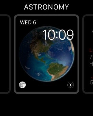
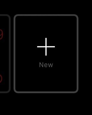
Force Touch on the clock face to enter "editing mode." To add an additional clock face, swipe all the way to the right and tap the "+" Plus icon.
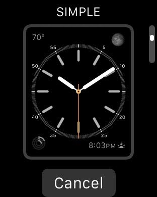
You'll be given a choice to add one of Apple's clock face styles. Tap one, like Simple, and you're ready to go.
Force Touch again and select Customize to edit the complications and color of your clock face.
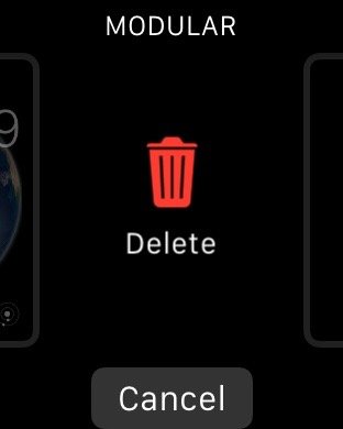
To remove any unwanted clock faces, Force Touch the screen to enter editing mode, then swipe upward to reveal a trash can and the world Delete.
Tap on the trash can to delete that clock face. If you delete one by accident, follow the steps to add a new clock face and choose the style that has been removed.
You can also follow the steps above to modify and customize existing clock faces on the fly.

