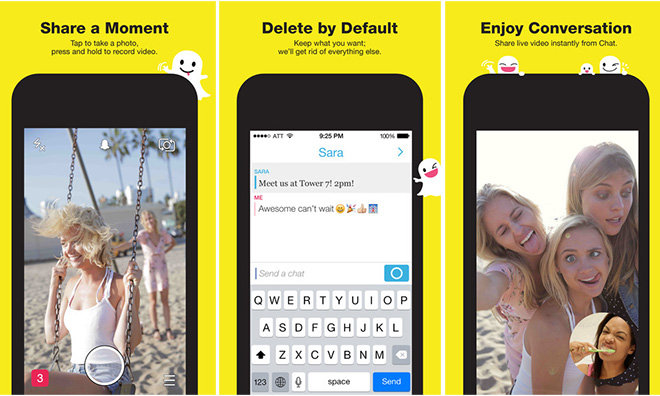
Speaking at Re/code's Code Conference on Tuesday, Snapchat CEO Evan Spiegel said the ephemeral messaging firm is tossing around the idea of ditching its familiar hold-to-view user interface, a change that could help pave the way for an Apple Watch app version.
When asked about a Snapchat app for Watch, Spiegel said he considered developing a lightweight version for launch alongside the device, but ultimately held off on development, Re/code reports.
"It has to be a totally unique experience," Spiegel said.
For Snapchat, which has seen an explosion in video content consumption, creating a Watch-ready app is far from straightforward. Aside from Apple's video streaming restrictions, the user interface is not well suited for small-screened devices. With its iPhone app, for example, Snapchat photos and video are viewable only while a user is touching the screen, a method not likely to translate well to Watch.
Spiegel hinted Snapchat's tap-and-hold UI might soon be replaced or ditched altogether, saying, "I think, for us, it's holding us back from longer videos being watched on our service." With a shift toward video, Snapchat might not make it to Apple Watch anytime soon.
Snapchat isn't alone in holding off on Watch app development. Industry giant Facebook has yet to release a made-for-Watch app version, while other social networking services like Facebook-owned Instagram debuted apps bogged down by usability issues and weak feature sets.


