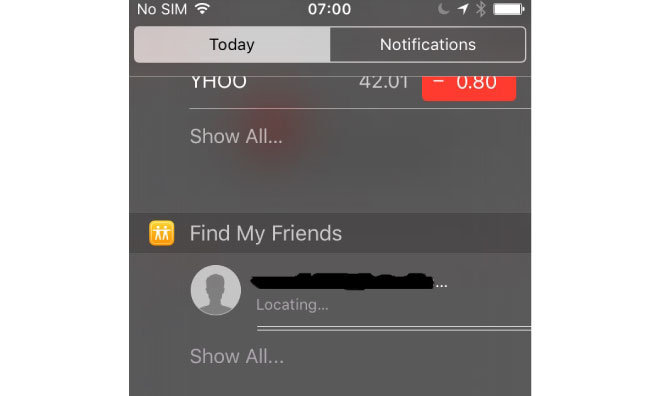
Apple's next-generation mobile operating system includes a number of evolutionary updates to complement its new headline features, like a new Notification Center widget for Find My Friends and user interface tweaks to Safari, Reminders, and the Camera app.
With the new Find My Friends widget, pulling down the Notification Center shade reveals the location of your nearby friends, with an option to view the location of all the friends you have access to by opening the full Find My Friends app. Users will be able to quickly return to the app they were last in when they jumped to Find My Friends via a small back button in the upper left, which is a system-wide addition activated when opening an app via Notification Center or Spotlight.
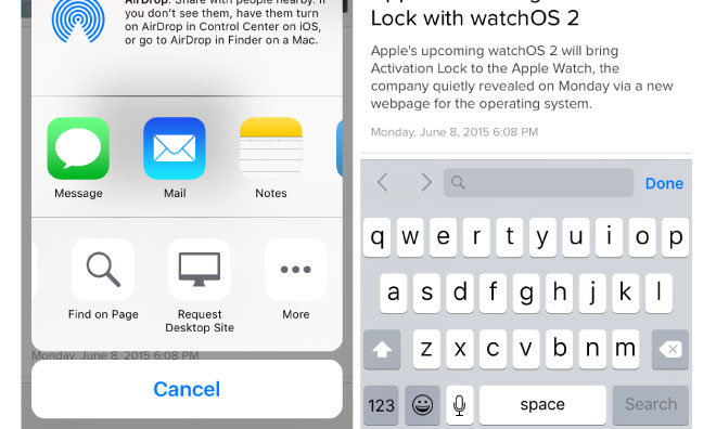
Safari was on the receiving end of changes designed to simplify the address bar, with the "Request Desktop Site" and "Find On Page" options relocated to the share sheet.
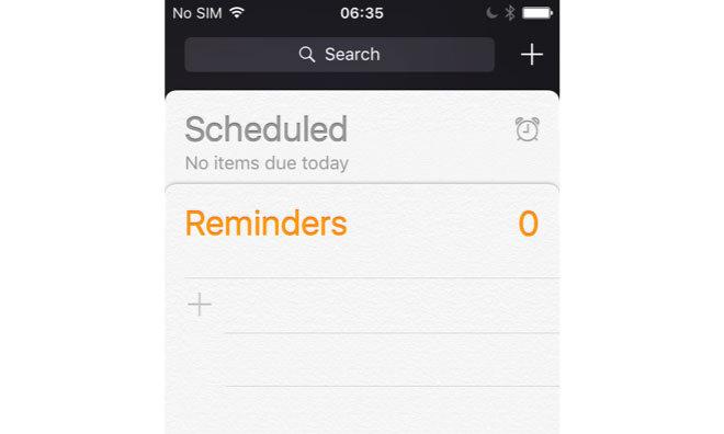
Reminders adds a new meta-list that collates scheduled reminders from all other Reminders lists.
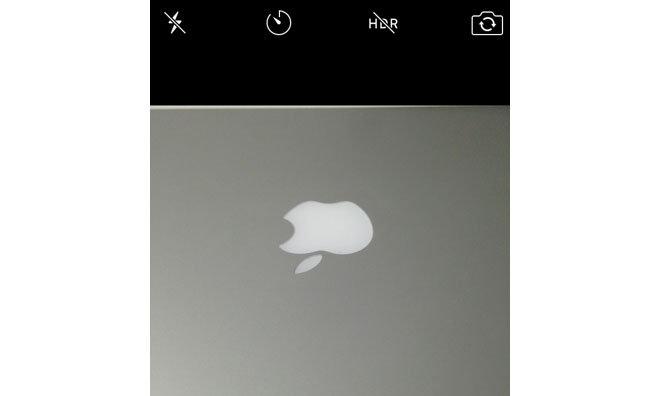
The Camera app has seen some attention with new, simplified iconography. Labels have been abandoned in favor of stylized glyphs — Â "HDR Off" in iOS 8 simply becomes "HDR" with a slash through it, for instance.
 AppleInsider Staff







 Wesley Hilliard



 Oliver Haslam

 Marko Zivkovic


 Amber Neely
 William Gallagher and Mike Wuerthele









14 Comments
Just to clarify the scheduled pane in reminders isn't new just moved: previously it was a clock icon in the upper right corner not a "tile"
I like the cross out glyph! I don't like tapping then tap to turn it off.
"Labels have been abandoned in favor of stylized glyphs." You wouldn't believe how much it costs to localize. This saves enough money in a year for Tim to get a new Aston Martin DB9.
%u201CShare sheet%u201D is becoming a misnomer %u2014 I%u2019d never think to look there for %u201Cfind on page%u201D or %u201Crequest desktop site.%u201D Is it becoming a bucket for %u201Cthings we didn%u2019t know where else to put%u201D?
Funny that it's the icons they're changing.
My annoyance with Camera app is you have to scroll through all the different camera operations just to get to the one you want. Just took a pano and want to do video? well swipe to square and it stops, then swipe to Photo and it stops, then swipe to video. (doubly annoying if i want to move from Photo to Pano and accidentally go the wrong way and get video, which kills the music I'm listening to...)
Br nice if it were a dropdown, or even 6 small icons and just tap what you want.