Apple's next-generation mobile operating system comes with many visual tweaks, but the all-new, simplified app switcher is perhaps the most radical change to the user interface.
The release of iOS 9 marks the third consecutive redesign for the app switcher, which first appeared — Â in a much more limited fashion -Â in iOS 4. iOS 7 brought app screenshots to the party, while iOS 8 added a list of frequent contacts, pressing the app switcher into double duty.
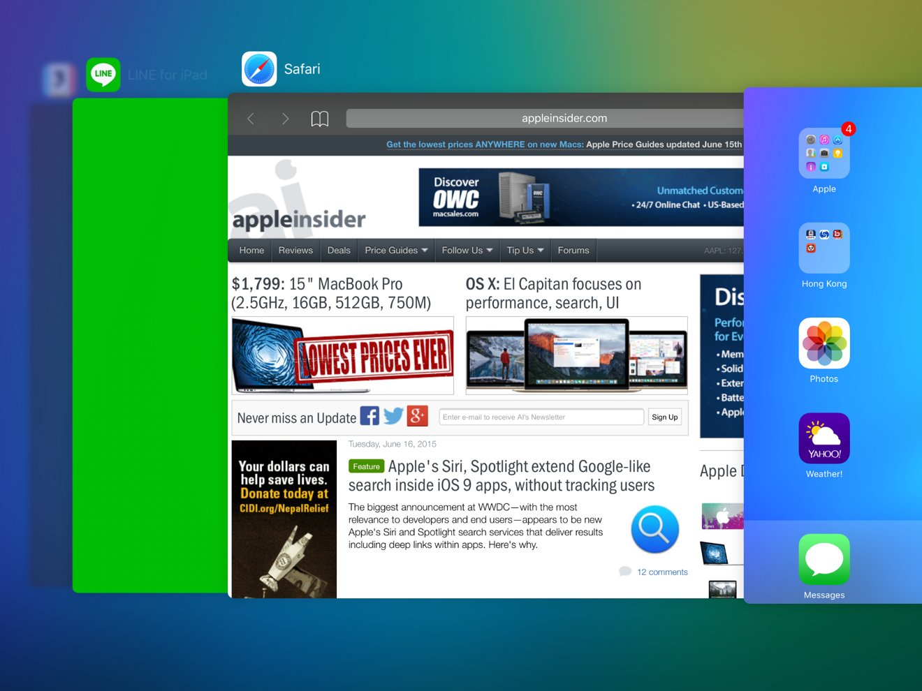
iOS 9 does away with almost every interface paradigm established for the app switcher in the five years since its introduction. It's still accessed by double-clicking the home button, but nearly everything else has changed.
The familiar row of icons at the bottom of the display is gone. Now located at the top, the icons are smaller and the app names are larger.

App screens are no longer shown in their entirety. The "deck of cards" metaphor adapted from webOS has been taken more literally in iOS 9, and apps are now arranged in a manner more reminiscent of Apple's Cover Flow, minus the unobstructed central item.
Perhaps the biggest change is that the home screen is now on the right side, rather than the left. Millions of frequent app switchers will have to rid themselves of that muscle memory.
A couple of other things do remain from the days of old: you can still force-quit apps by swiping up, and a single click on the home button will jump directly back to where you were when you called the switcher. Overall, iOS 9's new app switcher is a welcome change that seems much more in line with iOS's overall architecture than its immediate predecessor did.