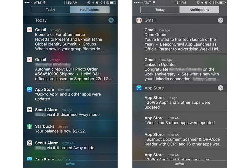
Apple's iOS 9 introduces a new Notification Center tweak that allows users to display alerts individually in the order they are received rather than compartmentalizing by app, a change that presents an event "firehose" format common with social media services.
Since inception, Notification Center sorted alerts by apps and time, but the system was somewhat clunky. Even if users opted to sort by time, notifications were perpetually presented according to their respective originating app. Depending on how often you checked and cleared your notification timeline, receiving an email could have potentially pushed a text message or other important alert down the screen.
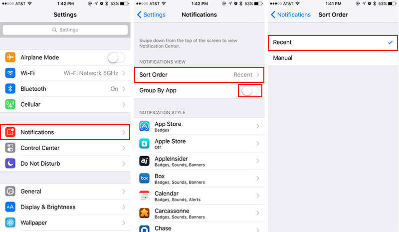
iOS 9 carries over the same app and time sorting capabilities (now called "Recently" and "Manual"), but solves previous issues by adding a third option in Group By App. Turning this feature off breaks alerts out into freestanding notifications displayed in Notification Center's cascading timeline.
To switch away from app groupings, navigate to Settings > Notifications > Sort Order and select Recent. Back in the Notifications settings menu, toggle the Group By App button to the off position. Confirm the change in Notification Center by swiping down from the top of your iPhone or iPad screen.
Users can revert to legacy notification handling methods by selecting Settings > Notifications > Sort Order > Recent and activating Group By App. You can also choose a strict sort order always grouped by app by choosing Settings > Notifications > Sort Order > Manual. For example, if Messages is at the top of a sort list set to Manual, notifications from that app will always appear first in Notification Center, regardless of arrival time.
5 Comments
If you can find a way for Notes to not have words become keyword triggers for Calendar it would be greatly appreciated. Words and Numbers like on a clock that include: tomorrow, today, yesterday, 12:00, etc., all get bold yellow and when you select the services panel slides up with options to add to Calendar. Definitely a bug or one feature that should be note to note configurable.
The default option is way better. Letting me wipe out all notifications by day has made my iPhone much less of a pain in the ass.
One major problem I have with this new set up is that the apps are categorized alphabetically. Before I would constantly go in my notifications and change their behaviors. Sometimes I want my messages to show preview. When I'm in a public setting I will change it to private. Sometimes I will change my messages to not show on the lock screen, polite and helpful for those times when you're on a date. Now the messages are all the way down towards the bottom. All the messaging type apps are far apart form one another. When you go into the manual configuration, it shows all my preferred apps listed in proper order as I have chosen like messages being at the top, but I am unable to drop in the settings of those messaging apps form the manual screen. Anyone else have this problem and find it annoying? This may not seem like a big deal, but I had all my messaging apps like voxer, line, messenger for Facebook easily viewable and grouped at the top of the screen where I could select and manipulate their behaviors on the fly. No longer with this option.
Ios 6 inspired
The default option is way better. Letting me wipe out all notifications by day has made my iPhone much less of a pain in the ass.
I noticed that on day one, and I love it! It's much easier to sort by day than by app.