Apple's Smart Battery Case will certainly get the job done, but it includes some baffling design decisions, and just isn't a great value compared to third-party products.
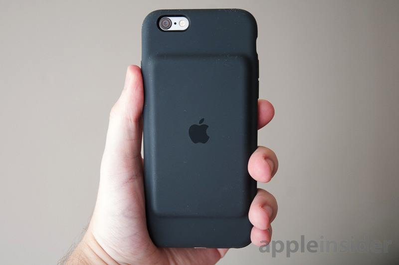
First of all, to address the elephant in the room — yes, the case just doesn't look as sleek as most Apple products, with a protruding battery "hump" that some people have likened to an iPod, a deck of cards, or even a tumor. It's like a mutant version of Apple's regular Silicone Case.
In practice, the aesthetic issue is overblown. A charcoal black version looked smooth and well-made to our eyes, though it's liable to show scuffs and lint over time. And ultimately, it's a battery case — what matters is how long it lasts and how much protection it offers.
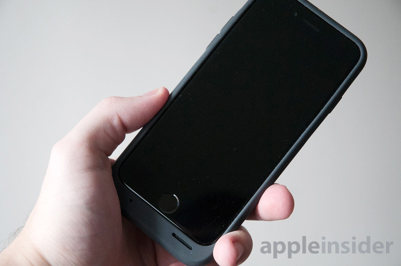
On the second point, the Smart Battery Case is engineered more to be light than rugged, but it does have a thick, grippy rubber exterior reinforced by plastic and metal. A raised lip helps guard the screen. Together these things are enough to protect against bumps and everyday wear and tear, and possibly a few drops if the screen doesn't take the brunt of the impact.
Battery life is decent, but not spectacular. Apple claims up to 25 hours of talk time or 15 hours of LTE data, compared with figures of 14 and 10 on a stock iPhone 6 or 6s. We tried the case with an iPhone 6, and found that in normal mixed use — with activities like Facebook, music, Words With Friends, and Google Maps navigation — we were left with a 12 percent charge on the case by the end of the day, about what you'd expect from an iPhone on its own.
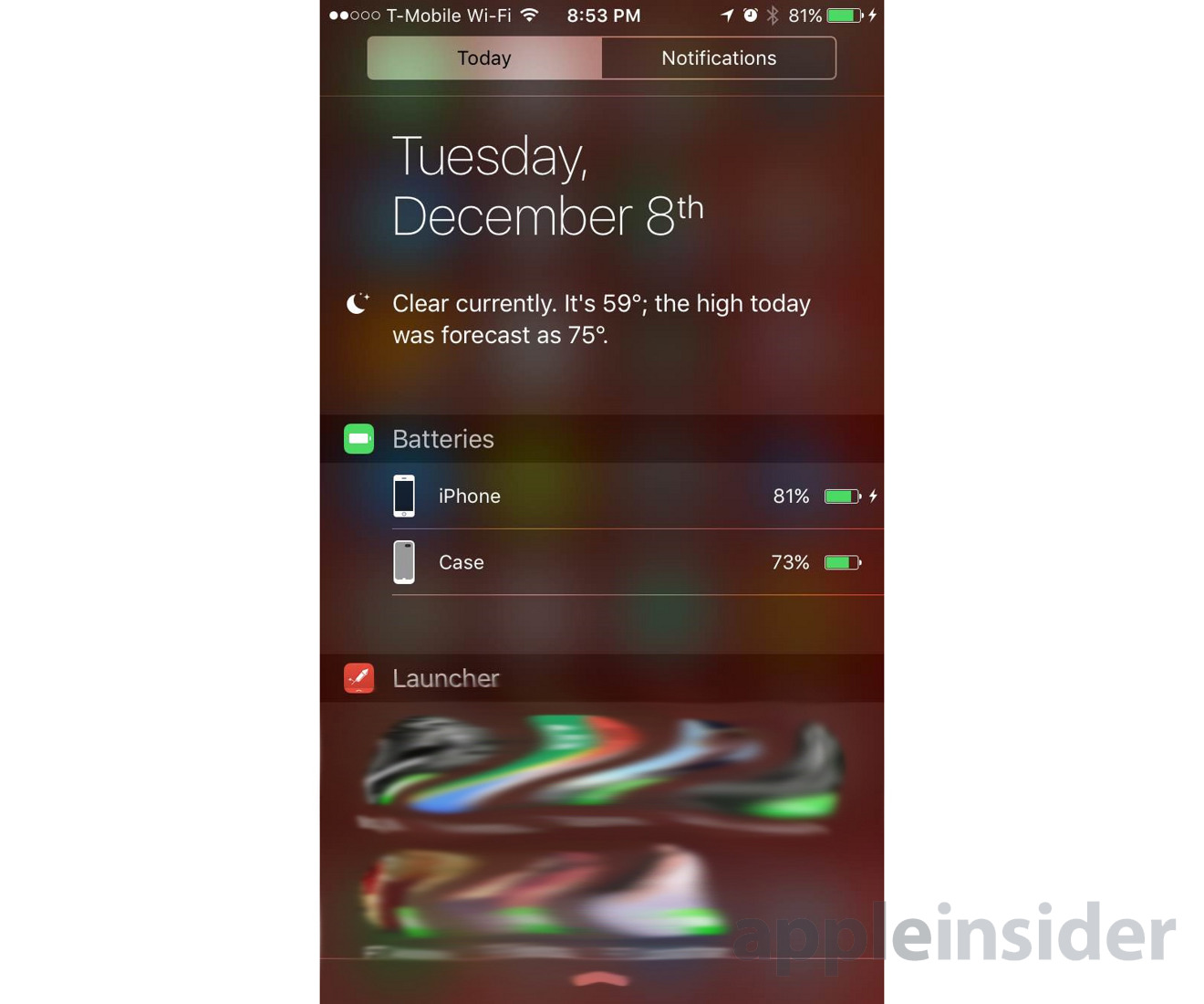
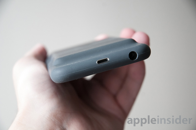
One of the neater things about the case its close integration with the Apple ecosystem. It uses a Lightning port instead of micro USB, which automatically makes it more convenient for a lot of people — especially those with Lightning docks. When you insert or remove a cable, it briefly displays both the phone and the case's power levels, and you can check that information again through an iOS Notification Center widget.
It'd be nice, though, if those separate levels appeared on the iOS lockscreen as well. Really there should be an external LED readout like other cases, which would do away with having to plug in an iPhone or swipe down on notifications just to gauge how much life is left.
On that note, some of Apple's other design choices are just bizarre. There is an LED charging indicator, but it's a basic on/off light, and it's located on the inside of the case — a place you won't see most of the time. There's no switch to turn the case off and save reserve power. And if you want to connect 3.5-millimeter headphones or stereo cables, the opening for them is too deep and narrow in many circumstances. An exception — naturally — is Apple's own EarPods.
The case's flaws might be overlooked except that Apple is charging $99 for a bare-bones product. That's almost criminal when you can get a decent Anker case for $40 that has a 2,850 milliamp-hour battery. For just a dollar more than Apple, you can get Mophie's tougher (and often better-designed) Juice Pack Air. If you're willing to spend about $130, you can get a case from LifeProof that not only charges your phone but makes it nigh-on indestructible.
Conclusions
Putting it bluntly — there's no reason to go with the Smart Battery Case unless you need something like it the moment you buy your iPhone and, mysteriously, no other option is available. It does what it needs to do, but at a high pricetag and with problems other casemakers solved years ago.
It's a shame, since the case's Lightning port and iOS integration is genuinely useful and sets it apart from the pack. Hopefully this is the harbinger of the technology coming to superior third-party accessories.
Score: 3 out of 5
Pros:
- Tight iOS integration & Lightning port
- Decent protection
- Extra battery life enough for most of a day
- Easy installation & removal
Cons:
- Too expensive for included features
- May be ugly to some
- No external LEDs or controls
- Makes 3.5mm port incompatible with some accessories
Where to buy
Apple's Smart Battery Case for iPhone 6 and 6s sells for $99 in Charcoal and White at B&H, Amazon.com and in Apple Stores.
-xl.jpg)


