Every once in a while, Apple rolls out new behind-the-scenes features that are exceptional technical achievements but receive little fanfare. With the launch of the miniature iPad Pro, that focus shifted toward the important-but-impenetrable world of color management.
Color management software does basically exactly what it sounds like: it manages the way colors are displayed in different mediums. With good color management, Apple's famous Bondi Blue iMac will look more or less the same on your iPhone's screen as it does in person or in a printed brochure.
Unless you're someone for whom color is important — a photographer or a designer, perhaps — you'll probably never notice color management at work. For that small group of insiders, though, color management is often absolutely critical.
Apple's desktop operating systems have long had what is considered the best color management in the industry, called ColorSync.
First released in the early 1990s, the development of ColorSync led Apple more-or-less directly into a partnership with Adobe, Agfa, Kodak, and others to form the International Color Consortium. Today, the ICC controls the world's primary color management specification.
Though the Mac has maintained its sterling reputation for color accuracy throughout the years, Apple's iOS devices have been left out in the cold — until now.
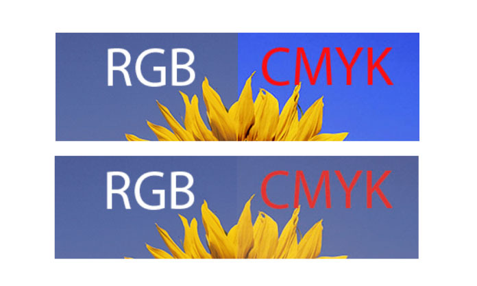
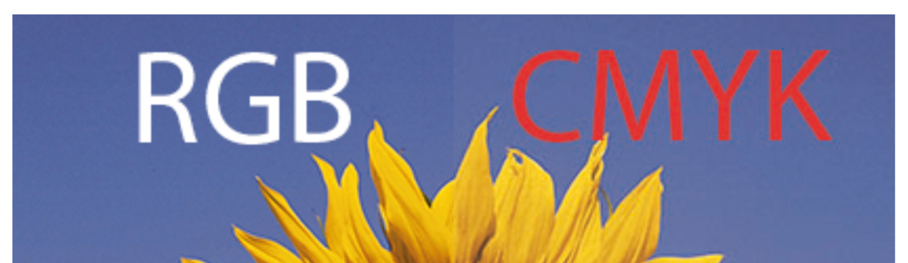
Color management fail in iOS 8.4, top, compared to ColorSync in iOS 9.3, bottom.
During its announcement, Apple made a big deal of the 9.7-inch iPad Pro's True Tone display, which automatically adjusts the white point to match the ambient lighting conditions. The company likewise touted the baby Pro's newfound support for the DCI-P3 color gamut, a next-generation color standard that has begun to trickle down from Hollywood.
What Apple failed to mention, as noted by AnandTech's Brandon Chester, is that iOS and OS X are now essentially at feature parity with respect to ColorSync.
Though consumers may occasionally notice the baby Pro's more accurate color representations, this is a Big Deal for color-focused professionals. It means that iOS now has the ability to slide into OS X's spot in some professional workflows, putting a little more "Pro" in the iPad.
Most of all, though, it's a sign that Apple is still paying attention to the little things.