Apple's Maps and Music services will gain new functionality and and new looks with the upcoming launch of iOS 10, the company announced at WWDC on Monday. In particular, Maps will gain in-app functionality with third-party extensions, while Music has a cleaner design that simplifies playback and discovery.
Apple Maps
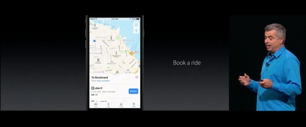
With iOS 10, Maps will become open to developers, allowing third-party extensions to plug into the official Maps app. Examples provided by Apple's Eddy Cue on Monday included Uber and OpenTable.
Cue showed how a user could search for restaurants, book a reservation, request a car, and pay for the car all within Apple Maps thanks to extensions, without the need to open another app.
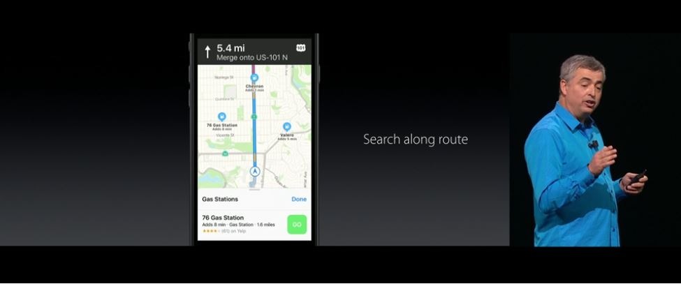
The look of Apple Maps has also been tweaked, offering users the ability to see traffic on their route and a dynamic view that will adjust based on current driving conditions. For example, in a city, the Maps will zoom in to show street detail, while driving on a long straightaway will automatically zoom out to give a better view of the road ahead.
Users can also pan and zoom ahead to see upcoming traffic conditions. And there are also quick controls to see route details, or the ability to search for stops along the current route.
Apple Music
The subscription Apple Music service has exceeded 15 million paid users, the company announced on Monday. And with the upcoming iOS 10 release, Apple Music will gain an all-new look focused on use and content discovery.
In addition to iOS 10, Apple Music will be tweaked for Mac, PC and Apple TV.
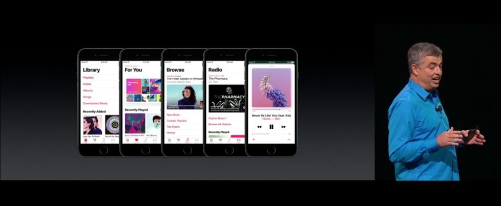
Featuring a new structure, the new Apple Music aims to make it clear where the user is, providing quick access to features that users are most likely to use.
In one key change, the music library has a section called "Downloaded Music," where users can see all of the songs stored directly on their device.
On the now playing music page, users can also scroll down to view the lyrics for the currently playing track.
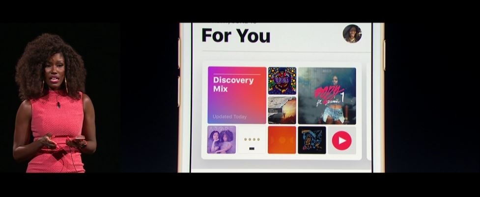
A "Curated For You" section incorporates the Connect social feature with curated mixes. And the Radio tab allows users to explore Beats 1, view upcoming shows, or listen to previous shows like a podcast.
