Control Center in iOS 10 has an entirely new look and design, adding expanded music controls and quick access to HomeKit accessories. However, the changes may not be readily apparent to new users, which is why Apple has added a quick introductory screen explaining them in the latest beta.
The fourth beta of iOS 10 was provided to developers on Monday, and as Apple pushes toward a public release of the software this fall, it continues to tweak and refine it.
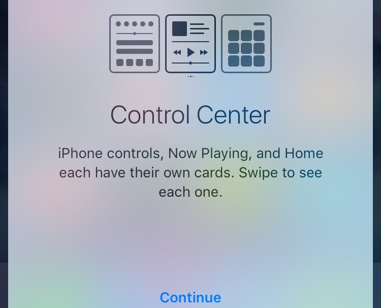
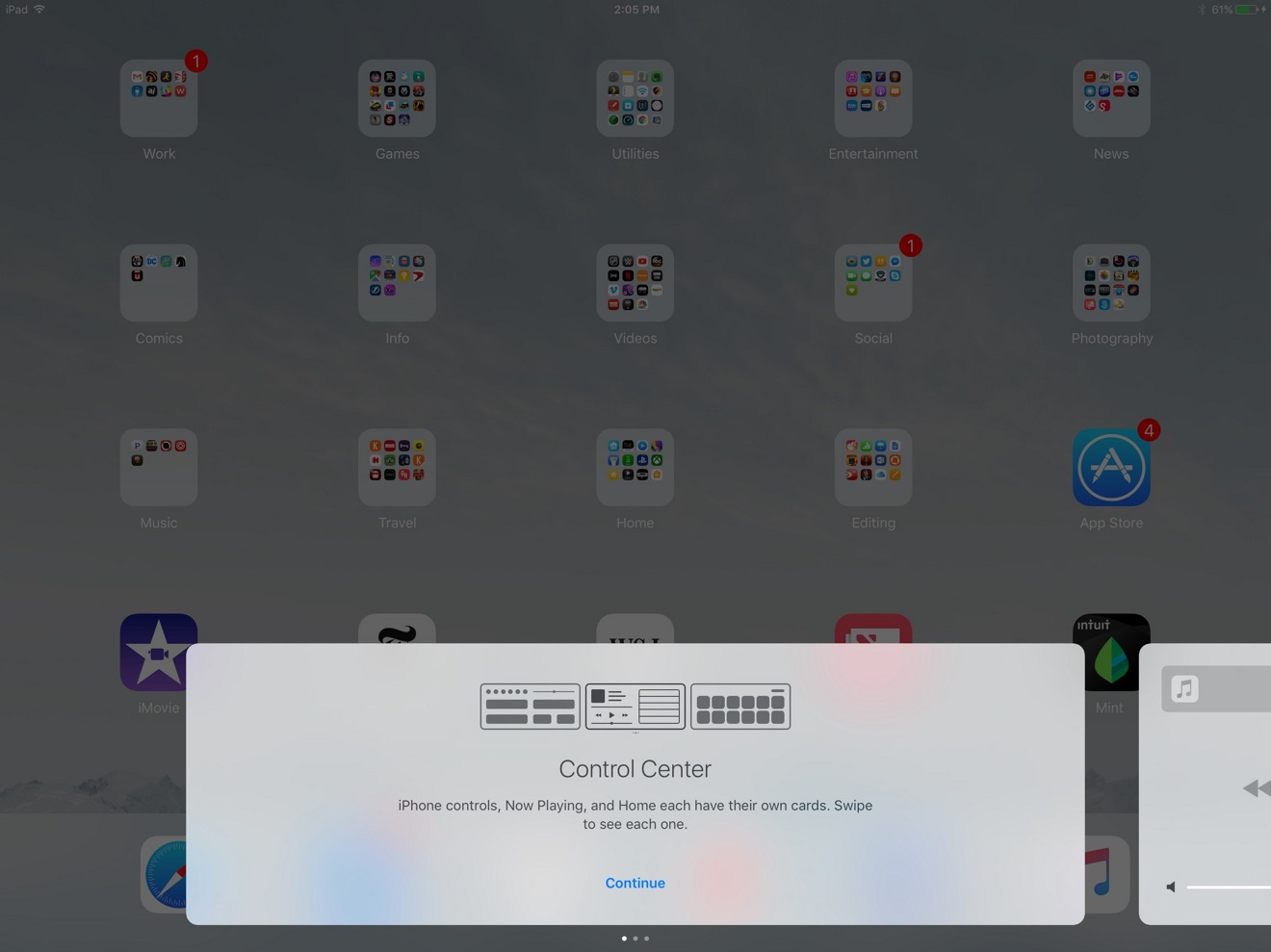
For new users, the changes to Control Center are spelled out more clearly starting with beta 4. When swiping up from the bottom of the screen, iOS 10 now displays a splash screen to acknowledge before using Control Center for the first time.
"iPhone Controls, Now Playing, and Home each have their own cards," the introduction explains. "Swipe to see each one."
The explanation could be seen as necessary because, at first glance, the new Control Center main view looks largely the same as before. The most notable change is that music and media controls have been removed, and placed in their own pane which can be accessed via a quick swipe.
In addition to having two new panes, Control Center in iOS 10 is also designed to take advantage of the pressure sensing 3D Touch display on the iPhone 6s and iPhone 6s Plus. These can be used to adjust brightness on the flashlight, set custom alarm timers, adjust brightness of HomeKit bulbs and more.
iOS 10 is expected to launch in September, alongside new next-generation iPhones. It is currently available to test for registered developers and members of Apple's public beta program.
 AppleInsider Staff




 William Gallagher
 Charles Martin


 Christine McKee





11 Comments
What's with the big night shift button? Something coming with new iPhones that will occupy space in control center? I wish Apple would let us customize it.
1) This seems like one of least complex changes they've done, but I guess enough people had issues if they're adding an introduction to beta 4.
2) I agree with @rogifan_new that the Night Shift button seems both atypically large and that it would be nice to customize Control Center. For example, I would prefer not to have to swipe to access my Music/Podcast/"insert audio app" controls.
I agree! Too much swiping makes for confusion. Would prefer user customization of the main notification page. I prefer my music there too.
why couldn't they do tabs instead in control center. seems better than swiping across three panes. or the design language is not consistent?