Workflow's new 1.6 release continues the app's increasing list of capabilities and makes visual refinements to its most-used tools, and is aiming to attract people who are new to automation. AppleInsider examines the new version in detail.
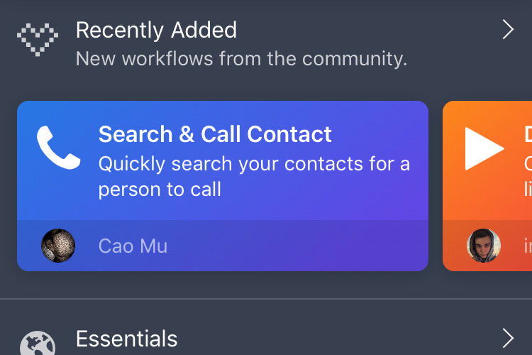
The Workflow gallery is bigger in every sense with more sample workflows plus larger, clearer icons and descriptions. When users first open it from within the app, they will see examples such as Home ETA which uses Apple Maps to automatically calculate how long is left on your drive home and then send a Message with that information to your partner.
They are all functions and features that users can do on their iOS device, but in multiple steps and using several apps. Workflow now reduces that to one button. It's aiming to bring the reasonably untapped power of iOS to more people.
Automation on iOS?
But, Workflow will never succeed — not entirely. At least, not as long as iOS functions in such a way that automation is less a workflow and more a workaround.
For those who just like to pick up their iPhone and get on with what they're doing, Workflow would help, but it's enough of a job to learn that the great majority of users will never look at it or even really realize what it is.
At the other end of the scale, though, there are many people who do see the advantages of putting effort into making a workflow now to save you time later. If that's you, you're at serious risk of becoming a Workflow devotee.
If the gallery is the clearest visual change for new users, Choose From List improvements is the same for existing users. Workflows have never had to be a straight, simple sequence of pre-chosen steps — Â they can be ones that ask you questions and act on your choices. So, a handy workflow for searching the App Store has always been able to ask you what users looking for and then show them a list of matches.
What Workflow 1.6 does is change that list. In addition to being a straight text label, users now also get the app's icon.
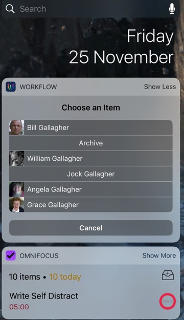
If a workflow involves searching through contacts, it now automatically shows the associated photo of each person. It's a small change and yet it makes workflows that use it look better and feel quicker to use.
What hasn't changed from previous versions is the basic way to create a workflow — that's because there's no need for it to be improved. Workflow contains a long list of possible functions and users simply drag each one they want over to where making a workflow.
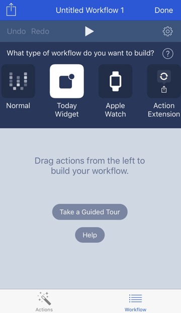
It's clearest on iPad, where the functions list can be seen next to a work in progress. Even on iPhone's smaller screen, though, users will get very used to swiping between list and what they're building.
For example...
Take, for example, Safari: Tap the Share button, choose Run Workflow and then tap on one called Shorten URL.
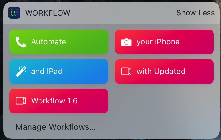
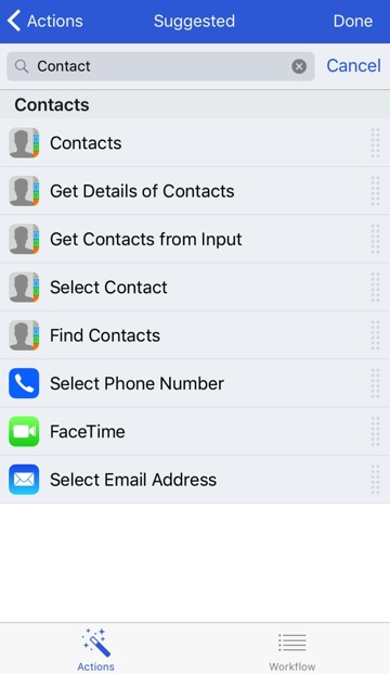
Arguably most useful is that it can be made a Today widget. Users can just pick up their phone, swipe to the left and tap on a Workflow button. To make one of these or any of the other flavors of Workflow, start with an empty pane and start searching the available functions for what you want.
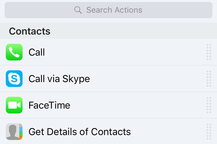
For example, tap on Find Contacts and receive a brief text description of what it does. Tap and drag that over to the Workflow and it turns into an expanded section with options.
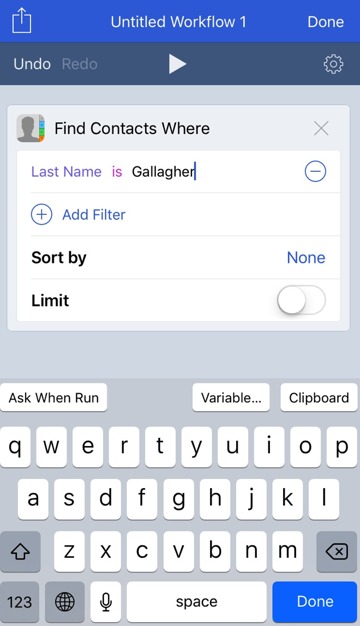
You've already created a workflow — it's just that if you ran this, all it would do is show you all your contacts. So, tap Add Filter and make some choices: pick a group, pick a name, a birthday and so on.
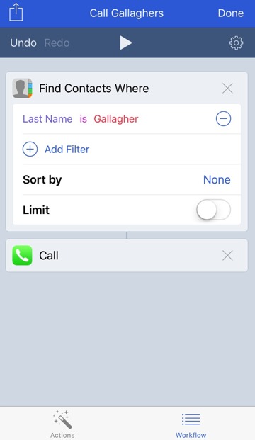
Say you often have to call everyone in your extended family to discuss Christmas. Set Find Contacts to show everyone whose last name is the desired surname. Then drag in the Call function.
Now you've created a useful workflow. Give it a name, choose an icon and close the Workflow app: since you've made a Today widget, it is now already in your Today view. Now at a swipe and a tap you can have a list of all your immediate family members and with one more tap you're phoning them.
Workflows can get hugely more intricate, but they are always solely about dragging functions into a list just like Automator on macOS Sierra and thinking about the right sequence for them.
Not working in a vacuum
Once you've got one working just the way you want, you can share it with other users — and this is the other major change to Workflow 1.6. Users have been able to share a workflow since the first version, and many of the ones in the gallery are from users but it's not been a smooth process.
Say you want to share that workflow for phoning your family: it's set to look for your surname, not anyone else's. So anyone who wants to use your workflow has to go in to it and make changes. That can be a much more complex than just changing one name so it's been rare that you could quickly take someone's great workflow and use it immediately.
Now, though, you can choose to help the new user out with Import Questions. When they install your workflow, you can guide them through which bits they'll need to update. It's another apparently simple improvement and it is definitely a great boon to trying out new workflows.
Very experienced Workflow users won't particularly need Import Questions for themselves, and casual iOS users won't be made into converts and devotees by it. Yet, it is well implemented, and it is going to be enough to tip more people over into trying out Workflow and seeing how it can dramatically speed up their most repetitive tasks.
Workflow 1.6 requires iOS 8.0 or higher and costs $2.99 on the App Store.
