The latest revision to the Evernote app for iPhone and iPad notebook app aims to speed up the service — AppleInsider takes a few notes.
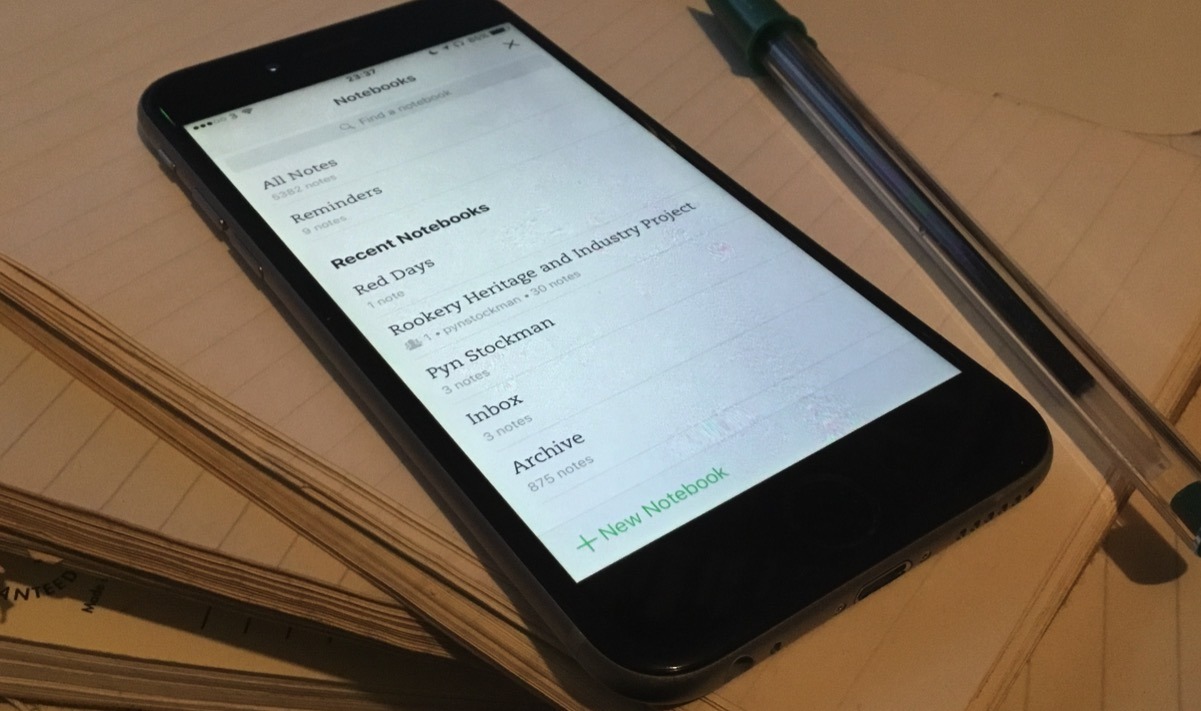
Evernote is a free note-taking and note-keeping service for iOS, Mac, PCs and online. Recently, the iPhone and iPad app versions were updated to 8.0.3, which brought a totally new look and improvements to functionality.
If you want to start a brand-new note, the redesign helps. In the most recent versions of Evernote up to this new edition, users tap a + sign to start a new note, but then have to say whether it would contain text, images or audio.
Tap the + sign, for example, to immediately write a text note. It's a saving of perhaps a picosecond but it also gets rid of the chore of effectively saying, "yes, I actually do want to write a note." To create a note with images, audio and the like, pressing and holding on that same + button invokes a drop down menu. The functionality remains the same, but takes fewer steps to get to the function you want the most.
The change is simple, just a reversal, but it's about making Evernote more useful and less about the company trying to promote different features.
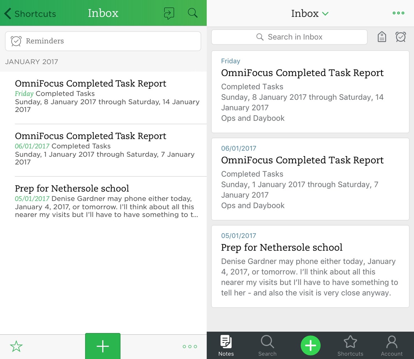
There's a difference in how things are displayed across the board, in either retrieving an old note, or starting a new one. Text is spaced out just a little more comfortably and you see a lot of white space. Previously Evernote seemed to be a very green app where now it looks very white.
Evernote now feels less "Xbox One" and more like it actually belongs on iOS.
[q]We remain regular users of Evernote but its failings seem magnified now that it's no longer the only game in town.[/q]
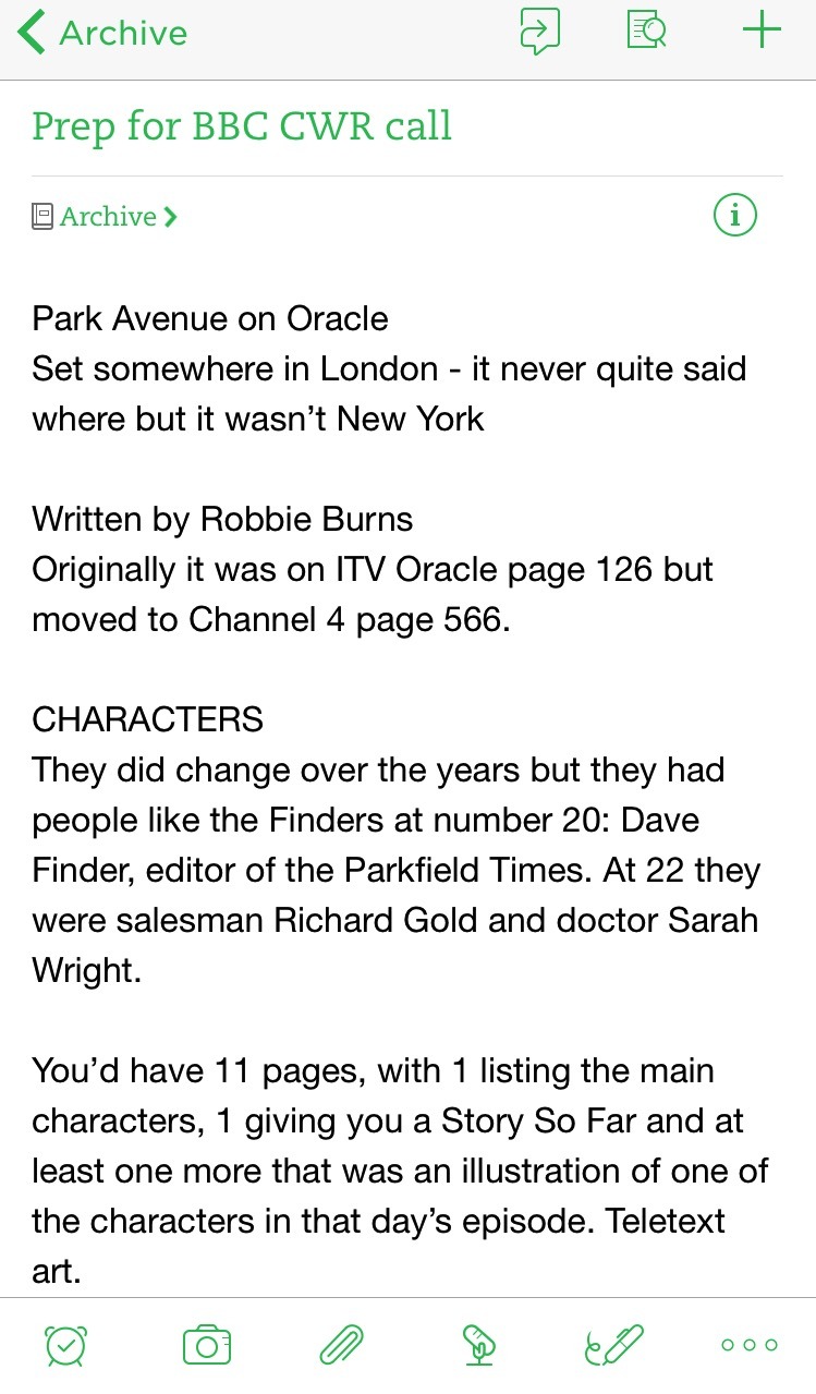
There's slightly less text displayed on the screen but with fewer lines and wider spacing, what is seen is significantly clearer and quicker to read. Evernote still remains better for reading than for writing, though. Even with the new design, Evernote is not an app that one would particularly choose to write a great deal in, as it lacks the kind of word processing features and strength that you get from Pages or Microsoft Word.
You could write a novel in it, but you really don't want to. It also lacks the the harder to describe feel of an app aimed at long-form writing, like Drafts or 1Writer. It's not in any way difficult to write in Evernote, but it's also far from being a pleasure.
Curiously, the website version of Evernote is a much more appealing and satisfying place to write in. So, it's difficult to define what makes us feel as we do about the iOS version and it's unquestionably true that your mileage may vary.
Try it out to see for free. Not only is the iOS app free but for basic use so is the Evernote service. Download the app, sign up to the service and be hammering away on your notes very quickly.
The free Evernote service is feature limited, rather than a trial, so users can keep on using Evernote for as long as it takes to decide if its worthwhile or not. At first glance, its no different to any other note-taking app. But, users should train themselves to write notes in it and also most importantly to save images, PDFs and documents too.
After a forced education, abruptly there comes a point where you understand why it's so useful. Being away from the desk and being able to look up a contract PDF on an iPhone, for instance, is a convincing argument that Evernote is worth using and worth paying for to get more features.
The Evernote service remains a little generous with the basic, free version. For instance, it does not limit how much can be saved in it or how much can be written in it. Instead, it limits how much users are allowed to upload to it per month.
That sounds like the same thing as limiting how much it can be used, but free users can upload 60 MB of data per month. That's a lot of text notes, and if the 60 MB limit is struck, just wait out the rest of the month and continue again.
If the subscription is paid, there are more unlocked features — for instance, subscribers can share notebooks with other users. Evernote will also take emails, allowing a user forward an email and have it saved in the notes.
Evernote Plus and Evernote Premium subscribers also get online support, but by itself that isn't worth the upgrade. As Premium users, we tried out a basic support request and got a response within 12 hours. It was a boilerplate standard answer, but it was correct and it was a response.
Once upon a time, a new feature was introduced into Evernote on a Saturday. It bricked our Evernote iPhone app and it took five days to get a completely inadequate reaction from the company's support team.
Apparently, Evernote support at the time didn't work weekends. So the company released a major update with problems that made the app unusable, on a day they didn't have any support staff.
Anecdotally we can say that support is improved, but it's generally not good enough to be counted as a legitimate benefit of subscribing. For the record, though, Evernote 8.0.3 wasn't released on a Saturday, and updated itself promptly and without any serious problems. However, it's still a little buggy.
When you first open the app it offers to switch on background updates so that notes are copied between an iPhone and an iPad automatically. If you choose no for any reason, such as wanting to limit the impact on a regular data plan, Evernote 8 keeps on asking every time its opened. Evernote support confirms that this is a bug and says it's being worked on.
Similarly, though, in a coffee shop where there is wi-fi but the device isn't logged into it, Evernote complains over and over. The app complains that it can't sync notes, and worse yet, reminds you of it every few seconds.
The solution is to either log in to that wi-fi network or switch the iPhone to airplane mode. Problems like this and previous support failings make it feel as if Evernote 8 hasn't been tested enough in the real world.
Evernote has been around for a long time and has a lot of users with an awful lot of notes. Consequently even the comparatively small problems of this new version cause a great volume of annoyance.
We remain regular users of Evernote, but its failings seem magnified now that it's no longer the only game in town. Apple's own Notes app is now a serious rival, for instance, and it is more pleasurable to write in. There are still questions over whether it can handle as many notes as Evernote does, but it is finally good and has the benefit of being free.
Evernote has been through a kind of shakedown cruise lately as it's looked to find a place in the new notebook playing field alongside Apple Notes, Microsoft OneNote and more. It's also been trying out new prices and changing what users do and don't get with each subscription tier.
This has all been a quite public churning of the app and service — but the pricing seems to have settled down. What Evernote arguably needed next was a better, faster and more appealing iOS app. It could go further and mimic some of its own online Evernote.com writing environment, but Evernote 8.0.3 for iOS is a significant improvement and a good app for a still-strong service.
Evernote 8.0.3 requires iOS 9.3 or higher and is free on the App Store.
 Mike Wuerthele





-m.jpg)




 Wesley Hilliard
 Malcolm Owen
 Amber Neely
 Christine McKee
 Andrew Orr

 Mike Wuerthele and Malcolm Owen





11 Comments
The author of this schmooze piece is clearly on drugs.
This iOS update is an abortion, from the Jony-Ives minimalist UI for 2-year-olds that now wastes all kinds of screen space, the elimination of features on down to the baffling requirement to keep signing in to the app with my iCloud password for no reason at all. Oh, and the overall sluggishness that wasn’t present before.
Take a look at the reviews and comments on the Evernote forums as well as in the iTunes App Store. I’m not talking out my a$$.
I was so angry at being served this platter of b.s. (I’ve been a paid subscriber from the beginning) that along with the logs they requested I send them, I promised to quit the service completely and move elsewhere. (For the record, I think OneNote is beyond sucky, so I don’t know what else I’d use. The Apple Notes app is far from up to snuff as well.) Evernote extended my Premium subscription for free for three months. If they don’t have this all settled at the end of that time, I’m gone.
I don’t know why modern software companies don’t do thorough QA and field testing any more, and I’m not going to support their lunacy with my money. They’re charging enough to to have a superb software development teams. Would you buy a car that had this many issues? Their customers are not supposed to be the beta testers unless they signed up to be beta testers. (Ahem, Apple?)
They say they are going to quash all these bugs “in the next release,” but there’s no excuse for this dumpster fire. The Web Clipper extension malfunctions, the macOS current app release is buggy, and now they’ve ruined the iOS app. Their apps used to work smooth as glass, for the most part, so I’m baffled by this gargantuan series of missteps.
BOOOOOOO! Two big thumbs down.
Notes does everything I need from a note app. Apple has some great apps on iOS actually. Podcasts is better than Overcast, I like Music far more than ever since the redesign in iOS 10: I actually think iOS 10 in general is the best designed iOS since iOS 6—speaks well for Alan Dye. Safari and Calculator are minimal and get the job done. Mail, Camera, Clock and Cal all do the trick, though Cal needs a little useabulity love to make it a more effiecnt app to use. iOS on both iPhone and iPad are badly, badly missing a native, standalone Apple dictionary app (with audible pronunciations as well). This really needs attention IMO. It'd be a really nice app to have. And obviously iPad desperately needs native weather app treatment.
And still my main complaint about iOS is the lock screen unlocking animations and UX. The little wait after unlocking before I'm allowed the interact with my device absolutely kills me! iOS 4/5/6 never had this problem. Please let Dye address this in iOS 11. He already gave us wake to raise which is very reliably coded and designed and terribly useful. And he thankfully got rid of the overly "fadey" lock and wake animations—they were ghastly. I'd go the full way and go back to iOS 6 and zero fade when pressing lock button to lock and wake the display. It should feel totally efficient. Any fade there doesn't make it feel more organic, just unnecessarily slow. It makes the user feel less in control of their device and takes away that moment of satisfaction, which is crucial.
Last year Evernote changed their policy to allow only two Basic (free tier) devices per account. They also bumped their price structure to a much less competitive scheme. A 40% price increase? Ouch.
The day they announced the 2device limit for free tier I started moving everything in Evernote to Notes. I already hadn't touched Evernote in nearly a year and had begun using Notes almost exclusively anticipating the feature flood. Does Notes have all the 60 features of Evernote I never used? No, but, well, I never used them. Way too little way too late. And I'm a poor guy. I'm on a 5S & wifie is on my old 5. I can't afford a monthly payment for a damn note taking app.