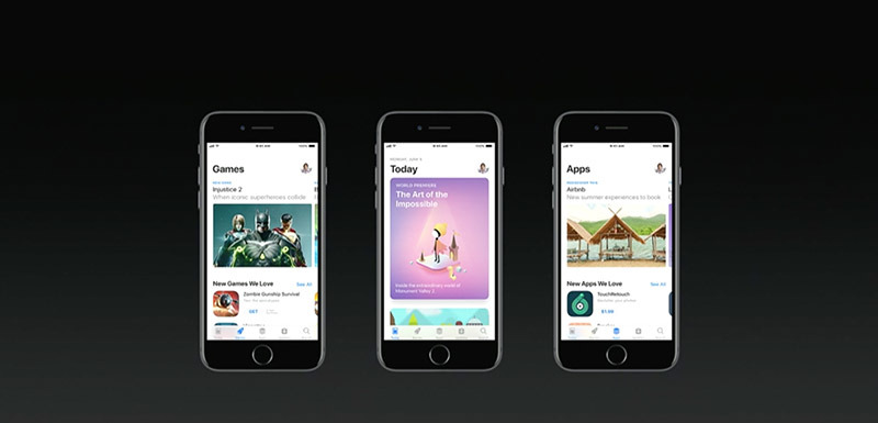
The iOS App Store is getting its first major redesign since launching in 2008, with a fresh new look complete with user interface elements reminiscent of the Apple Music app.
The redesign is largely based around tabs like Today, Games and Apps, which offer high-level looks at popular titles and those curated by App Store editors. Similar to Apple Music, category content is presented as large cards, panes and lists.
The Today tab, for example, shows off cards for app of the day and game of the day, both hand picked by App Store editors. Separated sections provide users with curated lists for genres, as well as bonus content like videos.
A new Games tab offers users quick access to the biggest releases, curated content, videos, tips and more. Scrolling down takes users to Editors' Choice selections, charts, gameplay videos and videos featuring tips and tricks.
Similar to the Games tab, the Apps tab provides a scrollable list of the App Store's hottest apps broken down by category and genre.
Users can drill down deeper into refreshed product pages, which come with options to make in-app purchases directly from the App Store, new badges like Editors' Choice graphics, comprehensive release notes, subtitles and other enhancements.
Finally, an enhanced search tab features an all new interface and expanded results that include developers, in-app purchases, categories, editorial stories, tips and tricks, and collections.
