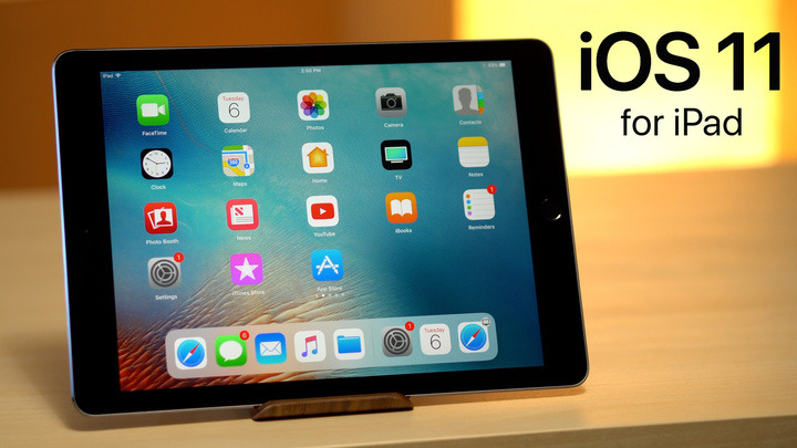
Apple will introduce a wide range of enhancements to its mobile platform when iOS 11 sees release this fall, including a host of iPad-specific features like multitasking, a customizable dock and redesigned app switcher. AppleInsider takes a closer look at how the beta runs on iPad in this video.
For more reviews, news, tips, features and more, subscribe to AppleInsider on YouTube.
 AppleInsider Staff




 Wesley Hilliard
 Malcolm Owen
 Amber Neely
 Christine McKee
 Andrew Orr
 Mike Wuerthele and Malcolm Owen




22 Comments
Nice video, thanks!
A while back I wrote this...
---
iPad has always been about how the tools we use for doing work change according to the work we need to do, and that in turn changes the work we do, to take advantage of the tools available.
In 1960, it took a roomful of people with mechanical calculators on their desks to do the work that later generations could easily perform with a spreadsheet. But when spreadsheets and other business applications came along, the work they made possible was wholly different from the problem they were initially designed to solve.
---
A good example is the document scanner and annotations capability. You aren't going to use a PC to scan a document and then annotate it. But this task is perfect for a tablet. So the work (annotating or signing, and then distributing a document) is done differently, and more conveniently, on this new tool, the tablet. It does what a Traditional PC would require a separate peripheral (a scanner) to accomplish.
Actually, the same can be said in a generic way about all interactions on a tablet; it does, with your finger, what was done in the past with a separate peripheral; the mouse. Looking back, it can be said the touchpad on PCs was an evolutionary step away from the mouse and toward direct human interaction with content. Something a tablet provides far better than even a touch screen PC, due to the angle of the screen relative to the user.
Apple pencil support is yet another way in which a tablet does work that has never been done by a PC. The traditional PC required a peripheral for pen input, in the form of a Wacom slate sitting off to the side. Newer PCs, like the Surface Pro, attempt to bridge a gap already negotiated by the iPad Pro, by supporting pen input on the touch sensitive screen. But who would use a pen to do art or architectural drawing on a Surface screen while it's angled in the traditional PC clamshell orientation? Nobody. And so those touch screen PCs are forced to accommodate the compromise they make by also being 2-in-1s, allowing use in a tablet orientation, with the keyboard either detached or hinged back behind the device. A rough and bulky tablet experience is what results, and why Apple doesn't go there. Better to create an optimized tablet (iPad) and support occasional use as a PC for mundane tasks like text entry via an attachable keyboard. This is not the iPad trying to be a 2-in-1 device; it's simply an accommodation of a legacy task better accomplished by the PC clamshell form factor.
That new control center looks absolutely horrible. Total garbage. I thought it looked bad but it is even worse when seen in use.
• extra effort to get to the control center
• nothing looks like a control, requiring touch and gestural exploration and wild guesses (which tends to scare off new users, who won't use it for fear of doing something wrong).
• nothing looks distinctively different from anything else (compounding the current disease of flat design in the icons). Why do we have to spend so much more time switching context with Apple's current design? Nothing has distinctiveness, that's why.
• no color??
• Too much customization choice leads to bad visual design and no layout consistency between devices and users. Customization is not the end-all be-all of giving users a good system. Now when users customize their CC, they'll memorize their own layout (the few people who will customize this) and hit a road block when they use someone else's customized CC. This is one of the things Apple used to be very explicit about NOT doing, yet here they are adding this edge-case customization crap, causing a complete redesign to an otherwise feature-complete usable prior design, instead of refining the [still hard on the eyes] existing design... and instead of fixing the MANY bugs still in iOS since this flat GUI BS started with iOS 7 in 2013!!
Why are we devolving computer GUIs to be no more than thin lines, black & white boxes with black & white clip art...??? It's either too low contrast or too much contrast. No middle ground. We could go back to CMYK CGA graphics at this point. Hell, monochrome displays, even, instead of the expensive full-color high-ppi displays being wasted on this difficult to look at (and to intuit) minimalist garbage.
The flat GUI design fad is like a bastard offspring between ASCII graphics and 90s-era Corel Draw/MS Word bundled clip art.
This new control center looks like they put the programmers in the design jobs at Apple (I think even the print team responsible for iOS 7's ugly redesign would do better than this new junker). Too lazy to learn graphic design and UX, or too cheap/poor to pay for actual expertise to create an interface with actual imagery, depth, distinctiveness, and more than two colors. That expertise used to be AT Apple. It used to be BRED at Apple. Where is it now???
I haven't seen anything about how iOS 11 will scale to your 64bit device. A7 iPads didn't get all the features of A8 and up with iOS 9 and 10. For example slide over on A7 but no split screen.