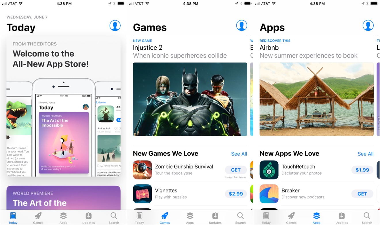
Other than speed enhancements and new multitasking features, some of the changes to iOS 11 are cosmetic — one of those surface changes is the appearance of the App Store to make it more look like Apple Music's design language.
Editor's note: This article was originally published in June following the beta release of iOS 11. It has been updated and republished for the public launch of iOS 11.
It's not quite a cut-and-paste job, but its very close. Apple has shaken up the default store tabs a bit, probably responding to actual customer navigations through the store over time.
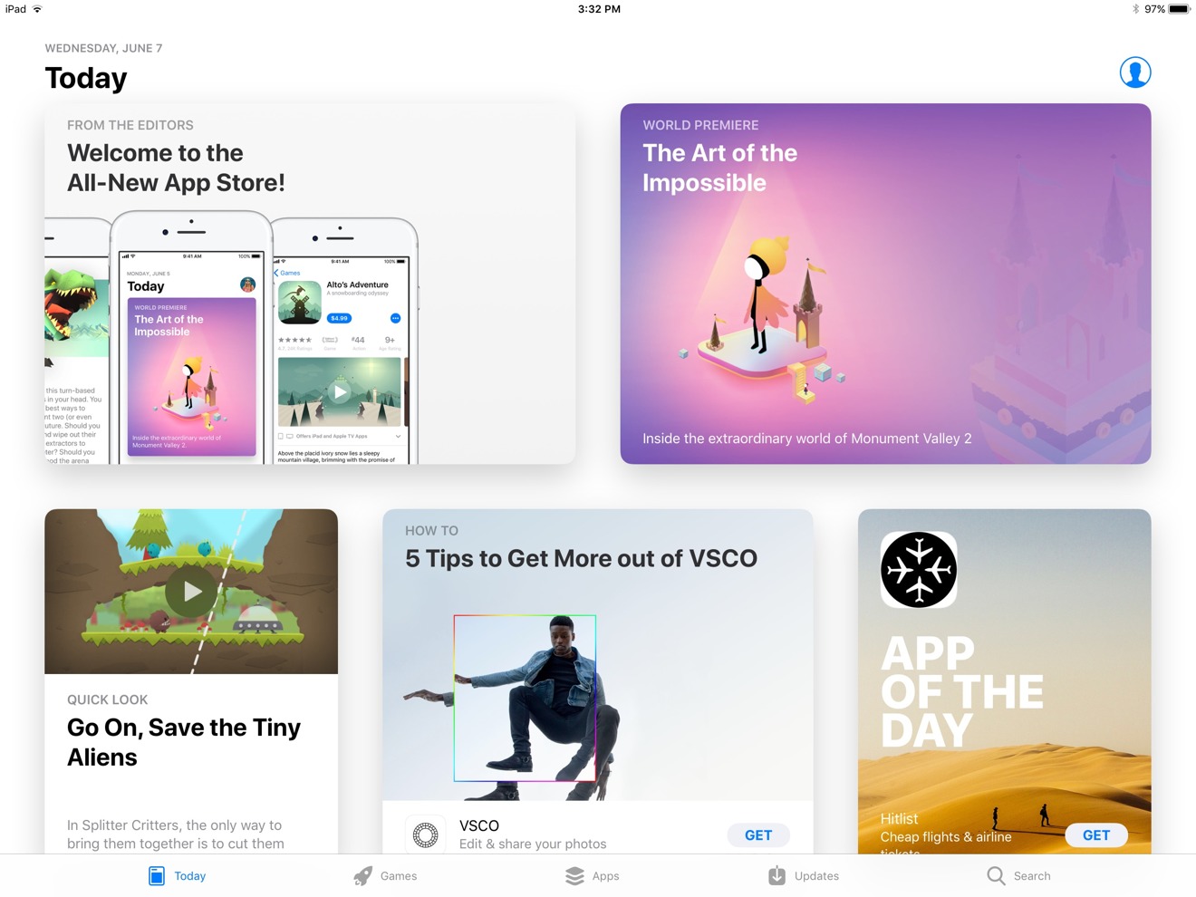
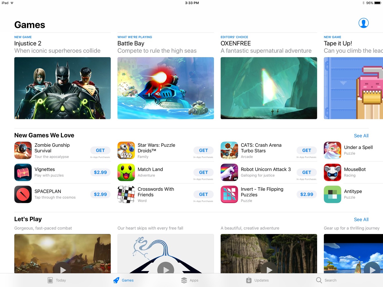
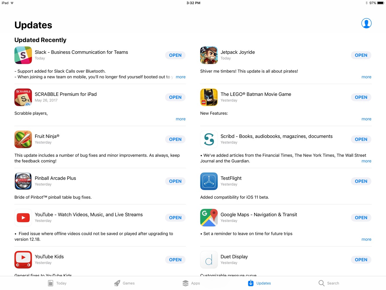
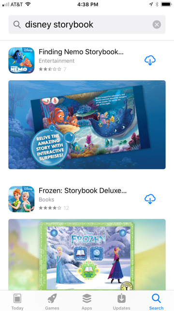
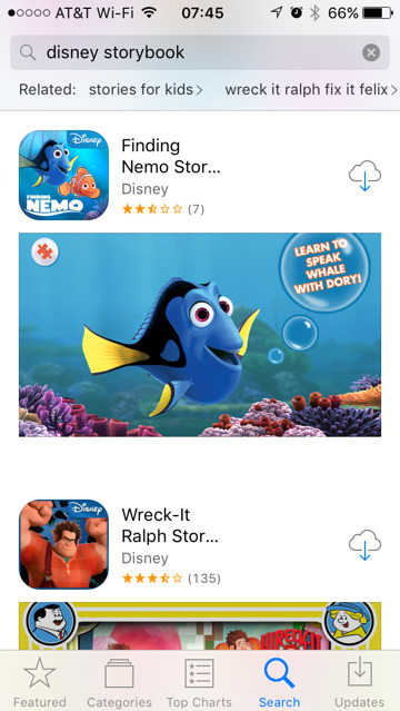
Previously, the tabs on the bottom of the store on the iPhone were Featured, Categories, Top Charts, Search, and Updates. The new tabs are Today, Games, Apps, Updates, and Search.
Functionality of Search and Updates are effectively unchanged. The new Today tab replaces and augments the Featured section, with Top Charts supplanted by Games.
Pleasantly, given the slight increase in graphical presentation, the interface is snappy, with no notable hangs in rendering or other oddities.
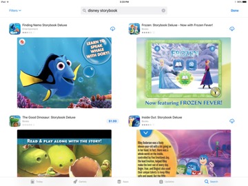
Search results are about the same, with returns varying between iOS 10 and iOS 11 sometimes because of the latter's ignoring of 32-bit apps. One search result, and a slight bit more is returned on the iPhone 7 Plus, where the iPad Pro in this case gets a few. The amount of returned data in a search doesn't vary from iOS 10 to iOS 11 when compared on the same hardware — but how it is graphically displayed changes a bit.
Neither iOS 10 nor iOS 11 hold an advantage on search times on the store. Both returned results at about the same speed.
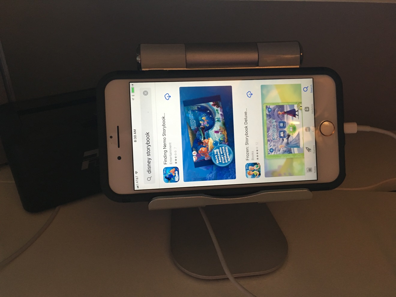
Notably, like Apple Music, there is no portrait mode on the iPhone.
Whether or not you appreciate the change depends greatly on if you like the Apple Music redesign. If you didn't, you won't find much to like here, at least at first.
But discoverability has been greatly enhanced with the App Store revamp. And separating games into their own separate tab makes it easier for users to discover non-gaming apps related to social networking, productivity, and more.
The debut of iOS 11 also has a new section dedicated to ARKit apps. To find it, choose the "Apps" tab and scroll down to "Top Categories," then select the "AR Apps" option. Apple also offers a curated "Get Started with AR" section of apps for the time being.
iOS 11 launched to the public on Tuesday and is now available for iPhone, iPad and iPod touch.
 Mike Wuerthele

-m.jpg)


 Marko Zivkovic

 Christine McKee
 Amber Neely
 Wesley Hilliard

 William Gallagher





6 Comments
I like it a lot.
Normally, browsing the App Store is terrible as you're basically deciding what App to look at deeper based on its name and icon. I've really enjoyed browsing this new store with its auto-play app video previews..you can quickly get a sense of one app after another.
It would be nice if there was a simple way (press and hold for instance) to view truncated app names, song titles, etc. in search results. Maybe there is already and I'm just not aware of it.
(and yes, I already submitted this comment to Apple Feedback.)
Much Better
It’s still difficult to get to apps that aren’t on the list. So “show all” just shows a couple of dozen apps in the category, rather than the thousands, or even hundreds of thousands that actually exist. Sometimes I like to browse by just moving down these lists until I see something interesting. That’s still very difficult to do, or to organize to do it the way I want it to.
I love it. It's a LOT better. It's cleaner. It's easier to read. It's more intuitive.