It was 2008. I had just recently returned to the U.S. after a three-year stint in Japan, the place where all tech lover dreams come true, and iPhone was all the rage. But I wasn't convinced.
Having experienced first hand the wonders of Japanese cell phones, or keitai, I was a bit underwhelmed at Apple's promise to deliver email, the web and — gasp — a decent camera in a chunky candybar form factor. These were all features I had lived with and used for years, in the country that invented cellphone culture.
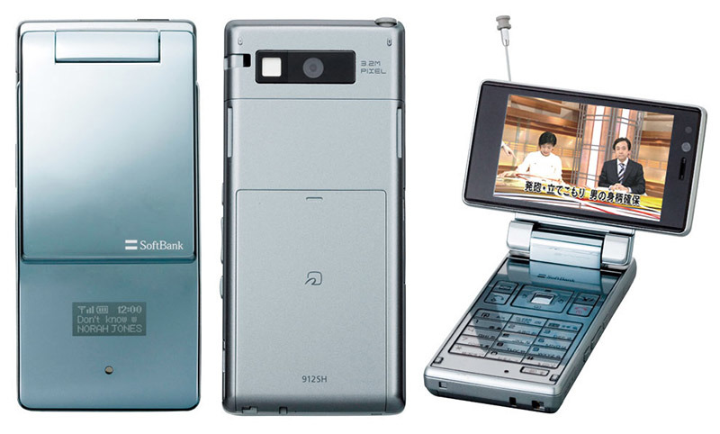
In Japan I went through a series of flip-style phones, most of which were built by Sharp and ran on SoftBank's then-new network. SoftBank actually purchased Vodafone Japan's business, itself a conglomeration of Japan Telecom and J-Phone assets, in 2006 and rebranded the enterprise as SoftBank Mobile. Side note 1: SoftBank in 2008 scored exclusive rights to sell the iPhone in Japan.
Keitai, while powerful for their time compared to U.S. domestic cells, were in retrospect still feature phones. The versions I owned all came with dedicated buttons for email, video and web access. So-called "full face" models, candybar style sliders, were also available, but each was clunky compared to the sleek all-screen interfaces ushered in by iPhone.
At the time, flip phones — what we now call feature phones — were the format of choice. Candybars were available, but the pocketable button-packed flip phones were by far more popular. In fact, it was the surfeit of buttons that made them more intuitive for texting — voice calls were a rare occurrence in Japan.
Remember typing on a numeric keypad? Try squeezing in a phonetic lettering system with three components, hiragana with 46 base characters, katakana with 48 base characters and kanji with thousands.
Sharp and other companies did what they could to further the flip phone format — one the last JDM models I owned boasted a rotatable screen with 1seg digital TV input — but all lacked one key element modern smartphone users take for granted: a friendly graphical user interface and (for iOS at least) a solid operating system.
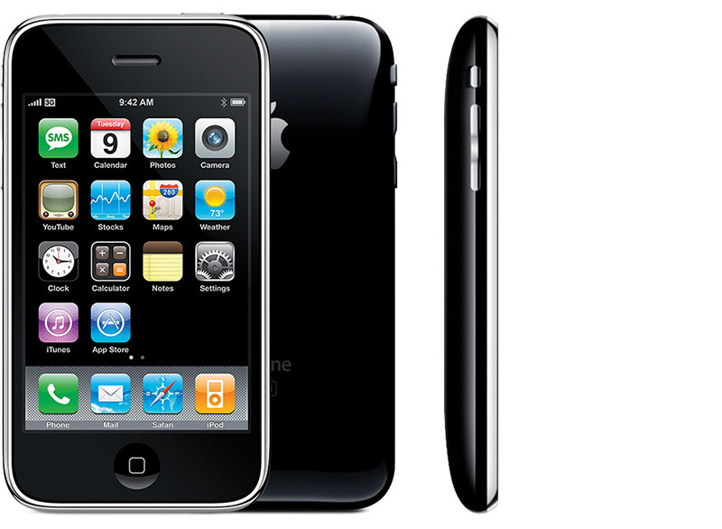
In 2008, I found myself at an Apple Store in Hawaii, waiting to pick up the next big thing in personal communications. Having owned a first-generation iPod touch, I was pretty confident that I knew what to expect from iPhone 3G, which at that point had been hyped to unfathomable heights. Side note 2: iPhone was not available in Japan until 2008, so this would be my first experience with the Jesus Phone.
People around me were excited, grins on faces, new toys in hands. The Apple Store employee was perhaps most elated to welcome me to the promised land.
"Are you excited to get your iPhone," she half-tittered with glee. It was a rehearsed line Apple Store employees were repeating to unnamed thousands across the country, probably at the same time I was hearing it, but my salesperson seemed genuinely thrilled.
Handing me a sealed box and stepping aside so I could experience the holy unboxing process, she waited expectedly. I felt her hovering, her exhilaration palpable.
But Japan had jaded me. Nothing could top keitai technology that left U.S. phones so woefully behind in terms of hardware, backend services and value.
The box slid open and there it was, chrome bezels gleaming.
"Pshaw!" I thought. "It has a single button, am I to believe Apple will handle all my text input needs with a lowly soft keyboard? What of the GUI? Direct interactions are sluggish and clunky!"
I was wrong. I knew that from the setup menu. Multitouch on iPod touch was a nicely implemented novelty, but on iPhone it was a necessity and the work Apple put into it showed. Compared to the "smartphone" operating systems of the day, it was a revelation.
There is a certain magic that comes from directly interacting with your device — not through a resistive touchscreen and layers of software computation, but through a capacitive touchscreen and well-crafted GUI. Apple proved a UI can surprise by doing exactly what you expect.
iPhone was the first device to get so many things right, even though it got a lot wrong. It helped push backend technology services and just about everyone in the coding business.
Apple promised a truly mobile web, for example. Earlier feature phones with their small screens and button-based UIs forced websites to dumb down their content, whereas iPhone pushed the web to be more immersive.
Email, which on other platforms looked like a mashup of equally terrible web clients and text messaging portals, was consistent with an experience one would expect from Mac. A straightforward, legible interface, proper editing tools and powerful management software makes all the difference.
Most impressive, at least to me, was the iChat-esque messaging feature. It combined everything iPhone embodied: a slick UI, solid soft keyboard and speed. Spectacular.
That said, iPhone 3G's camera was far behind Japanese hardware. Of course that quickly changed with subsequent iPhone iterations.
But that's the point. iPhone will never be perfect. Consumer wants are a constantly vacillating force, one that changes daily, not on yearly refresh cycles. Apple does its best to stay ahead of the curve, but there will always be something missing, something users need that iPhone can't deliver.
There are also competitors. Some Android handsets boast features that make iPhone owners jealous, whether it be a rich OLED display (soon to be rectified with "iPhone 8") or better optics, but iPhone has consistently offered users the best all around package of high-end hardware and software. Software is a particularly critical component of any good smartphone platform. It keeps hardware relevant, features up to date and consumers safe. Apple does it better than anyone else.
Do I miss keitai? Sometime. We humans have an odd penchant for reminiscing about painful experiences. Coping, some would say. So really, no, I don't miss the keitai of old, and considering iPhone marketshare estimates, Japan doesn't either.
 Mikey Campbell



-m.jpg)


 William Gallagher
 Andrew Orr
 Mike Wuerthele
 Bon Adamson
 Marko Zivkovic
 Wesley Hilliard
 Amber Neely

-m.jpg)


4 Comments
I remember the day when I first hold my first iPhone. It was magical.
I recently travelled in Japan, and can confidently say the locals have thoroughly embraced the iPhone.
Other terrible titles for this article:
"Apple proved a UI can surprise by doing exactly what you expect."
For me, this really captures what impressed me most about the iPhone when I first saw the demo and later when I started using one. It was a feeling of freedom, because I didn't have to jump through a million hoops to get what I wanted, as I did for years with my BlackBerry.