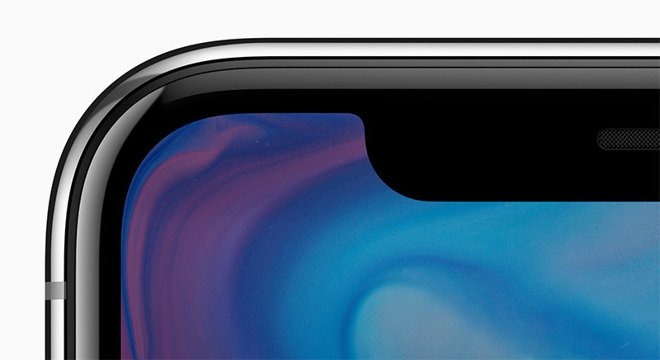
It wasn't quite a landslide vote, but AppleInsider readers came down in favor of Apple's decision to highlight and not hide the so-called "notch" housing the camera, sensors and earpiece atop the iPhone X edge-to-edge display.
With 1,853 votes tallied on Twitter, AppleInsider's highly unscientific survey of 1,853 readers found that 57 percent of respondents think Apple is right to embrace the iPhone X notch.
Conversely, the remaining 43 percent of those polled would prefer that Apple hide the area atop the display. In fan-made mockups, this has been done with a black background matching the notch and the borders around the screen, obfuscating where the screen ends and the notch begins.
But Apple has chosen to highlight the notch in iOS 11, having user interface elements bleed up into the spaces to the left and right of the intrusion.
#iPhoneX notch poll.
— AppleInsider (@appleinsider) September 14, 2017
In fact, during Apple's iPhone X keynote, the company even showed full-screen videos played with maximum size, leaving part of the picture cut out by the notch. However, attendees who got a hands-on with the iPhone X afterwards — Â including AppleInsider's own Daniel Eran Dilger — were told that by default full-screen video will shrink down to avoid the notch.
It's clear Apple has gone out of its way to embrace, rather than hide, the protrusion into the display.
Though Apple's decision has been made, the discussion rages on. How would you prefer Apple handle the notch on the iPhone X?
