The launch of iOS 11 brings about a convergence of the iPhone's Notification Center and Lock Screen for a new feature called Cover Sheet. Presenting a user's notifications and other events, the feature also offers a glimpse at how the new home-button-free iPhone X will work when it debuts in November.
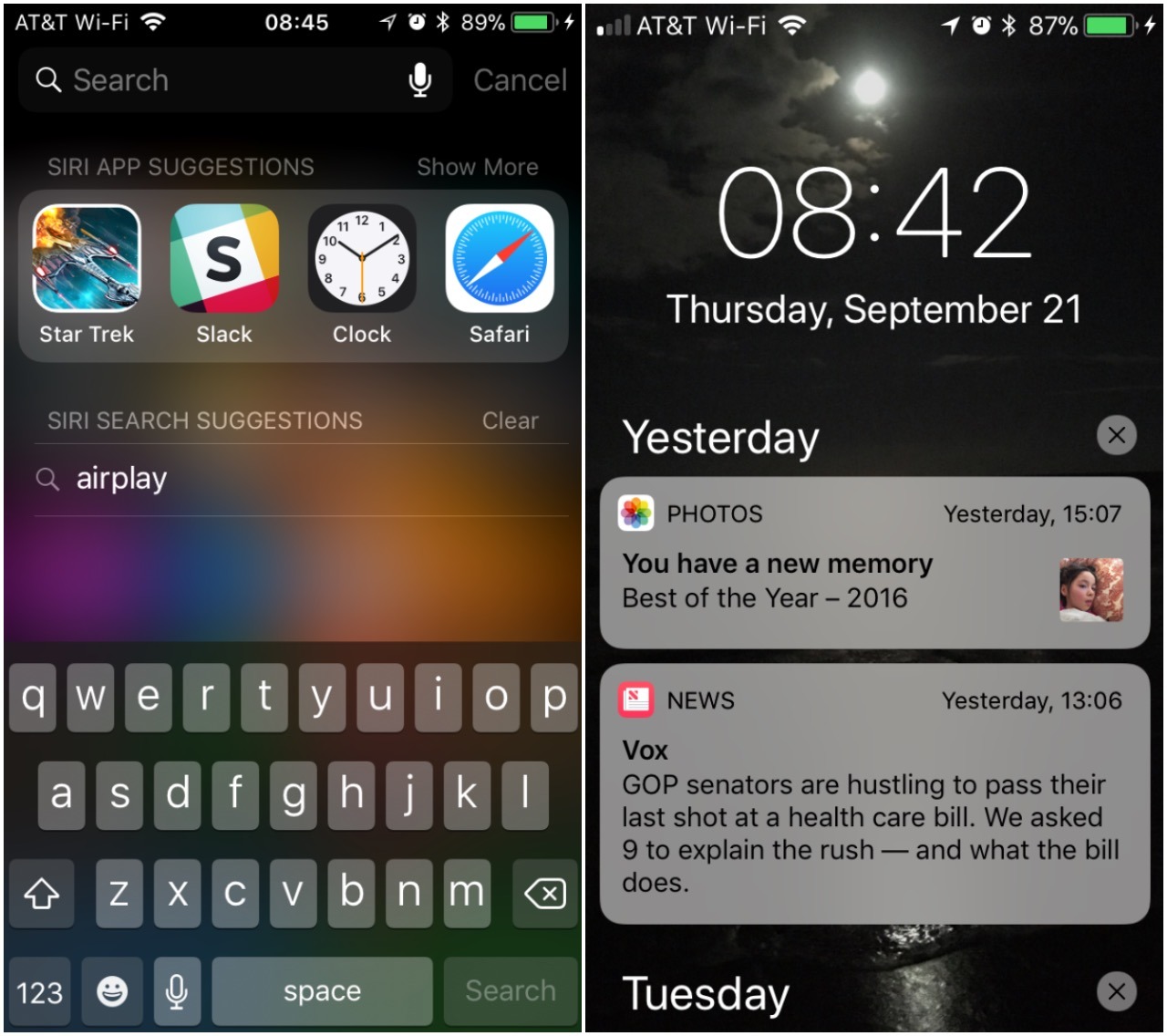
There are two types of downward swipes in iOS. A swipe from the middle of the screen brings up the integrated search menu, and Siri App suggestions window. Swiping down from the top of the screen induces the redesigned Cover Sheet.
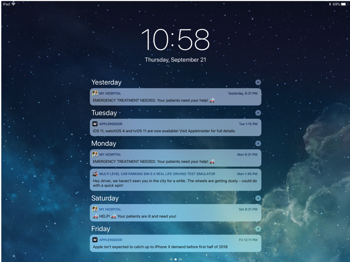
The new Cover Sheet looks exactly like the Lock Screen complete with your wallpaper, with all of your recent notifications from all sources. As with the Lock Screen, notifications are grouped by date.
Tapping a notification generally opens it up in the relevant app — in this case, a notification from AppleInsider about the iOS 11 release. Other notifications expand the preview in a relevant app, or may give the option to reply to a message-sender.
And, like with the iPhone X, to dismiss the notifications and return to the home page, you swipe the Cover Sheet up.
Notifications can be a useful, condensed source of information at a glance. But, too many Notifications can confuse the matter, and prevent you from seeing what you want, when you want.
Dealing with the flood
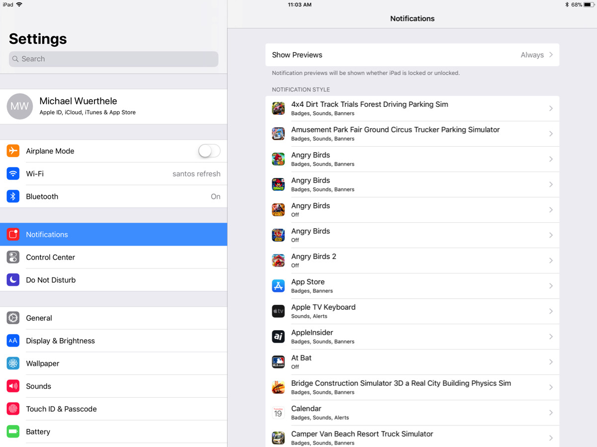
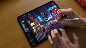
Apps generally ask permission to send the user notifications. If a device is used by multiple people, such as the family iPad Pro that we're using as an example, the variety of notifications can get oppressive, limiting the use of not only the Cover Sheet, but notifications as a whole.
To cut these back, tap on the Notifications settings item. Inside are all of the installed apps on a device, and options.
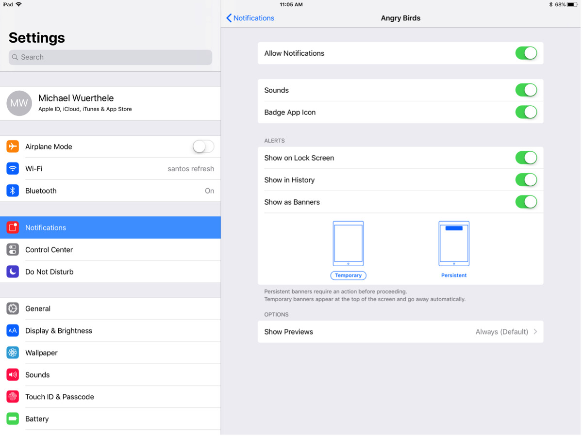
The follow-on screen gives all manners of configuration options for each type of notification, all the way from not allowing them, down to where they are shown and how they are displayed.
 Mike Wuerthele






-m.jpg)



 Brian Patterson
 Charles Martin


 Malcolm Owen
 William Gallagher
 Christine McKee

 Marko Zivkovic



10 Comments
Lets make notifications and the lock screen look identical, cuz thats not a security issue. BRILLIANTLY stupid.
A key element of speed and convenience possibly missed in the article is that on pre-X iPhones, if one pushes a lock-screen notification to open it in the respective app, it's necessary to make a Touch ID gesture to unlock the phone. With the iPhone X, I presume Face ID obviates the need for an extra gesture and the X will go straight to the app.
What does "show history" mean in the notifications page for an app? Different from "show on lock screen," but does anyone know how?
Not a fan of this implementation. User-unfriendly. Very confusing. As confusing as when Bruce Jenner transitioned to Caitlyn. Wished they would just keep it simple and use a solid white or black color background.