TuneInstructor is ostensibly designed to organize iTunes and play your music — but a lack of coherent English tutorials and bizarre user interface choices make it bewildering.
Apple has bloated iTunes up into enough of a confusing mass of options that you're sure you could do better. The developer of TuneInstructor 3.7 certainly does and has worked to fix the issues. Yet, the result is an app that probably only works for that very same developer.
It's not a tool for the rest of us, and not even for the rest of us who are both technical and very patient.
Developer Tibor Andre has done more than we ever have to make iTunes work the way we want it so all credit to him. TuneInstructor sets out to do a lot.
It just feels like it isn't finished. Or tested, really.
We have not one single doubt that he uses his own software all the time and that it makes iTunes easier — for him. Just only for him.
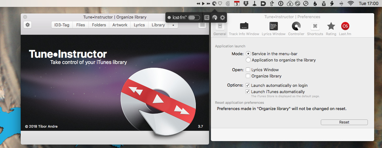
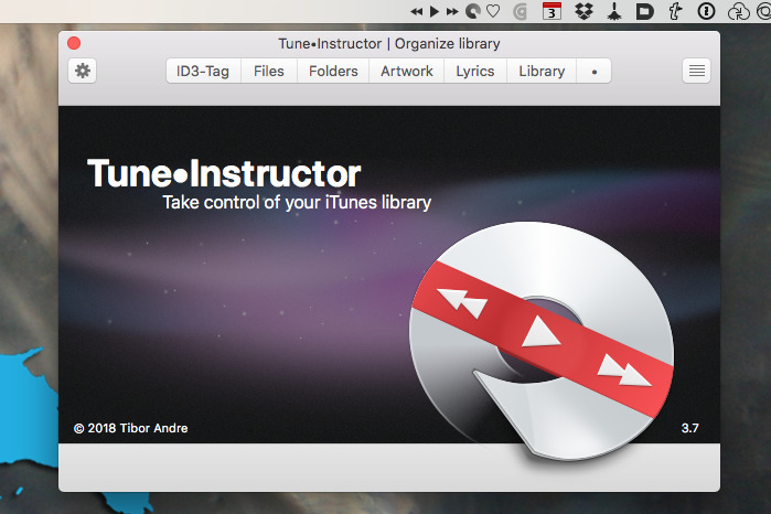
TuneInstructor is a menubar app for macOS that's replete with functions: the official site includes 25 video tutorials, if only you could watch them.
They use a QuickTime video plugin that Apple started removing back in 2013's OS X Mavericks. No current Mac can play these without you taking steps to re-enable what's called a legacy QuickTime 7 web plug-in. (Apple Support does tell you how.)
Then if you do that, the tutorials turn out to all be in German. Now, Andre is based in Germany and we don't expect anyone to learn a language just to help us out, but the text on his official site is in both English and German. It's only the videos that aren't.
Still, iTunes is iTunes and these are videos so you can watch even if you don't speak the language - except the version of iTunes shown in them is both German and ancient. We can no more carbon date it than we can understand the German for Quit, but it's still got traces of the old brushed metal design from some years ago.
Design is an issue here. Where Apple's iTunes packs in a lot, TuneInstructor packs in a great deal yet in overlapping and ugly ways. It's sometimes hard to see what you're clicking.
Fitting this idea of it all making sense to the developer, the software also assumes that you're a user of the music streaming site LastFM. There is a tick box in the settings to say whether you are or not and it does default to off. Yet the app's main offering is a deliberately very small control strip where, on or off, LastFM occupies over half the space.
Next to it are two controls: a button to bring up a full window with many settings options and another button to bring up some other settings. Then there's a button for bringing up a window with lyrics for the currently-playing song, if available.
They're never available, and never will be, unless you happen to know a source for lyrics and plug it into the right settings.
You might well know one and you might add that information to settings — but even if you're the most informed and techie iTunes user around, don't ever expand the lyrics window.
Maybe it's different when you get actual lyrics in there, but when blank, the expand button solely expands: it doesn't shrink the window back again. Unless you fully quit TuneInstructor, that lyric window will stay full screen for the rest of time.
That's the kind of thing that makes us think this hasn't been tested. It's not uncommon to find software works only for its developer and there's no reason why it shouldn't: they've made it, of course it's going to suit them.
Yet the overall aims of TuneInstructor are to give you more control over iTunes and to make it so you need not open Apple's player again.
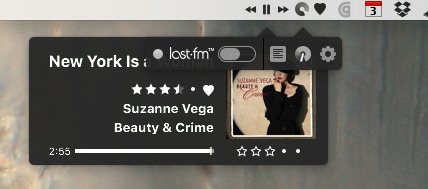
The album-cover-shaped item on the left is Apple's own iTunes mini-player. Hover over it and you get controls. On the right is TuneInstructor.
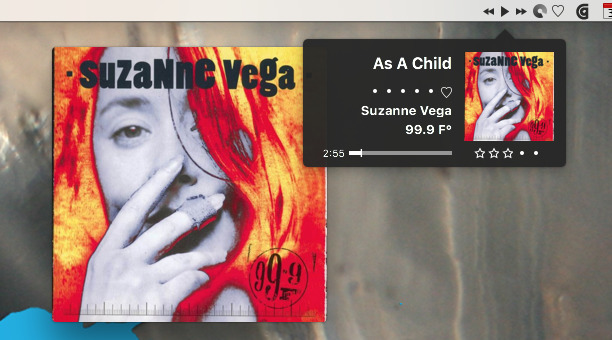
The menu bar contains forward, back and play/pause controls and it shows you album artwork as each track begins. You can't get that artwork back or find out what the track is unless you click pause or a heart icon to rate it. When you do get it, that artwork is neat and small plus it has those controls for rating the track.
Actually, two controls. Taking up space in this intentionally small player window is one set of star icons under the track title and another under the artwork. Both are for grading, both do the same thing.
Still, that aside, the smaller artwork and the font design is neater than Apple's own iTunes mini-player.
Except the controls you get when you hover over Apple's one include something essential that's missing from TuneInstructor: a search box. You can't search for a track to play next within TuneInstructor, you can only skip forward or backwards.
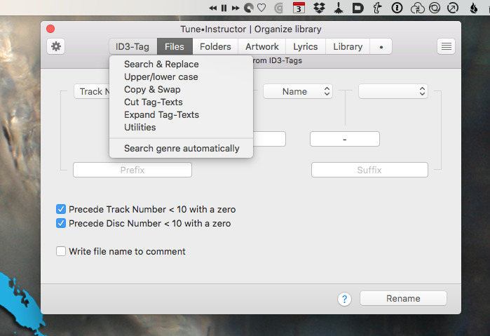
Or rather, that's the case with playing back music. If you stop to create playlists then you could do searching to build those. The app is full of options to do with searching and replacing on ID3 tags, for instance.
Only, if you know what an ID3 tag is and you're techie enough to understand all of TuneInstructor's options, then Apple's iTunes is already a breeze to you. If you struggle with iTunes, as many do, you haven't got a prayer with comprehending TuneInstructor.
It made us appreciate iTunes more and it got us playing music while we worked. There just wasn't any other pleasure in using this or, indeed, in trashing it.
Again, we should be clever enough to build our own music app. It's only that we are smart enough to know we're not going to use TuneInstructor.
TuneInstructor is a macOS app available directly from the developer. It's free but donations are encouraged.