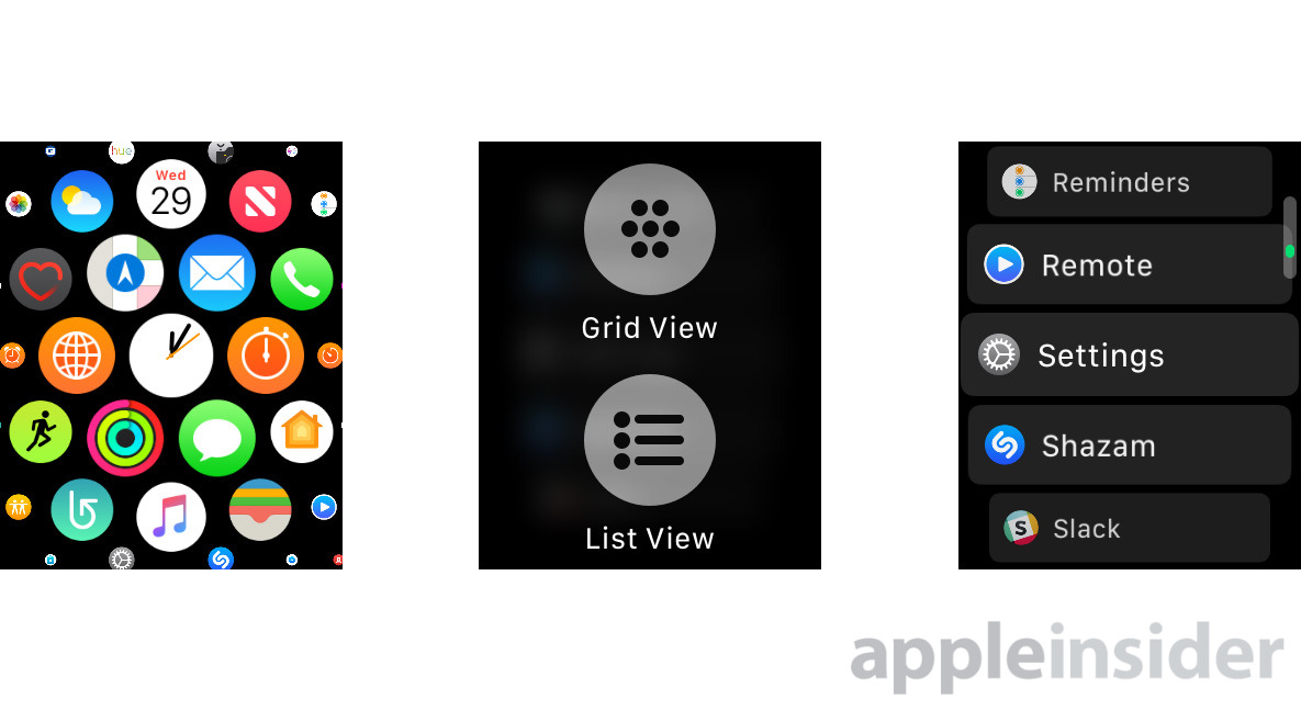
By default an Apple Watch uses a "honeycomb" view to browse installed apps, identified only by their icons. watchOS 4 includes an optional, more straightforward List View — here's how to turn it on.
Contrary to what you might expect, there's no way to do this from the Watch app on your iPhone. Instead, on the Watch itself, begin by pressing the button on the Digital Crown, which will bring up the app switcher.
Press down firmly on the display to invoke a Force Touch menu with "Grid View" and "List View" options. Tap on the latter, and the mode will change instantly.
List View arranges apps into alphabetical order, with text labels marking each one. This can make it easier to find apps if Grid View seems too cluttered. Since you can't reorder List View like the Grid, however, there's no way of clustering together frequently-used apps.
Reverting is simple — press down on the screen when looking at List View, then select the old setting when the Force Touch menu appears.
 Roger Fingas






 Bon Adamson

 Marko Zivkovic
 Wesley Hilliard
 Amber Neely

 Malcolm Owen

 William Gallagher




-m.jpg)


6 Comments
That’s much much better. Apple do so many things with the UI that you have to work out some how!
Thanks for this!!!
I hope there's a way to switch between the carousel app selector vs. the side-by-side app selector on the Watch.
Thank you! Now I no longer have to play "guess the icon"or "find the icon".
Fat fingers rejoice!