Sometimes, a new and fresh look at what a class of app can do is what you need to like an app, but it can also be a turn-off if it lacks something you need.
Agenda 2.0 for Mac genuinely brings something new to the field: it's a a notes app that concentrates on when you write things as well as what you write. If that fits the way you work, you'll never use anything else.
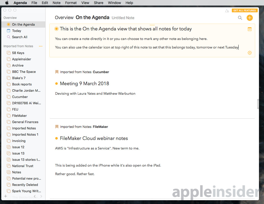
What happens in Agenda is that you create a note and it is automatically labelled with Today or a date. You can change that date, though: you can tell Agenda to regard a particular note as being Tomorrow instead.
That doesn't sound dramatically useful except it does rather fit with two things that we all tend to do. The first is that if we're trying to find something we've written we may well remember that we were working on it last Tuesday. Tell Agenda to show you last Tuesday's notes and there you are.
The second is that unless you're startlingly well organized, you have a handful of notes that you're currently using and the rest are forgotten. You might keep some because you know you'll need them again, you might keep some that are collections of details you need repeatedly. The rest, though, are just junk clogging up your notes app.
With Agenda, you can leave all the old ones in folders or categories and tell the app that these two, ten, twenty or however many you like are the current ones.
More, you can make a note for a meeting that's on next Tuesday and Agenda will make sure it shows it to you on that day. Alongside projects full notes, there's a section called On the Agenda which is all you need to concentrate on today.
It's particularly easy to change a note to mark it for a particular day and it's also simple to add them to or remove them from the On the Agenda feature. Each individual note is well-designed too: it looks better than the basic feel of Evernote, for instance, and more on a par with Apple Notes. It's good to look at and it's a pleasure to use.
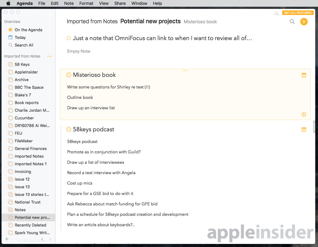
Except, individual notes aren't really shown as individual notes and this takes some getting used to. Instead of displaying a list of notes that you can then choose to open, Agenda has you open a project and then it shows you all of the notes in there. It shows you them as one long scrolling page.
The currently selected note gets a faint yellow background and some controls where you can change the date. This model is only really useful when you have just a few notes. If you have a project that's got dozens or hundreds then having to scroll through them all is cumbersome.
You can choose to collapse the notes to just titles but still they're over-sized headings and it's unwieldy when you have a lot to go through. If it had a more regular view with a list in one column and a pane showing the contents next to it, you could quickly go through everything.
Instead, if you choose this collapsed list for speed, Agenda then requires you to expand any entry you want to check. Again, when you've many of them, it takes too long.
Mind you, you'll write these dozens and hundreds quickly because Agenda feels good to use and that's hardly a bad thing. You can also fill up your Agenda by importing from Apple Notes but that's not great. It ignores any hierarchy of notes and folders you have in Apple Notes, for one thing.
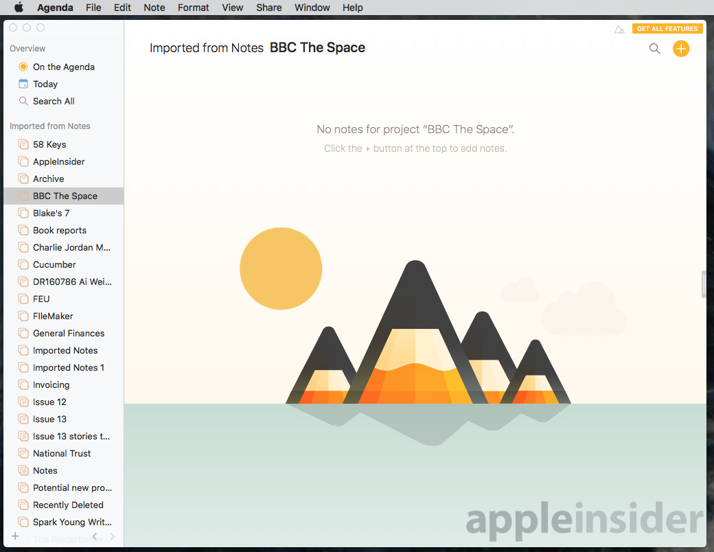
That means if you had a folder in Apple Notes devoted to one of your clients and then a subfolder for one particular job with them, Agenda make both into separate projects. You don't get the most tremendous feeling when you open an important project in Agenda and find that it's apparently empty.
We had one Apple Note that was a long handwritten one and Agenda ignored the contents so we we had a note with the correct title and nothing in it. The same happened with an Apple Notes entry that had a table of text in it. We'd expect Agenda to import the former as an image or at least to warn us for the latter that there were notes that weren't imported correctly, but it did neither.
You'll be happy with how Agenda feels when you're actually writing notes, though. There are even some basic collaboration features, though your colleagues will have to also be using Agenda. For now they also have to be on the Mac, though, as there isn't yet an iOS version.
That puts Agenda behind Apple Notes, Evernote, OneNote and others but an iPhone and iPad edition is coming. Ultimately, your choice to get this is going to come down to whether the calendar side of it is brilliant or worthless to you.
Fortunately, you can try the app for free to find out. Actually, you can keep on trying it for free: while there is a premium version that adds features like removing a watermark, the major functionality of the app is free forever.
If you do want to remove that watermark from printed or PDF documents, you can buy an in-app purchase. Currently this gets you the Premium version and that includes a lot of extra features. There are ones to do with exporting notes to Markdown, others to do with creating calendar events directly in Agenda and so on.
Agenda 2.0 for Mac is available for free on the Mac App Store and then there's an optional $24.99 in-app purchase.
That purchase gets you all of the premium features that available today plus any created during the next year. After that, you'd have to pay again to get any further premium features but you still keep the ones you've got.
 William Gallagher




-m.jpg)





 Wesley Hilliard
 Malcolm Owen
 Amber Neely
 Christine McKee
 Andrew Orr
 Mike Wuerthele and Malcolm Owen



5 Comments
The Mac is a stationary computer. Everyone is mobile now... Except Microsoft.