The Tile looks nice enough on a wall, but has enough flaws that for the price we'd recommend other products — from LIFX or otherwise — if you want lights as decorations.
As we hinted at in our LIFX Beam review, smartbulbs are often some of the most practical smarthome accessories, yet usually meant to be a sideshow rather than the main attraction. Yes, people will notice when a room turns purple or red, but they're not meant to focus on the bulbs themselves.
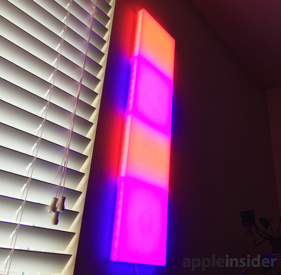
Like the Beam, the Tile is meant to sit out in the open and draw attention. The package actually includes five tiles, plus power and connection cables, and adapters for international outlets. Each tile has 64 lighting zones that can cycle between 16 million colors and dim on command.
You can rearrange the kit into whatever pattern you like, in this case just making sure a green-stickered tile is the one that connects to power and gets paired with Apple's HomeKit. The Tile is in some ways more flexible than the Beam, since beyond having more zones per unit, tiles don't have to touch directly. Instead they're connected via cables that stretch up to a few inches away from their neighbors.
Our first problem: we found it very, very difficult to make the tiles touch while still sitting flush against the wall. You have to curl up cables while passing them through narrow slits, and by their nature the cables are liable to pop out in one place or another.
Trying to do this while mounting tiles vertically (using included 3M adhesive strips) was extremely frustrating, and as it turns out, risky. We accidentally destroyed the tip of one of the connector cables even though we didn't think we'd applied that much pressure.
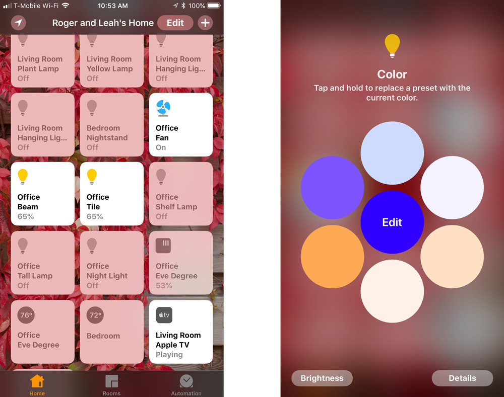
We did eventually get a pattern we liked up and working. The LIFX app, thankfully, makes it relatively easy to add the Tile to both HomeKit and the LIFX cloud. From there it was standard procedure to add the accessory to HomeKit scenes and automations, and we could control it like any other light via the iOS Home app or Siri.
You can also control it by way of Amazon Alexa, Google Assistant, and Microsoft Cortana. Of those we were only able to test it with Alexa, which proved oddly inconsistent. It would for example sometimes respond "I'm sorry, I don't know that one" when we tried to set the Tile to various basic colors. Other times it worked perfectly, but of course, there's no reason why it shouldn't respond correctly every time.
Both HomeKit and Alexa have a separate, fundamental problem, which is that they can't exploit the Tile's full functionality. Those platforms only let users assign a single color across all tiles, which certainly looks good but suggests that both Apple and Amazon have been relatively short-sighted.
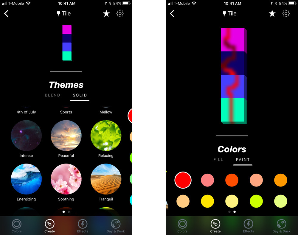
Conversely the LIFX app lets users pick from one of a collection of preset color themes, with blended or solid transitions, or else "paint" by drawing patterns or filling in whole tiles. We found that solid or filled schemes typically looked the best, since it was difficult to come up with a hand-drawn pattern that worked with surrounding colors and the edges of each tile.
Indeed even if you do come up with a nice pattern, that can easily be lost or broken. There's no way of adding presets, so switching to another theme will instantly erase any custom work. There also seems to be a problem with detecting tile alignment, since in a few instances we would draw on a tile and our line would start from the wrong edge.
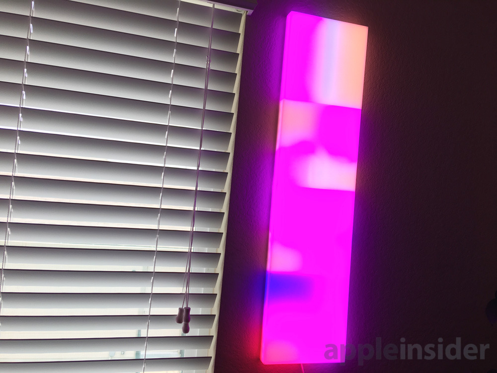
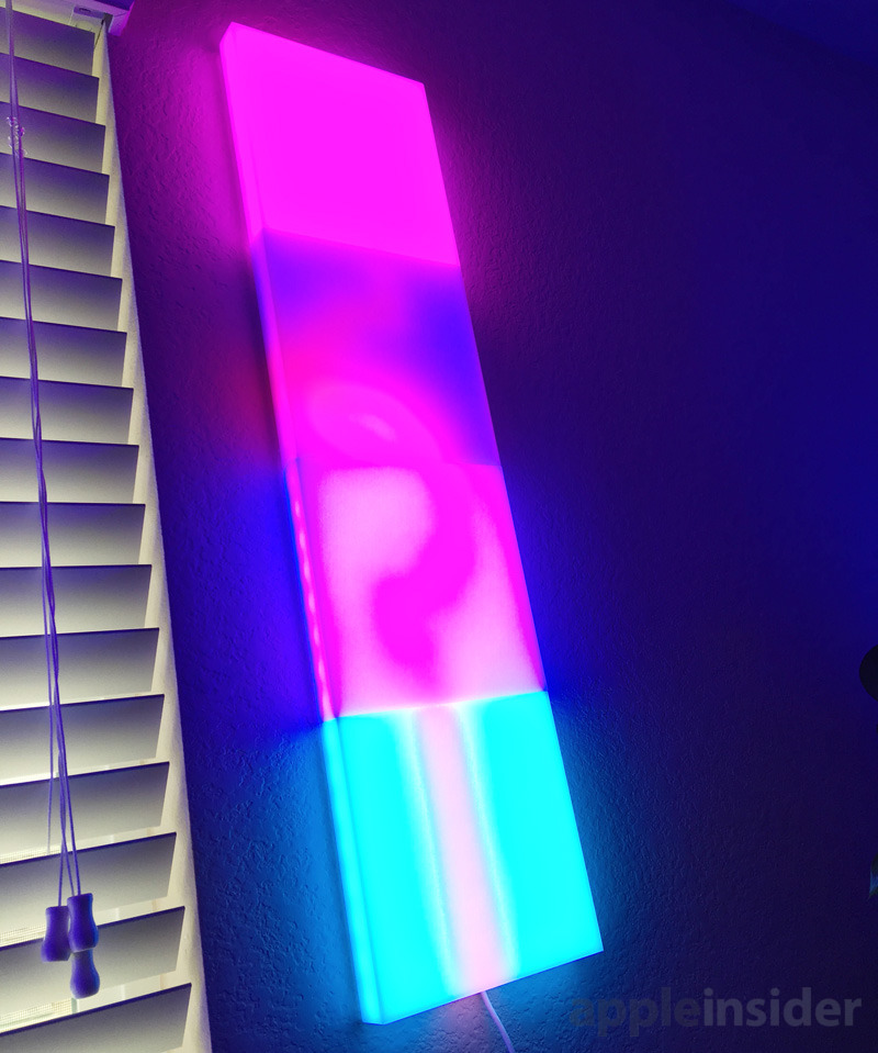
When everything aligns properly — literally and figuratively — the Tile looks great. It won't be the primary source of illumination in a room, but it's still quite bright and stylish, assuming you're into its futuristic aesthetic. Which isn't to say it can't fit in with "traditional" rooms, but it definitely contrasts with rustic furniture and accents.
Also present in the LIFX app are a series of effects, but as with the Beam only a few are worth using, namely "Color Cycle," "Animate Theme," and "Pastels." Others like "Spooky" and "Candle Flicker" might make sense with regular LIFX bulbs, but here they're just gaudy. "Day and Dusk" is potentially useful but mostly dull, since it just matches color temperature to the time of day.
Conclusions
We really wanted to love the Tile, since we've had a positive experience with the Beam and other LIFX lights. As things are though, we feel it's too rough an experience to be worth the pricetag. Even if installation proves to be a cinch, its working behavior can be erratic.
In mid-2018 there are several alternatives, too. Nanoleaf's triangular Light Panels may not be everyone's cup of tea, but they're cheaper and visually distinctive. The same can be said for the LIFX Beam, and there are always lightstrips like the Philips LightStrip Plus.
Heck, you could simply buy a standard LIFX bulb or two, install them in custom lamps, and still save money.
Score: 2.5 out of 5
Where to buy
The LIFX Tile Kit retails for $249.99 and is available with free shipping or in-store pickup at Best Buy.
 Roger Fingas





 Charles Martin
 Malcolm Owen

 William Gallagher


 Christine McKee
 Wesley Hilliard

 Andrew Orr



There are no Comments Here, Yet
Be "First!" to Reply on Our Forums ->