Sparkle wants to make it easy for anyone to build a website yet also be comprehensive enough for professionals. AppleInsider builds a site.
There are enough websites in the world now, you know. If you must make a new one, though, then Sparkle 2.6.3 wants you to use it. The app is meant for speed and ease of use so that any of us can create any website in a very short time. We've been here before, however, and too often ease-of-use means not-very-powerful.
That is true of Sparkle to an extent. You won't use this tool if you're already a die-hard fan of Adobe Dreamweaver. Yet the differences between this and more pro tools are often slight and the speed of trying out ideas in it is compelling.
You might not use Sparkle if you're a total novice, either. It's got a similar feel to Apple's iWeb in how it's chiefly a drag and drop kind of app. However, the app itself doesn't have any templates as iWeb did or as online services like WordPress or SquareSpace do.
You can get templates online, though. Also, what the Sparkle app does give you is a core simplicity but with at least a little extra power when you need it.
From scratch
No one in the world would ever design a website by turning to their computer first. Okay, we just did. Here's a two-page website we created from scratch with only the most cursory look at Sparkle's documentation.
That took 12 minutes and some portion of that was trying to remember how PayPal does its Buy Now buttons.
It's not that we set out to race, though, and knowing the time it took is more chance than stopwatch. Instead, this is how quick it is to step into the app and start doing useful work.
True, when you open Sparkle for the very first time and see just a blank canvas, it's a little daunting yet only for a moment. Then you see the row of six buttons such as Text and Image and that's it, you get it.
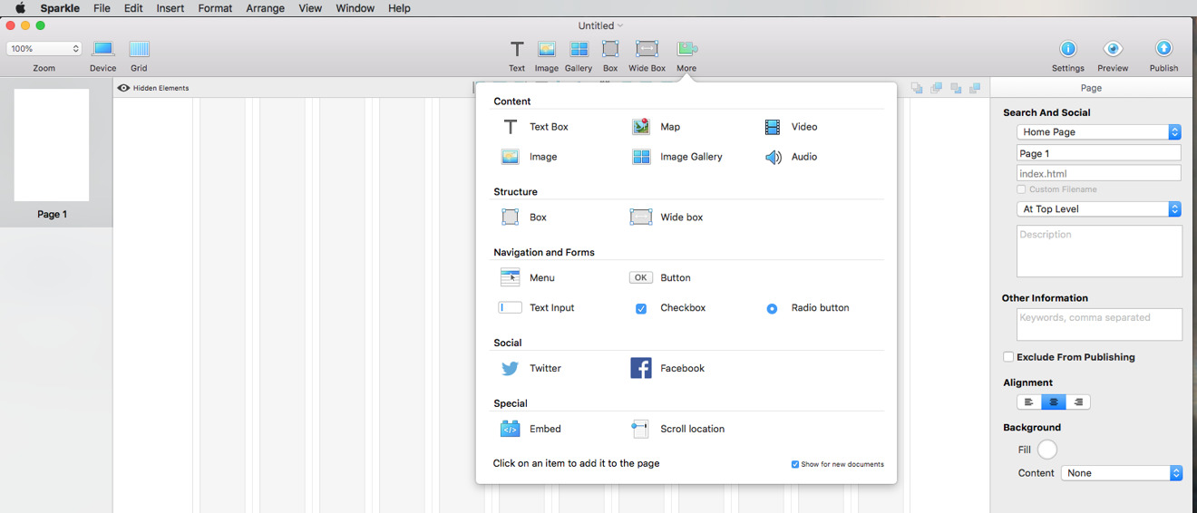
You get that you can click on any of these and start adding the content you want to your site. There's also a More button which is peculiarly enticing because when you click that, you get this:
That's like a tray of the most common things you could want to add to a website. You choose them just by clicking.
So you click on one of these options and now you've got a text box on the screen. Or a placeholder for an image that you then drag in. Or a box to divide the page up.
Once they're on the screen, you can then drag them around anywhere. You can resize them or delete them. Click into one like a text box and you can start typing or pasting in writing you've already prepared.
You don't get a great deal of control over the font faces: by default you're shown only ones that are considered safe for the web because all computers have them. It's far from bad discipline to stick to these, though, and there are ways to add more if you delve.
Sparkle isn't about delving, though, it's about creating sites that are useful and functional. It's just that this can also mean options that have previously been complex such as adding e-commerce.
We did this in a thrice for ours because we've previously done it via PayPal for other sites but ultimately it's the same process. You need to work with an e-commerce site and then when that has given you the settings you need, you pop those into Sparkle.
Typically that means copying a block of HTML text and pasting it in to where Sparkle is waiting. You don't need to know or care about the HTML exactly, you just need to be certain to copy all of it in.
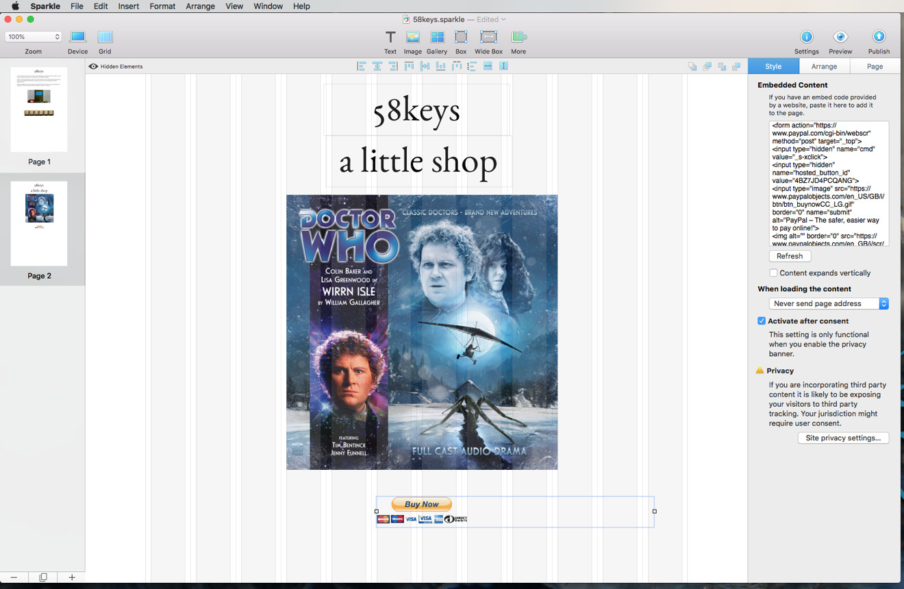
Here's how our shop page looked within Sparkle. Notice the coding we pasted in under the Embedded Content heading at the top right. You've probably just paid more attention to it than we did: we copied that from PayPal, pasted it in to Sparkle and then worried more about the Buy Now button beneath the main image.
For that code calls up a Buy Now button image from PayPal and that's fine but for some reason it appears in a box that's the wrong shape. You can see it on the final website but in Sparkle, Buy Now is ranged left in an image box that's too wide.
We're being a bit fussy: you can drag that box anywhere so we could center the button as we liked. However, it meant that Sparkle's usual automatic guidelines wouldn't work correctly. We couldn't line up the box via guides, it had to be by eye. We could resize that box but it shrunk or grew the Buy Now button.
Then these days you cannot just design a website to look great on your Mac, you have to make it at least passable on iPhones. Or even Android. Sparkle makes this quite easy but it doesn't give you all the control you may want.
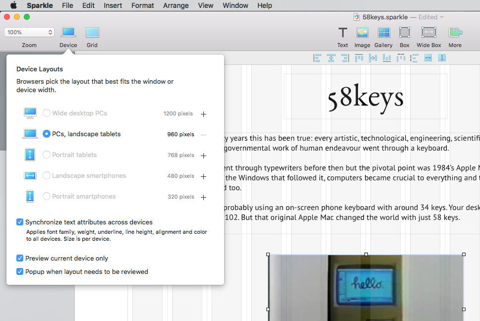
The process feels a little unnecessary, too. When you're done with your desktop website, you click on Device and choose a layout such as Smartphone Portrait. You have to choose that by clicking on the + button to add it and then clicking the radio button to select what you've just added.
What it's doing is separating the mobile page from the desktops so that you can change things to look good on one without affecting the other. Yet still it feels like too many steps. Plus each entry like Desktop or Smartphone Landscape does give you a size in pixels but there's nowhere to change that.
Doubtlessly that's deliberate because it means you have one basic option instead of a hundred different screen sizes. Yet when you know you're developing a site for iPad users, it would be good to be able to say which iPad.
At least this is all better than iWeb ever got to be: that Apple website design tool was last updated in 2011, less than a year after the iPad first came out.
In so many ways, Sparkle is iWeb: the Next Generation with that application's relative ease of use coupled to more modern needs like designing for cell phones.
Sparkle 2.6.3 is available directly from the developer or via the Mac App Store. It's free to download and if you never paid a penny, you could still design a basic website. Just the one, though, and it will be limited to three pages. It'll also be branded as "Made with Sparkle".
There's one more issue with the free one. Sparkle is a design tool, not a web hosting one so whatever you make with it, you have to separately have paid for web space from some provider. Sparkle is able to connect to very many of them and make publishing your updates swift.
If it isn't compatible with your provider, though, then the usual way around that would be to have Sparkle export all the files to disk. Then you can upload them in whatever way your site space provider tells you.
Sparkle's free version won't export to disk. Nor will the first paid tier called Sparkle One which costs $44.99. That version removes the branding, though, and while it still allows you only one site, there's no limit on the number of pages.
To get an unlimited number of sites plus that export to disk feature you need Sparkle Pro which is $89.99.
Sparkle One and Sparkle Pro are available as in-app purchases within Sparkle Free. All three versions require OS X Mavericks or later.
 William Gallagher







-m.jpg)



 Malcolm Owen
 Charles Martin



 Christine McKee

 Marko Zivkovic






37 Comments
omg, ban that now, its like going back in time 20 years to crappy website templates.
Hype is better and cheaper
I'm curious how Sparkle directly compares to online authoring tools and hosting services like Wix and Weebly? Both Wix and Weebly are free web based tools and have a free hosting tier inside their domain. The free layers have some storage and feature limitations but can be upgraded with more storage and features and also linked to a separately purchased domain name outside of their own domain.
I recently had need to put together a really basic web site just to show samples of my work. iWeb probably would have been fine, but I didn't know if it would work with High Sierra so I figured I'd try something new just for giggles.
I didn't want to spend a lot of time on it, so I figured I'd use a template system like Wordpress of Joomla. The more I looked into them, the more confused I became. I also found that the price of decent templates got me close to the price of Sparkle Pro, so I just got that instead.
One of the things that attracted me to it was I thought it would automagically reformat the site I created for computer screens to one optimized for tablets and phones. I don't know why I thought it would, but in case anyone else has the same impression, it doesn't. It DOES let you create separate versions for different devices, but you have to do all the formatting for each device type manually.
I don't know how it compares to anything other than iWeb and the now-discontinued Adobe Muse, but it offers many more flashy effects than iWeb and is easier to use than Muse. Operation is straightforward and intuitive, and while it doesn't get as granular as some might like, the amount of flexibility and customization it offers is pretty good.
If you want an example of what an amateur put together in about 16 hours, here's mine: http://v5vaudio.com