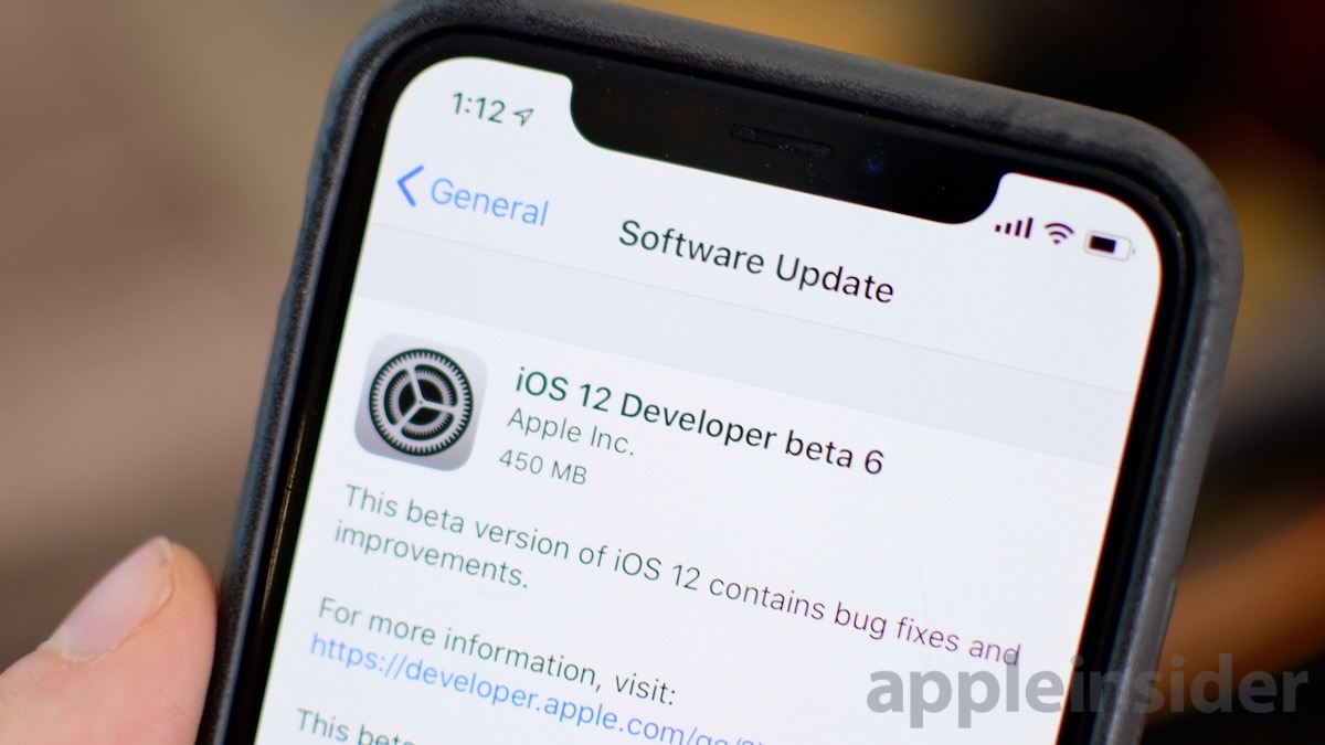
Earlier on Monday, Apple released the sixth beta of iOS 12 to developers. We've had our heads down rooting through this latest update to see what has changed in this update.
We are getting closer and closer to release, so the changes are getting more difficult to find, but there are still notable changes to talk about.
In this beta, we saw new splash screens added to the Stocks app. Apple often adds these splash screens with major new updates to indoctrinate new users to the changes that were made in that particular app. They've been added in waves throughout the betas, but as we get closer to the actual release, more have been added.
Other changes include new wallpapers in the Home app and a new AirPlay icon on the lock screen during playback to wireless headphones or speakers.
Full list of changes (live updating)
- App Store splash screen
- iTunes Store splash screen
- Books splash screen (at least for us)
- TV app splash screen
- Music splash screen
- Reordered wallpapers
- Removed iOS 10 wallpaper
- New AirPlay icon on lock screen
- Bolder font in Maps
- Home app wallpapers removed
- New gradient color wallpapers in Home app
- Notification close button moved to the right in landscape mode
The sixth developer beta of iOS 12 was released alongside the latest betas of watchOS 5, macOS Mojave, and tvOS 12.
Check out what changed last time around in beta 5.
Find any other changes? Reach out to us on Twitter @AppleInsider or @Andrew_OSU.
12 Comments
Are icons, keyboard keys and links smaller? Do I need to buy magnifier and stylus as accessories in order to operate it? Is it designed only for small frame pople with small hands and younger generation or more user friendly accounting for older people with bigger and drier finger tips and aging vision? Is it inclusive device or exclusive device for socially connected young generations who need "cool stuff"?
I don’t see much visual differences between io11 an io12...
I suspect the biggest differences will be “under the hood” with better security, stability, and performance.
The lack of WOW doesn’t bother me... flashy is overrated. I look forward ios12’s official release.
Small matter of semantics, but what you are calling a "splash screen" is what I would call a "first time use" screen (or sequence). Splash screen were popular (with developers mostly) back in the Windows 3.x era and appeared every time the application was launched. Microsoft tried to promote splash screens as a "feature" but they were mostly a crutch to compensate for the excessive loading times exhibited by many apps of that era. When a user launched an app the app would often take tens of seconds to actually display its main view. The splash screen was put up during this app loading phase to provide visual clues to the user that the app was alive and would eventually finish loading. Without these clues, or any visible signs of app life, the user would often try to launch the application again and again. Most people have about a 4-8 second window of tolerance to a user initiated command. If nothing appears to happen after this window elapses users will assume the app is broken or they didn't launch it properly.
The only reason I bring this up is that the sudden appearance of true splash screens across several applications would be a cause for concern, i.e., a sign that Apple is compensating for excessive app load times. The "first time use" screen are intended to bring functional changes to the user's attention or used as a subtle form of user training.