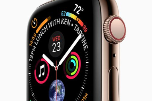
As well as the time, the new Apple Watch face that we're expecting for watchOS 4 and the Apple Watch "Series 4" contains a remarkable nine complications, and an awful lot of data for the user at a glance. AppleInsider details what they are.
When Apple leaked an image of its forthcoming Apple Watch Series 4, most of the attention it got was focused on the hardware. Yet alongside its gold surround, its larger display area and possibly slimmer body, there is the face.
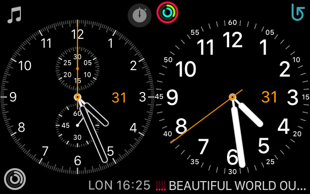
This brand new Watch face is a combination of several old ones that Apple described as Activity, Utility and Chronograph. It's reminiscent of very high-end analog watches but looks better.
Surrounding the hour, minute and second hands there are nine complications and each one is distinct and clear. Or at least, they are distinct and clear to see: that's not the same as knowing what each of them does or is for.
What's on the face
With all the Apple Watches released so far, you've been able to change any of the complications to show data from third-party apps. So you can have a count of your To Do tasks from OmniFocus, for instance, and launch that app by tapping on the complication.
Presumably that will continue to be the case but, unsurprisingly, all nine of the complications in the leaked image appear to be by Apple. We still expect that you can tap on any of them to get more details from the dedicated app on your Watch.
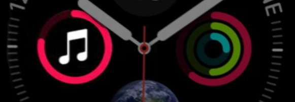
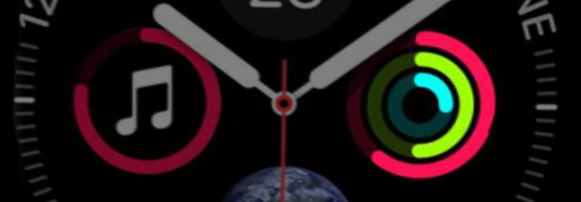
The close up images below are from a recreation of the leaked Watch face by Andrew O'Hara.
Timer
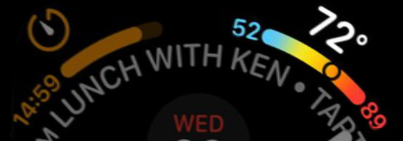
At the top left of the face is a countdown timer that is currently running. Given that it's showing 14:59 it may have been set to count down 15 minutes but there's also a progress bar which looks to be further along than one second.
Appointment
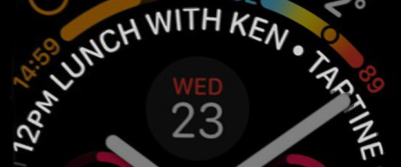
Around the centre of the of Watch face there are markers for minutes but the top of the circle is broken with text showing your next calendar event or appointment.
Presumably the length of this varies depending on the title of the next event but it will also have certain limits.
This information is currently shown best on two Apple Watch faces, the Chronograph and the Utility.
The Apple Watch Series 4 face does make both of those seem colorless, though.
Then while a bottom line showing text is arguably clearer, this 12pm Lunch With Ken Tartine gets more room. It occupies about a third of the circle or the equivalent of 20 minutes.
We don't know who Ken is but he could be meeting us at Tartine Bakery in San Francisco. We should set off soon, then: Tartine has two restaurants in the city and both are about an hour's drive from Apple Park in Cupertino.
Weather
Previously the Weather complication could show you the temperature but this new version uses the extra space to provide more.
It's still showing the current temperature but that's above a bar with the day's minimum and maximum. Notice the circle within the bar that shows where in that range we are now.
Day and Date
While it's just the day and date, this is actually substantially clearer than any previous equivalent. So far this information has been limited to either a small complication or a single abbreviated line of text above digital time displays.
It is curious that it's showing Wednesday 23 and not, for instance, Wednesday 12. That's the day this image is planned to be showed publicly.
Music
This is the only complication, of those shown in this example, that you can interact with using the Digital Crown.
As you turn that crown, the circle representing volume will increase or decrease. At lower sound volume the circle will probably be green: Apple is keen on warning you when things are getting a bit loud.
Activity
Someone's not been standing up much today. This is the Activity complication that updates to show your exercise during the day and again it's clearer than before. The Siri face did have a similar-sized icon in its scrolling list of items.
Otherwise, though, Activity was either a monochrome complication or a large icon behind the watch hands in its own face.
Astronomy
The full Astronomy face shows you either this same view of the Earth showing the terminator between day and night or the equivalent view of the moon.
UVI
At bottom left there's the current Ultra Violet Index. The example 3.6 comes in the range where advice is to stay in the shade as much as you can.
What's significant about that is where the data could be coming from. Earlier this year, Apple filed a patent for "Light-based Shielding Detection" which described a portable sunscreen detector.
The filing did specifically include mention of the Apple Watch and described the detector as something that could be "attachable to a wearable electronic device".
Sunrise/Sunset
This last complication is one that uses the extra space available on the display, though possibly unnecessarily so.
It's what current Watches call the Sunrise/Sunset complication. Here it's showing the time of sunset today, 7:30pm, but also the fact that this is in 9 hours and 21 minutes time.
You've got the sunset time and you're looking at a Watch, it's hard to know how often you'll want that extra information.
Also notice, though, that complications one and nine have a similar pattern. They show actual information like the countdown or the sunset time around the circle of the Watch face and have an icon the corner. By comparison, complications three and eight both use that icon space to show the most important data.
Given that you can presume the sunset icon will change to a sunrise one at appropriate times, it's likely that the timer one may be able to change to a stopwatch too.
Complicated
You either find this number of complications impressive or garish. Either way, the fact that so much can be displayed so legibly and clearly is a mark of the bigger display area.
That will of course be why Apple chose this face to show off the new Watch. But, there is a part of us that is looking forward to seeing Mickey Mouse on it too.
Keep up with AppleInsider by downloading the AppleInsider app for iOS, and follow us on YouTube, Twitter @appleinsider and Facebook for live, late-breaking coverage. You can also check out our official Instagram account for exclusive photos.
 William Gallagher






-m.jpg)


 Marko Zivkovic

 Christine McKee
 Andrew Orr
 Andrew O'Hara

 Mike Wuerthele
 Bon Adamson

-m.jpg)


35 Comments
Excellent analysis (with a clever tone).
I’m not a fan of the Watch UI and this just seems way too cluttered and fiddley.
Looks gorgeous! Hope it isn’t only for the series 4. I have a series 0 Rose Gold Edition and a Series 2 White Ceramic Edition. Not planning to invest in another watch until one of them stops working. Sometimes I wake up and realize I have one on each arm. Maybe I can wear one as a pendant, but no heart monitoring...shame. A Mickey Mouse rose gold pendant would be cool...
This will be optional and likely a face that Schiller would joke about, saying for those crazy enough here’s all the complications on at once.