Apple's signature productivity apps get a set of new features that exploit what Mojave brings to the Mac. AppleInsider writes, calculates and presents what's new.
Somewhere in Apple Park, there is a group of people putting on a brave face. They're cheering the release of macOS Mojave, they're toasting iOS 12 and only a little part of them is dying inside because nobody's noticed all they've done for iWork.
You're not even sure anyone calls Pages, Numbers and Keynote by the collective name of iWork anymore. We had to check: yes, Apple does still occasionally call them all that.
Yet most of the updates to these apps in time for Mojave are significant and useful.
It's chiefly the same quartet of features added to all of them but then the Numbers team has squeezed in something special just for their app. And Apple Notes has had a little love too.
Dark Mode
All three apps have now been reworked to support macOS Mojave's Dark Mode. Every Apple app on the Mac has so this isn't special but it is curious because of the three, only Keynote tends not to have plain white documents.
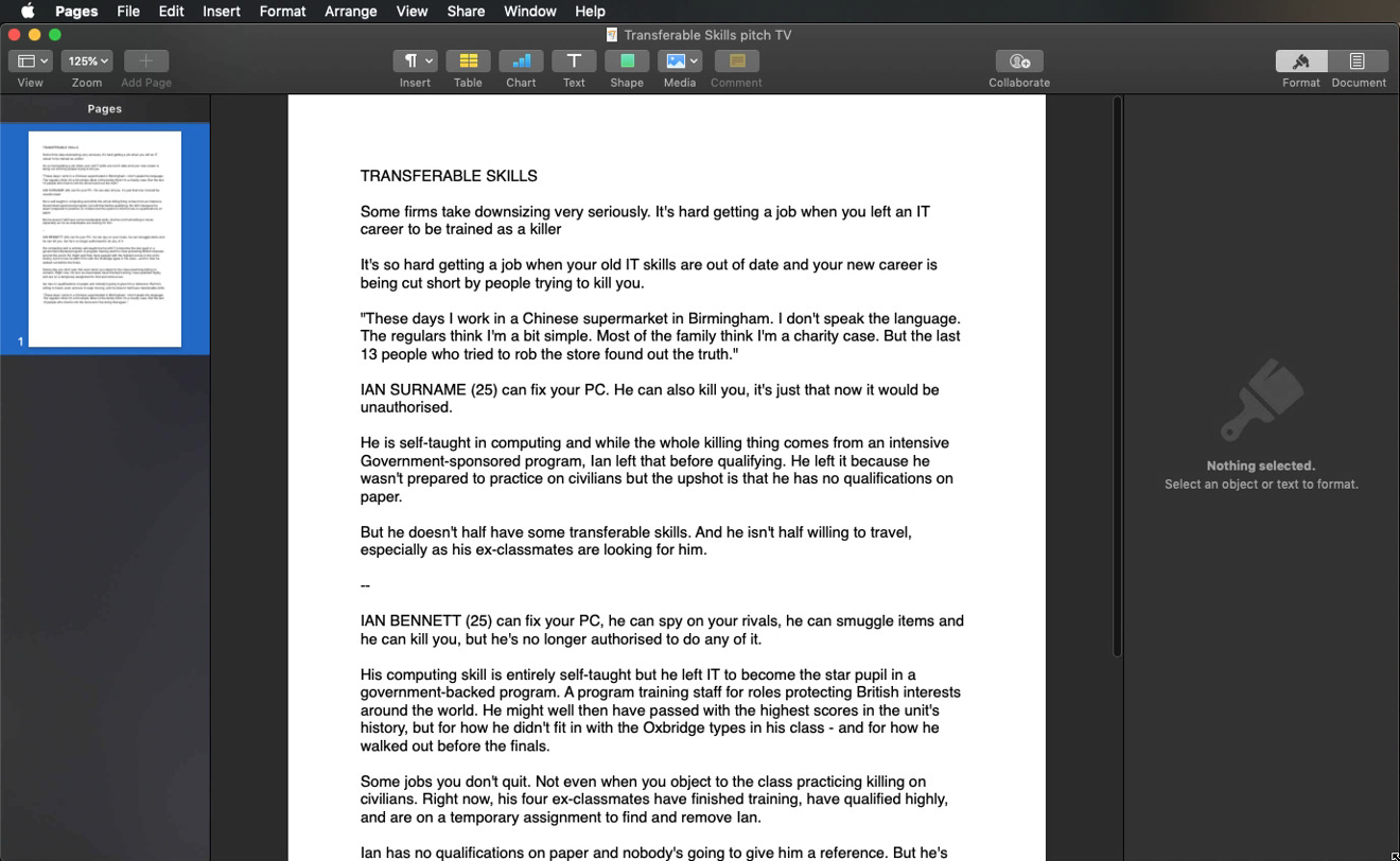
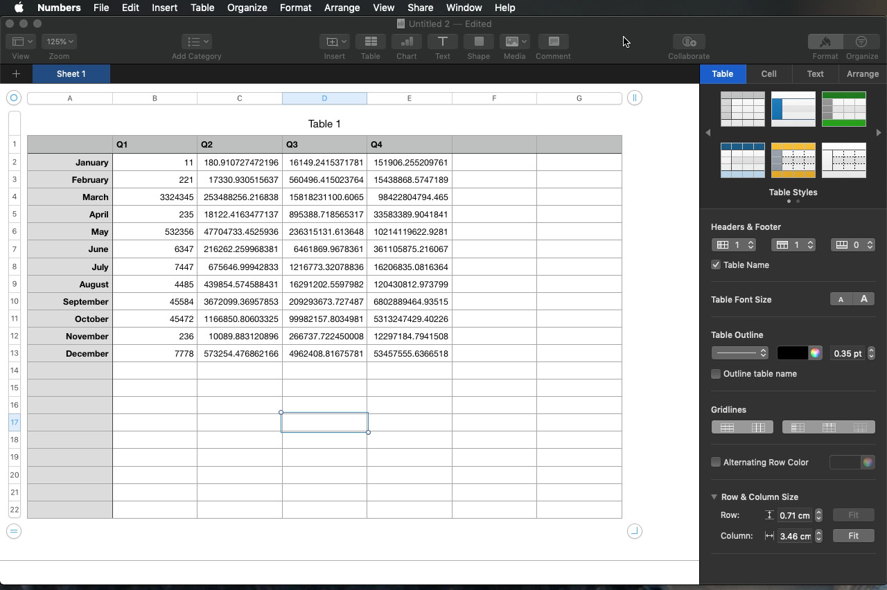
So with Numbers and Pages, you get all the finely-designed dark menus, navigation bars and dialog boxes — but your documents remain white.
It's far from a mistake: the entire aim of Dark Mode is to make macOS and its tools recede into the background. It's meant to make your work be the focus. Yet as good as that is for images or video, with spreadsheets and documents, it's so much white that there doesn't seem to be a great benefit to Dark Mode.
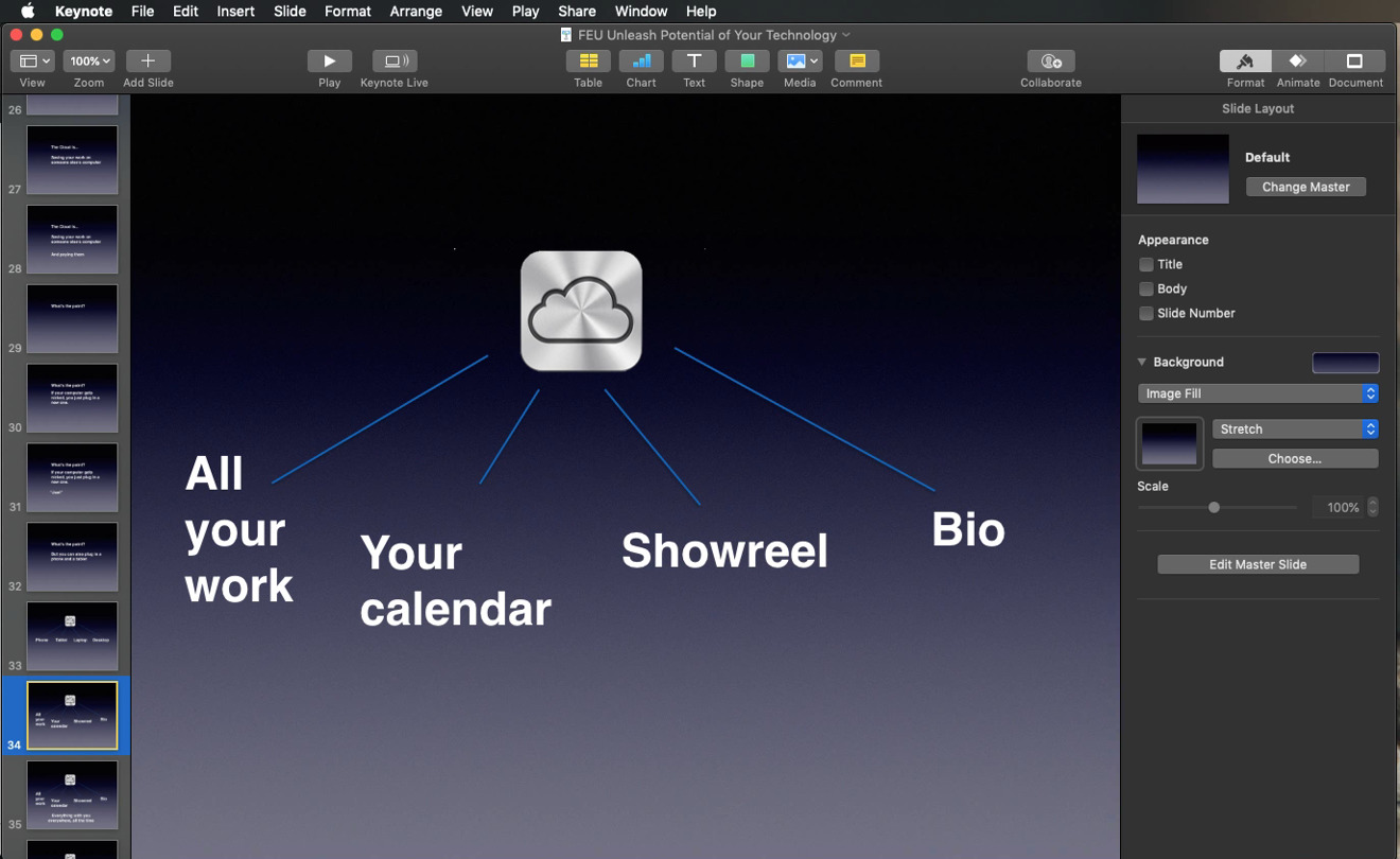
Keynote tends to fare better because you have to positively choose to have white slides: only three of the 35 supplied templates are like that, for instance.
As these are Apple apps, they obey whatever your choice in Mojave is: they automatically switch to Dark or Light Mode when you choose one in System Preferences, General, Appearance. You don't have to change any setting or preference in each app — which also means you can swap back and forth between Dark and Light without fiddling.
Continuity Camera
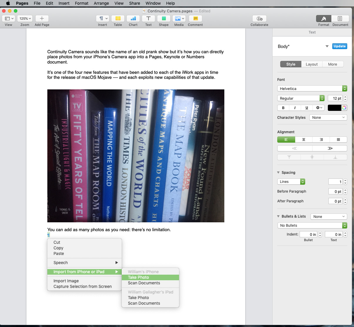
This is also in all three apps but it feels most at home in Pages and Keynote. As you create a document or a presentation, you can choose to insert a photo directly from your iPhone. That's directly from it right now: these apps can wait for you to take the shot and then insert it automatically into your document.
From the Insert menu in any of these three apps, choose Insert from iPhone and then Take Photo.
It doesn't actually take the photo but it's close. This feature remotely opens the Camera app on your phone and then waits for you to take a shot. It is specifically Apple's Camera app: whether or not you have an alternative such as Obscura or Halide open, your iPhone will launch Apple's one and switch to that.
Back on your Mac, if your cursor is in text then you see a small prompt to take the paragraph. So most times you're doing this in Pages but also while you're specifically editing a text box in Keynote, the prompt is like a drop down beneath the cursor so that you can see exactly where the shot will go.
When you're anywhere else, such as having clicked to highlight an image you've just imported, then the prompt is a wide notification-style dropdown from the top of the document window.
Your phone has to be near your Mac: this works via a combination of Wi-Fi, Bluetooth and both iPhone and Mac being signed into iCloud with the same Apple ID. Mind you, it also has to be nearby so you can reach it: this is not a tool for compiling photos from afar.
Then when you've taken a shot and also tapped on Use Photo, the app inserts it into your document wherever your cursor is.
Alternatively, the same system lets you scan documents. This is using iOS 12's feature where it lets you take multiple photographs of pages in order to create a single new document. That works as it did before, with the camera taking the shot automatically when it believes it's identified the edges of the page.
Whether you're taking photos or scanning documents, though, the image goes directly from your iPhone into Pages, Numbers or Keynote. They don't go into the Camera Roll on your iOS device nor Photos on your Mac.
This is like the iPhone's iOS 12 screenshots feature except there you get the option to save the image and hear you don't.
We keep saying iPhone but Continuity Camera also works with your iPad. In our testing this was a little flaky: sometimes the Insert menu would be renamed to Insert yet the iPad options would be greyed out. Other times, with no obvious difference in setup, both iPad and iPhone were available to take photos or scan documents.
Record audio
This has long felt like a missing feature — just not from Pages, Numbers or Keynote. The place we've really noticed its absence is in Apple Notes where recording audio directly into a note remains one of the few reasons we keep using Evernote.
Apple Notes has had an even quieter and smaller update than the iWork apps and now supports Continuity Camera. It also supports Dark Mode and here the previously white area for writing turns to dark too.
Yet Apple Notes hasn't been updated to record audio and we can only hope it will eventually.
In the meantime, you use this Record Audio in the three iWork apps just as easily and smoothly as you'd imagine.
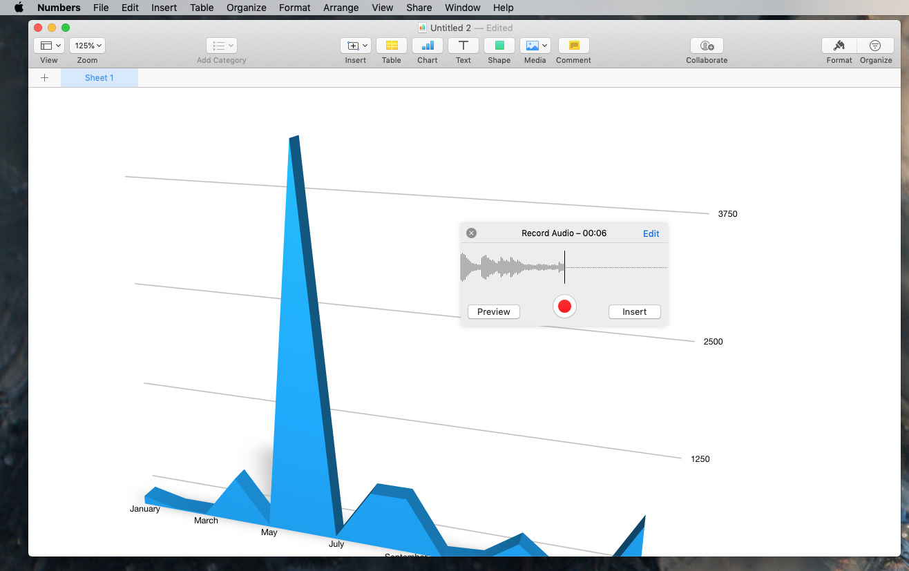
This time it doesn't matter where your cursor is. At any point in your document, choose the Insert menu and Record Audio. Up pops a recording dialog that looks similar to the one in the old QuickTime Player: it's a very basic big red button.
Once you click on that, the button disappears to be replaced by a moving waveform as you speak. Then when you press Stop, you can preview the audio. Nicely, you can also edit it: you get to trim audio right there in the dialog before it's saved to your document.
When you do that, it appears as a round icon with an image of a speaker and it lands in the dead center of whatever you have on the screen. If that's in the middle of a chart, so be it.
You can drag that icon anywhere and it overlays your document: it doesn't make text reformat around it, for instance. If you record two or more audios then they both get this identical icon and by default are closely overlaid on each other.
We can imagine using this to leave instructions for someone on how to use the sheet so in that case you'd scroll to the point you're describing first, then record your audio.
If you have an external microphone plugged into your Mac, you have to select it as the default sound input in System Preferences, Sound. You can't change it within these apps.
Nearly missed this
All three of these apps also have what Apple describes as a way to "enhance your documents with a variety of new editable shapes." We'll just trust them on that.
We have occasionally used shapes in Keynote to build examples of simple decision trees but otherwise, that whole catalogue of rectangles, circles and icons is unknown territory for us.
App-specific updates
Shapes, Dark Mode, Continuity Camera and Record Audio are all in Pages, Numbers and Keynote — and they work precisely the same in each. Beyond that, all three apps report having had general stability fixes.
Numbers, though, has one more new feature all to itself: Smart Categories.
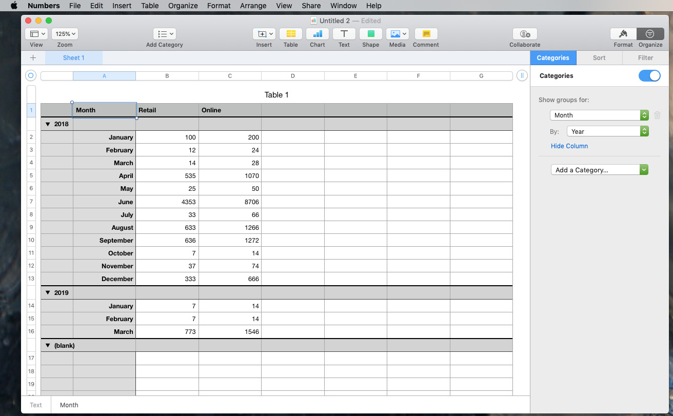
It's a way of sorting your spreadsheet so that you can see data divided up into separate sections or categories. And then to be able to add subtotals. This sheet was a straight list of months and sales data from two sources, retail and online. Switching on Smart Categories let Numbers automatically display it in more of a breakdown.
In typical Numbers fashion, the feature is easy to use and yet also quite hard to fathom. Nonetheless, you can see immediately how dividing up the data helps you understand — and subtotals help you blame the right people.
Keep up with AppleInsider by downloading the AppleInsider app for iOS, and follow us on YouTube, Twitter @appleinsider and Facebook for live, late-breaking coverage. You can also check out our official Instagram account for exclusive photos.
