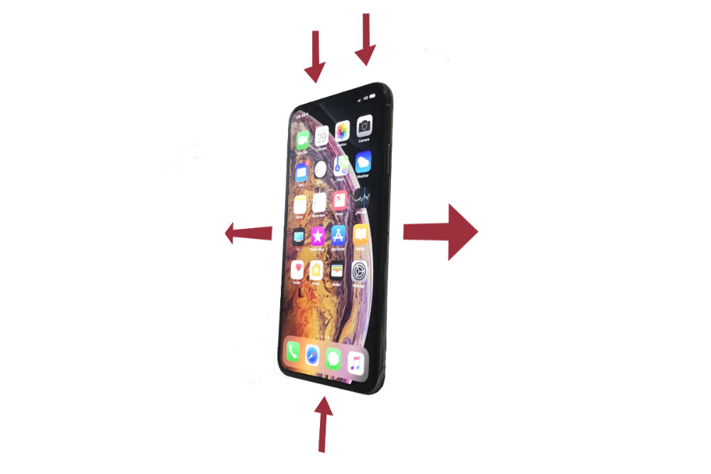
There are 15 different gestures you can perform on your iPhone or iPad, not even including app-specific ones. AppleInsider maps out the obvious, the obscure, and the forgotten swipes of iOS, and shows you how to use them all.
We're not really nostalgic for the original iPhone but it did have a certain simplicity. When Steve Jobs showed us how to swipe to unlock the phone, it was typical, startling Apple. No one else had thought of it and now Apple had, it seemed so obvious. Every other phone maker's combination of buttons to hold down was wrong.
That one swipe changed everything and it became the focus of Apple's original iPhone ads, too.
Only, if you now pick up a modern iPhone, that particular swipe is gone. And instead we have 15 different swiping gestures. They move you around between open apps, they give you fast access to information or the camera.
They make using your iPhone speedy — but not all of them are always available to you and some are duplicating or overlapping with each other. This is all iOS itself, too, we're not counting common gestures within apps like tugging down to reveal search bars. It's also not counting dragging or dropping and we're building up to telling you the iPad brings even more.
You will know at least most of these and you'll know them so well that you have to stop to think how you do them. Yet there will be ones you've either not seen or not tried. And if you've ever had something happen on screen that you didn't expect, here's what gesture you made to cause it.
It starts before unlock
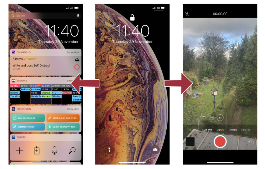
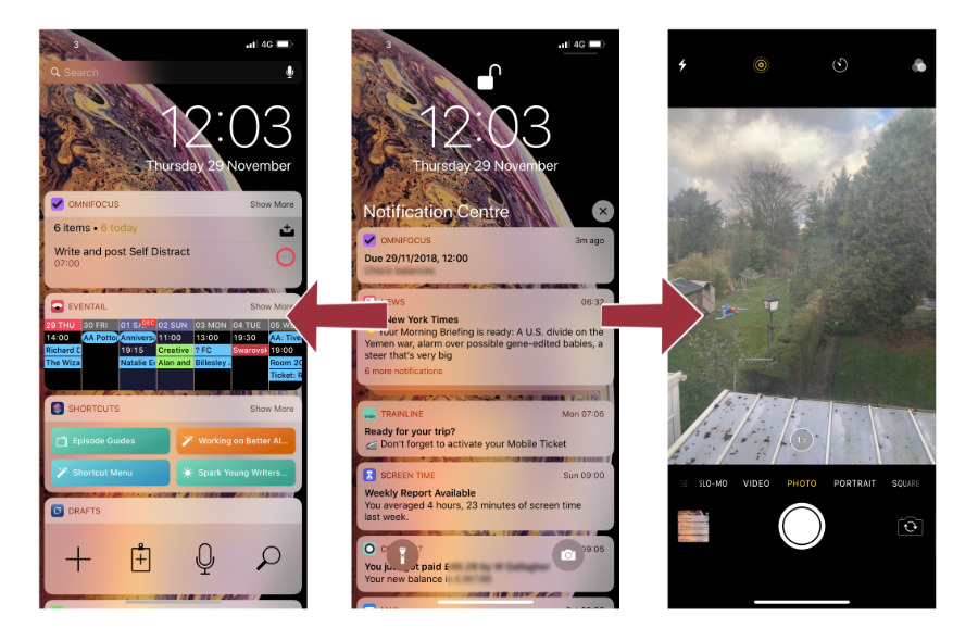
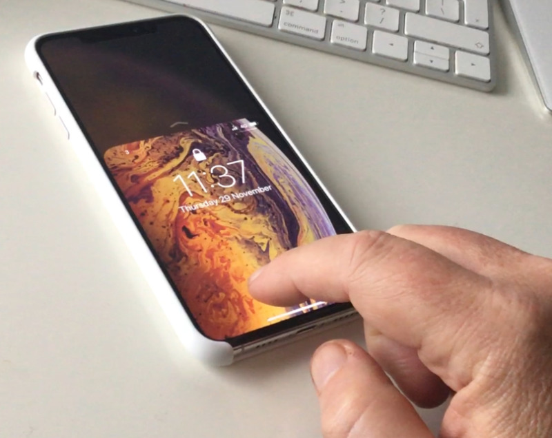
Pick up your iPhone and even without unlocking it, you've got swipe gestures available to you. The regular swipe up to get to the home screen doesn't work until you've unlocked but you can swipe from the right edge of the phone to the left and you'll open the camera.
It's the full Camera app, open instantly and with all its features available to you including the ability to see photos — that you've just taken. To get to the rest of the Camera Roll you have to unlock the phone.
Do the opposite, swipe from the left edge to the right on the lock screen and you call up Widgets.
You also have full access to whatever information is shown in widgets you've already added to the this view. You can't add new widgets, rearrange or remove them without unlocking. You can tick a To Do task as done in the OmniFocus widget if you have that and every widget lets you choose to Show More or Show Less.
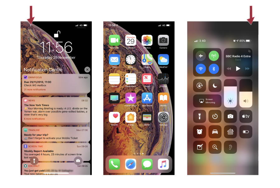
Next, you can swipe down from the top right to get Control Center. Your phone is still locked but there you can adjust brightness, volume, open a Home app panel and many more things.
Unlock
Once you unlock the phone, you gain the ability to edit widgets, to see all your photos and everything else. You can still swipe left to right to bring up those widgets and you can still swipe down from the top right to get Control Center.
You lose the ability to swipe from right to left to instantly bring up the Camera, however. Now if you swipe from that right edge you switch between home screen pages if you have more than one.
If you use only a single screen of apps on your iPhone then we admire your self-discipline. However, it doesn't matter as swiping at the side of that one home screen won't do anything.
There remains a similarly quick way to get the Camera, though, and it involves more gestures. It's hard to see why Apple chose to do this, but you can get quick Camera access through Notification Center.
More Notifications and Widgets
As well as the swipe down from the top right to get Control Center, you can now swipe down from the top left. It doesn't do anything at all until the phone is both unlocked and opened but when you are then at the home screen or in any app, this swipe brings up Notification Center.
You know how it works. If you've had a notification and not dealt with it then it will be on this Notification Center screen.
However, while in Notification Center, you can now also swipe from the right of the screen to the left to go into the Camera. Take a photo and then swipe up from the bottom to leave the Camera and go to the home screen, or swipe left to right to return to Notification Center.
In Notification Center, you can also swipe from left to right to move into the Widgets view. And then swipe right to left to go back.
Don't get used to it
You can also get to the Widgets from the home screen. Go to the very first screen of apps — either by swiping or tapping on the first of the little dots at the foot of the screen — and swipe again from right to left. This brings up the Widgets exactly as swiping from Notification Center does.
Except now if you swipe back from Widgets, you go to the home screen, not Notification Center.
The Widgets view, Notification Center and Control Center are like overlays on your iPhone. They sit atop everything else so you can see a sense to calling up one and swiping to the others.
Yet within the Widgets view, a swipe right to left does different things depending on what you were doing before you opened it.
Plus, you can call up Control Center from the home screen, from within any app and even from within Notification Center and the Widgets just by swiping down from top right. You can't go from Control Center to Widgets or Notification Center.
It doesn't matter where you are when you open Control Center, you cannot swipe to go anywhere else. You can only swipe up to dismiss it or tap on a control to go into its associated app.
More inconsistency and duplication
Once you're using an app, you'll see a wide, thin bar at the very foot of the screen. It'll be black or white depending on the color of your app's screen, but it will always do the same thing. Tap and hold on it and you can then swipe left or right to move between open apps.
Except that bar also appears the lock screen. You can't swipe it left or right, you can only swipe it up. It's part of the gesture that takes you to the home screen and then this bar vanishes until you're in an app.
It's not the only gesture for moving between apps on the iPhone, though. You can obviously swipe up from the bottom to go back to the home screen and look for your app. However, if you do that same swipe in slow motion or you swipe part way and then wait, you instead go into the Application Switcher.
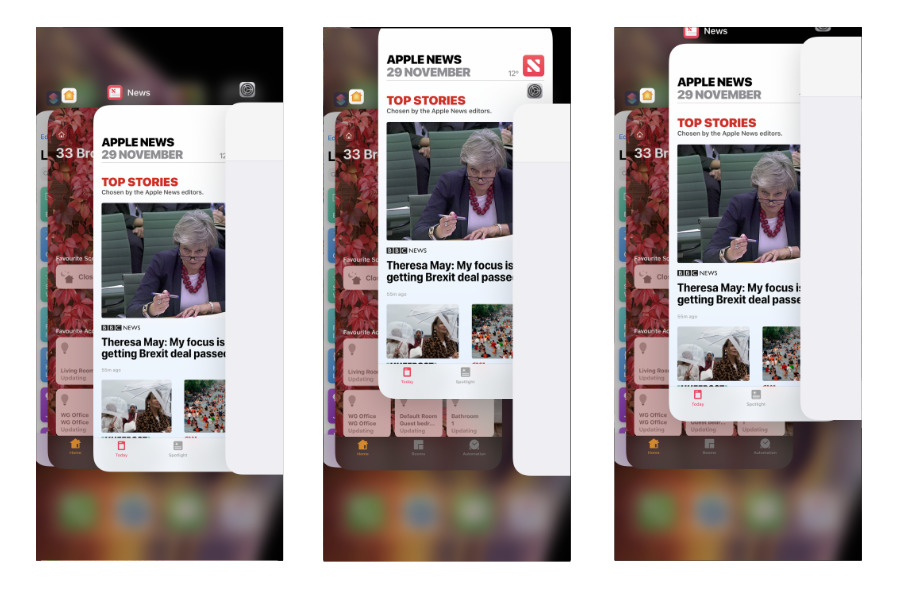
Application Switcher on iPhone (left switching apps, middle force quitting one, right force quitting two)
In iOS 12, the Application Switcher shows you each open app as a card in a stack. Swiping left or right along these cards brings apps to the fore and you can then tap to go into the one you want.
Or you can flick your finger up to force quit one. You can press on two cards at once and flick both up to force quit the pair of them.
Incidentally, even here in the Application Switcher, you can swipe down from top right to get Control Center. You can't get Notification Center or Widgets.
One or two more on iPhone
There is one more feature you can get on your iPhone using a gesture and for some reason you have a choice of two different swipes for it. The feature is Reachability, which was designed to help your thumbs get to the top icons on large iPhones. You know this and still you've never used Reachability.
It always felt like a sop to people who were complaining about the bigger screens and Apple definitely made it a second-class citizen on iOS because you have to choose to enable it. Go to Settings, General, Accessibility and in the Interaction section there is Reachability.
To make up for your having to schlep through all of that, though, Apple gives you these two different gestures to activate it.
You can swipe down from very near the bottom of the display, which feels like tugging the screen toward you. Or you can quickly swipe up and down at the bottom of the display.
In either case, iOS 12 slides the entire screen down so that your thumb can stop all that swiping at the bottom and just tap on the icon you need.
And in both cases, these are the most fiddly gestures to get right. Doubtlessly you get used to them, but it's quicker to ignore Reachability and just, well, reach.
That's all, follks
We make that 15 different swiping gestures that you can do on this small piece of glass. If you have a larger one, though, then there's more. The iPad adds three more gestures and takes away one.
That's a total of 17 different swipes you can make on an iPad and again, there are duplications and confusions.
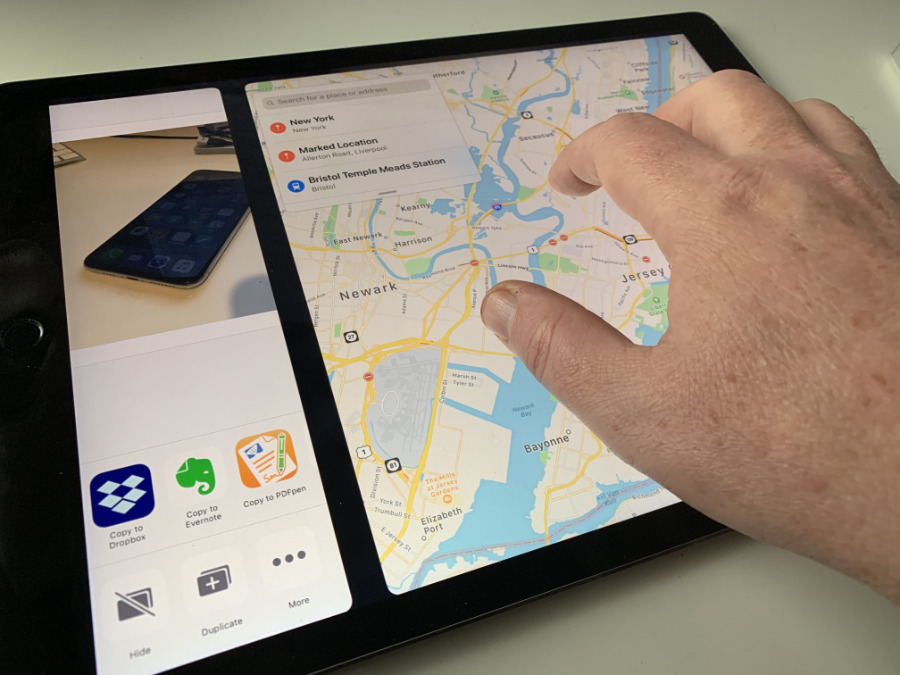
The one that's gone is the bar at the bottom of all your apps that you can drag to change between them. However, you do instead get the option of a five-finger shove. Place all five fingers on the glass and then swipe to left or right. You'll move between open apps.
If we find Reachability a chore, this shove is our favorite: it is particularly fast when you're jumping back and forth between two apps.
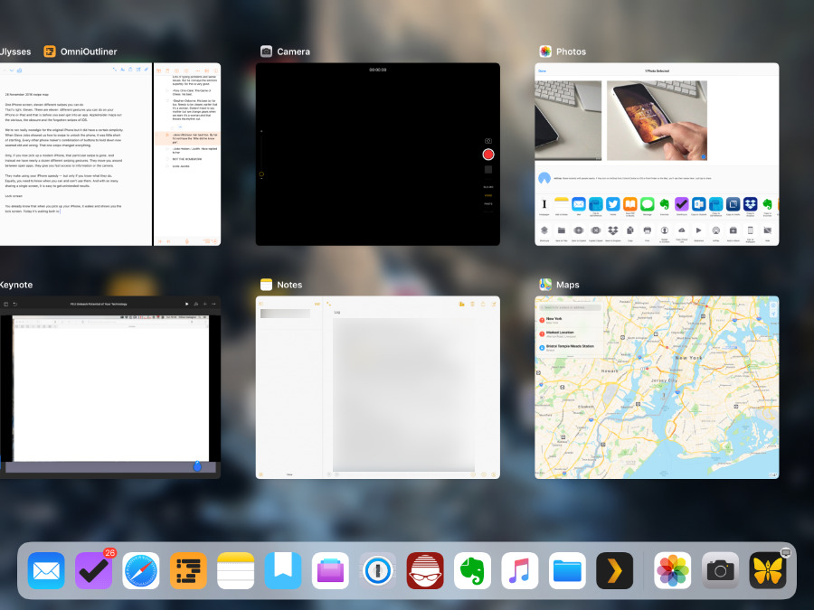
However if, instead of shoving left or right, you place those five fingers and very briefly swipe upwards, you go out of the app and back to the home screen. Do exactly the same thing but take a little longer over it and you go into the Application Switcher.
This is the same Application Switcher that you get to on iPad or iPhone by swiping one finger up from the very bottom of the screen. Rather than cards in a stack, the iPad shows your open apps in a grid but you can still swipe left or right to move through many of them.
And you can again swipe up on any one or two to force quit them. You might be more nimble-fingered than us and force quit three or four together.
When the Application Switcher is open, you can also swipe on an app to bring it up but that starts to get into drag and drop which is another can of gesture worms.
Easy
Depending on the size of screen you have, you get at least 15 and maybe as many as 17 different possible gestures. They overlap, some are subtly different on iPhone and iPad, and they're also inconsistent.
Rather than seeing Widgets, Notification Center and Control Center as one layer atop the regular iOS home screen or apps, though, think of it as a series of layers. The home screen or apps are the first, then atop those you have Widgets and Notification Center.
And then above those you have Control Center which you can get to no matter what you've been doing.
It's just that even as we think of it all like that and it explains why you can always get Control Center, we've got that oddity of the Camera next to Notification Center.
There's no question but that gestures are great: they become muscle memory and you fly around your device all the faster because of them. Still, think of all this the next time you tell someone that iPhones are obvious and easy to use.
Keep up with AppleInsider by downloading the AppleInsider app for iOS, and follow us on YouTube, Twitter @appleinsider and Facebook for live, late-breaking coverage. You can also check out our official Instagram account for exclusive photos.
