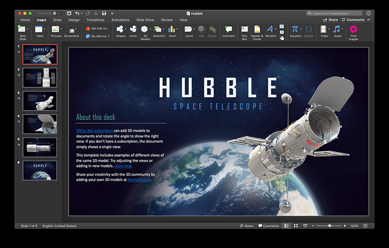
Microsoft on Tuesday pushed out an update to its suite of Office apps for Mac with full support for new operating system-level features baked into Apple's macOS Mojave, including Dark Mode and Continuity Camera.
The latest Word, Excel, PowerPoint and Outlook iterations, issued as version 16.20.0, enable support for tentpole macOS Mojave functionality, according to release notes provided alongside today's update.
All four Office apps now benefit from compatibility with system-wide Dark Mode user interface aesthetic. Introduced with Mojave, Dark Mode toggles UI elements like window borders and icons from standard, brightly lit color to a darker scheme designed for use in low-light environments.
In addition to Dark Mode, PowerPoint integrates Apple's Continuity Camera, which allows users to insert photos taken from an iPhone into an open document. As implemented in PowerPoint, users open a presentation, select a target slide and perform a control-click operation to bring up an edit menu dialogue. Selecting a paired iPhone triggers the Camera app on that device, which can be used to take a photo for insertion.
Beyond Mojave-specific capabilities, the latest Office version includes embedded fonts for Word and new features in Outlook including calendar sharing, meeting forwarding prevention and support for Teams.
The update is available to Microsoft Office 365 subscribers, who will see the update download automatically, as well as licensed owners of Office 2019 for Mac.
 AppleInsider Staff




 Wesley Hilliard
 Malcolm Owen
 Amber Neely
 Christine McKee
 Andrew Orr
 Mike Wuerthele and Malcolm Owen





26 Comments
I'm trying to figure out what the big deal is with dark mode. I tried it - things looked different and often times it mad ether interface lest clear. (ex: try to tell if you're in a private browsing window in safari with dark mode!) In the end it really didn't matter and I switched it back. Beyond that, I have to use Outlook for work, and man is it a PITA to use!
I am trying out dark mode, which I thought I would like because I use Photoshop all day long and so I work in a dark office for color accuracy. So far I’m not liking it too much. Windows are more difficult to make out in Safari and everything just kind of blends together. I’m going to stick with it for awhile longer to see if I can get used to it. Also because bright white screens tend to tire my eyes more the older I get.
I tried dark mode for a week. I liked the look on the screen but I often have to print what I see on the screen including emails and contact cards. Unless I am interest in buying stock in HP to try an recoup the money I would spend on black toner cartridges, I decided dark mode is not for me.
I love dark mode (only not for the Apple Mail - the backround is just almost black).
At work I even have a "Darke Reader" extension for Chrome (try it - it's really cool for lot's of reading while browsing).