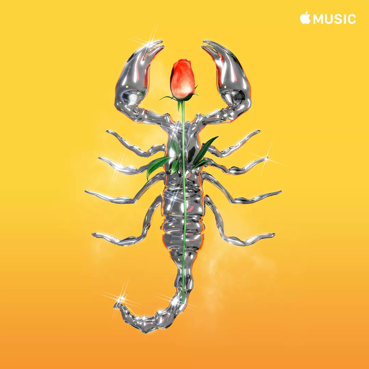
Apple is reportedly hiring veteran industry artists to redesign the covers of "many thousands" of Apple Music playlists, hoping to make them look less generic.
One example is Gerard Huerta, known for his custom letter work for bands like AC/DC, Blue Oyster Cult, Boston, and Foreigner. His work now adorns Apple Music's "The Riff" and "Classic Metal" playlists, The Verge said. Another artist, Stole "Moab" Stojmenov, was commissioned to do the covers of "Hip Hop Hits" and "Northern Touch."
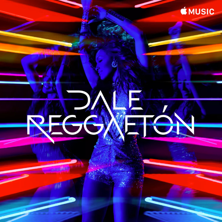
For three playlists — "Dale Reggaeton," "Puro Jefe," and "Al Cien Con La Banda" — Apple turned to Carlos Perez. Perez directed the video for the Luis Fonsi song "Despacito," which now has over 6 billion views on YouTube.
Hundreds of playlists have already seen redesigns, said Apple editorial director Rachel Newman. The rest should follow in the next few months.
When Apple Music launched in 2015 much of its playlist art was boilerplate, particularly for genres outside the mainstream, such as dark ambient. That stood in contrast with its competition, Spotify — that service has long had stylized art, if mostly photos rather than illustrations.
7 Comments
That is so true, finally, Apple is doing something about their generic looking playlists. Looking forward to redesigned the covers!
Huh. This is fairly interesting to me in that I pay very little attention to cover art.
For the most part I’m listening to music through my whole house audio system (multi-room coverage streamed to an Airport Express and to an AirPlay enabled receiver) via AirPlay, via HomePod or in our cars. In my car I generally use Bluetooth and no album artwork shows up (if I connect with a Lightning cable there is artwork but it’s small and at an odd angle, I guess to look cooler?) and in my wife’s car we use CarPlay which technically shows artwork but it’s heavily blurred, enlarged and in the background behind the song info and buttons for skip back, play/pause and skip forward. So I don’t tend to notice artwork at all.
It’s true, I’ll use the Music app on my iPhone occasionally or iTunes but even then I’m just seeing the artwork peripherally.
This is one of those things that I would never notice if I didn’t read about it here.
“Dark Ambient”... LOL. These music categories are hilarious.
At first I was glad to hear this news...
then i I saw examples of the “new” stuff that looks about 5 years old in bad looking 3d/game of thrones stuff with 80s filters applied to hide the flaws and pretend it’s a theme.
Rather not see thst in my app.