There isn't just one announcement image of the dates for WWDC 2019, there are four. AppleInsider examines what apps make the cut for all four images — and whether they're a clue to what this year's gathering will focus on.
If Apple's invitation to its March 25 event is less cryptic than usual, the annoucement the company has just issued for its WWDC 2019 announcement goes far the other way. And especially so when you discover that there are in fact four different announcements.
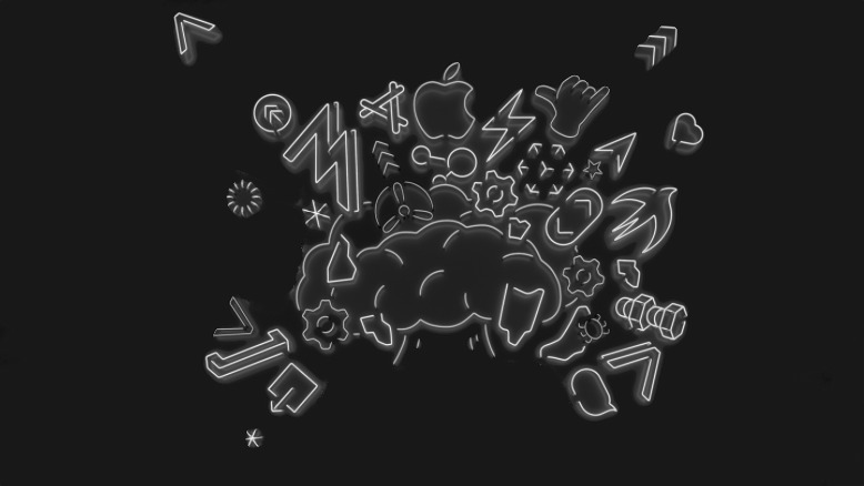
Each is drawn in the same neon style and each shows a head whose brain is exploding with apps and tools. Each has the same strapline. "Write code," they say. "Blow minds." And each shows the same event of when and where WWDC 2019 is taking place.
However, the four have different heads. There's a blocky kind of robot face that looks to have a USB-C port as a mouth. As well as that one, there's a startled teddy bear and there's a faintly surprised alien. Then there's a skull. It, too, seems quite happy but then we've seen these before.
All four are stylized versions of existing Animoji.
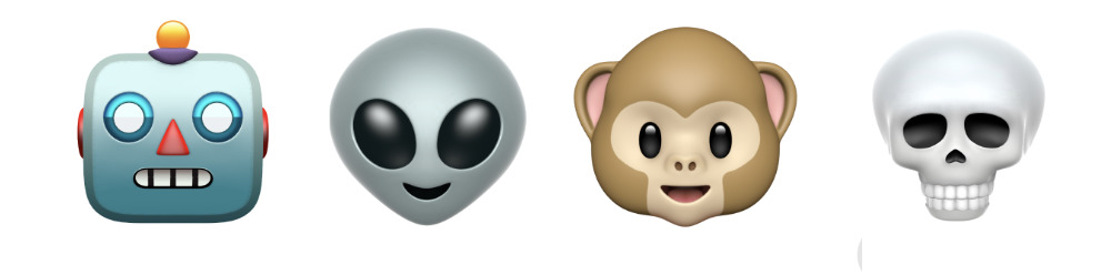
The four exploding heads in the invitations are stylized versions of these Animoji
Then each head has something in the order of 50 icons exploding out of it — but what may be significant is that around a quarter of those icons are different in each image.
If it's reasonable to assume that there's something important about those icons and symbols which are identical in all four, then they seem to fall into certain categories.
Clockwork
At about the 2pm position, upper right, there is the icon for Apple's ARKit, the framework for its Augmented Reality software. Just away from that and crossing the 3pm position is the icon for the Swift programming language.
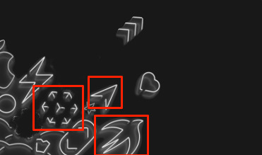
That's ARKit, possibly Maps, and definitely Swift
Going counter-clockwise, there's the App Store logo immediately to the left of the Apple. The next large icon, at about the 10pm position, is the one for Apple's Metal 2 graphics processing interface.
Tucked in between the App Store and Metal 2, just a little closer to the centre of the image, is the icon for Testflight. This is the app that lets developers send beta testers the latest versions of their apps before they are launched in the app store.
That's the Metal 2 icon, the App Store and Testflight. Easy.
The last icon that can definitely be identified is at the 8pm position and it's the Share icon. It's pointing away from it usual direction, and it's pointing at a star icon, but it's the familiar Share one. And since Share is already implemented in practically every part of every app on iOS, it could just be here because it's important.
Please give us Share in Mail. We're begging.
If its permanent presence across all the WWDC images means that it's going to be talked about, however, if it means that Share is going to be featured, then that's exciting. For unless Apple has some bright idea we haven't — and the company does have a great track record for that — then it could mean Share will get the one improvement we want.
We'd give a limb to see Share be added to Apple's Mail app. It's such an obvious place for it and it would be so very useful there that it's practically cruel how Apple has denied us it so far. Still, that is a feature that would be a boon to users yet wouldn't make any difference to developers who have already decided whether or not to include sharing in their own apps.
WWDC is still primarily aimed at developers — the opening keynote is for the world but the rest of the week is very specifically not for general users — so we may just be being hopeful with this one.
That said, WWDC is about giving developers tools now that will attract users later, so at least some of these icons appear to promise benefits for app makers.
Informed guesses
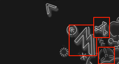
There are guesses when you know something and there are guesses when you've just stared at icons too long. But it looks to us as if Maps may get some attention at WWDC. We're basing that in part on how much work Apple has been doing with maps lately, but also on how there's a very Maps-like icon on each of these images.
It's in the top right corner, around the 2pm position and just to the side of the ARKit one. Unlike the Metal 2, App Store, Testflight or really any other icon, though, it's not quite accurate. It looks like the arrow you see when driving but this one is broken. Maybe a few years ago we could've taken that as Apple making a self-aware gag about the problems Maps had.
Now, though, it feels more as if Apple is going to do more with offering Maps integration for third-party apps.
All of the icons are broken as if really made from neon tubes but this could be messages. Or just a blob, really.
Similarly, you could make a case that there's a Messages icon at 3pm and close in to the head image, but it's broken.
What's missing
Maybe it's there and we're just not seeing it, but there doesn't appear to be any sign of Apple's HomeKit features. Nor is there any obvious reference to Health — or at least not in the permanent icons.
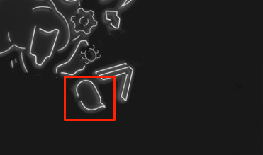
Among those icons that only appear in certain images, there is what could be a Health-style heart icon included in a Messages-like speech bubble. That actually appears in three of the four images and is only left out of the robot one. Perhaps robots don't have hearts.
There is a possible Home reference in the alien image with a bulb icon. Curiously, that bulb isn't quite complete — like the possible maps and messages icons, it's broken. That could just be thoroughness on Apple's part, taking the theme to its full and mimicking how these really would be rendered in neon tubing.
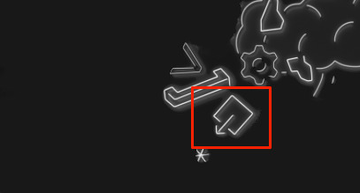
The bulb only appears once and the developers' Xcode app's hammer icon is in three faces but at different positions in two of them.
Most of the rest of the of the icons are arrows or the kind of different parentheses that developers will be familiar with from both Swift and Xcode.
However, then there are assorted hands counting off different numbers and at the same 10 o'clock position there is one significant icon.

Maybe there are many apps with rocket icons, but we see this one in Apple's announcement and we think of Launch Center Pro
It's an Apple Music icon in one and a joystick game icon in another. Then it's Apple's Calculator app icon and lastly a rocket that — unlike every other icon in the image — looks like a third-party developer's one. If there were any others that were this close to a non-Apple developer's app, we'd be sure, but as it is, maybe it's a coincidence that this one looks like the icon for Launch Center Pro.
You can go too far
Examining these images in such detail is irresistible, especially as soon as you see their mix of static and changing icons. Yet even as you dig into each pixel, there has to be a part of you that's reminded of teenagers poring over every inch of a text message from a boyfriend or girlfriend.
You can read too much into all this when Apple may just have told a designer that WWDC is for software developers, so please throw in a few app icons. You can say that there needs to be a pile of neon-looking vectors in the reveal, but that doesn't mean that "Miami Vice" is coming back.
Much as we want to read secrets into this annoucement, and as much as we are crossing fingers for Share in Mail, there is one last point that may reveal that there's no special meaning in this at all — and that's last year's WWDC. The announcement graphic for that was as different as can be, yet you will see a huge number of the same icons in it.

WWDC 2018's invitation featured very many of the same icons as this year's one
Only, that was 2018 and earlier WWDC announcements had nothing of this. The 2017 one featured stylized crowds milling around while in 2016 we were shown text written a Swift-like code environment. Then 2015's was a more abstract graphic wrapped around the Apple logo and 2014's was a detail from that logo on a brightly-colored background, all made from different shaded blocks.
You have to go back to WWDC 2013 to see apps in the announcements — and then you've really got to want to see it. That year was one iOS-app-icon-shaped rounded rectangle with many others underneath and slightly offset from it.
If nothing else, this year's one is more fun than any of these.
Keep up with AppleInsider by downloading the AppleInsider app for iOS, and follow us on YouTube, Twitter @appleinsider and Facebook for live, late-breaking coverage. You can also check out our official Instagram account for exclusive photos.