It's very early days for the promised Collections tool for gathering and managing research, but what's working is promising. The whole browser is feeling faster, too, which may help make it a strong Safari rival.
After months in beta testing, Microsoft's new Edge browser for Mac has added a first look at its much-promised Collections feature. This is a research tool that previously AppleInsider has said may become a reason to switch from Safari.
That was if it lived up to its promise, and this first look is still far too early to be decisive. The Collections feature doesn't feature in the regular public beta yet, nor even its developer beta, but it has now been included in the early-look build called Canary.
As such, it's got bugs, and they will surely be fixed, but they do get in the way. Nonetheless, there is enough here to start assessing the Collections feature — and what works so far, has potential.
Previously on Edge
To make an important recap, Microsoft is building a new browser to succeed the failed Internet Explorer. It's really building it for the PC, but because the company has chosen to base it on the same engine that powers Google Chrome, and Chrome is on the Mac, so Edge is on macOS too.
You do still get the sense that being on the Mac is a happy chance rather than an aim. The way you navigate through settings is very un-Mac-like, with the need to type in application URLs to navigate around, although this appears improved since the first betas.
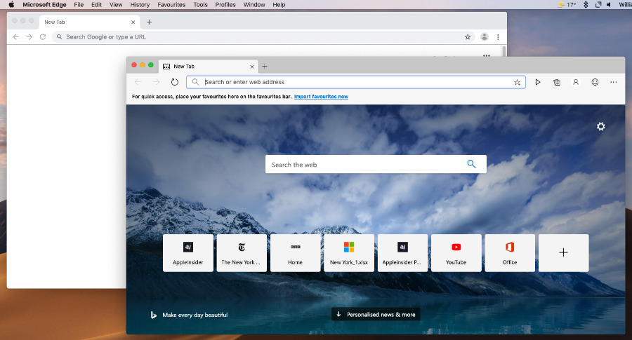
Only the fact that Microsoft Edge (foreground) includes news means you can distinguish it from Chrome (rear), at least until you open Collections.
More than anything else, though, Microsoft Edge looks like Google Chrome. It's so like Chrome that if you like Google's browser, you'll feel at home here, but equally there's been little reason to switch.
Similarly, if you don't like Chrome, then you won't like Edge — at least not until you try Collections.
This really is the differentiator between Edge and other browsers. It's closest to Safari's Reading List in that in one sense it's a way to save some bookmarks, but it's much more powerful.
Collections
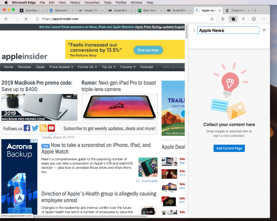
You can create as many different Collections as you like, having one for your favorite football team, another for that planned vacation in France, a third for work. In each case it's quick to create a collection, and then it's very quick to add items to it that you find online.
When you go to a website, and Collections is open but you haven't either created or selected a particular Collection, you get an Add Current Page button.
It doesn't always work, but you get it. Then when you have created a Collection and you've clicked into one of them, there's an Add current page link at the top.
Note that the button is capitalized and at the bottom of the pane, while the link is at the top and not capitalized. It sounds trivial, but it keeps taking a blink as you're trying to find where the function is, and remember why you get it where you do. That's compounded every time the button fails to work, too, making what will surely become a fast and smooth feature currently feel wearisome.
When you have Collections and you're showing a list of them, you get their name plus three thumbnail images representing whatever you've saved in there.
You should be and presumably will be able to drag items directly into the collection. That's particularly useful because it means rather than saving an entire web page, you should be able to just drag in an image, for instance.
In practice, in this early look, you can do this but you have to drag the image off the website and drop it onto the Collections icon, the tool that displays or hides the Collections pane. Drop it there and the webpage is replaced by just that image. Then you can click on the Add current page link to save it.
This isn't an example of Microsoft adding hoops to a task, it's a prime example of Microsoft not adding enough. When you see an image you want, and you've got all your Collections listed, the design makes you expect to be able to drag it over to one of those collections. Do something that the design doesn't expect, even if it's what that design appears to cry out to you to do, and it all clunks.
Microsoft seems to expect you to be adding to just one Collection in any given session, so actually if you first go into one, then you can drag anything there.
There is also a context menu method of adding any part of any webpage. Click on the image or highlight some text and then right-click, and you get a menu including Add to Collections. That works quickly and is a good way of swiftly amassing notes on a topic.
Managing research
You can do much management of the Collections, but you can do some. Your primary way of organizing your research is to create lots of specific Collections. However, you can write notes in there. And you can drag and drop items to rearrange them.
So you could collect a group of related items and make a note above them all to say so.
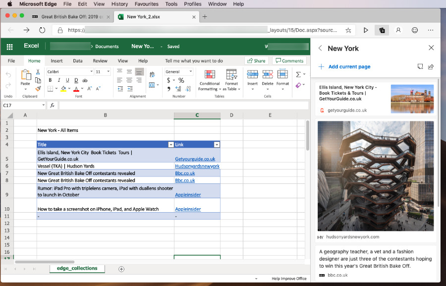
There is currently one Share option available in the Collections. You can share all of the items in a Collection — seemingly not one or some, only all — but you can solely share them to Microsoft Excel.
Of all the apps to share collections of website information to, you might expect Microsoft Word, OneNote or OneDrive before you thought of Excel.
However, it works. It sends to Microsoft Excel Online, regardless of whether you have Excel installed on your Mac or not, and it's quite slow. Yet once it's there, your Collections data is displayed as a table with two columns. There's the Title, which is the headline of the original webpage, and then a link to that page.
If the item in Collections is a text snippet from a web page, though, the snippet doesn't survive the journey to Excel. Instead, you get the headline from whatever page it came from, and a link back to that.
Surely that will be addressed as right now it removes some of the benefits of being able to save part of a website before it's updated.
And equally surely, there will come the ability to share one or some of the items, as the Excel table is prefixed with a heading that ends in the words "all items," as if that's your choice instead of the only option.
Collections isn't all
If we said before that Collections could be the reason to switch from another browser, we still think that. However, Microsoft Edge has had other improvements.
Chiefly we're now seeing some of the speed that we were promised before but simply weren't getting. Microsoft Edge is quick and if that's not enough reason to switch, it's definitely a contributing factor.
Just don't switch yet. As well as the Collections feature which Microsoft says quite clearly is unfinished, we also kept hitting problems with websites such as Netflix and YouTube.
YouTube would occasionally display an error and have to be reloaded, for instance, while we couldn't get Netflix.com to play at all.
This kind of thing is to be expected in a beta, and so is the fact that doubtlessly Microsoft Edge is bigger now than the final shipping version will be. Although, it takes up around a quarter as much disk space as Google Chrome. And remains about 15 times bigger than Safari.
Right now
It's not a good idea to switch to Microsoft Edge right now, but not because it has any great problems beyond those occasional hiccups with video on web pages. It's not worth it because at the moment it isn't offering anything you're not already getting on Safari or Chrome.
Collections is a head-turner and if it's limitations so far feel more like longer-term design issues than short-term beta bugs, we're still impressed with what works in it.
Keep up with AppleInsider by downloading the AppleInsider app for iOS, and follow us on YouTube, Twitter @appleinsider and Facebook for live, late-breaking coverage. You can also check out our official Instagram account for exclusive photos.
