The Twelve South Journal has just been updated for the latest generation iPad Pros. While the design has largely stayed the same, the updated folio is well-suited for Apple's professional and prosumer-oriented tablet.
A modern design
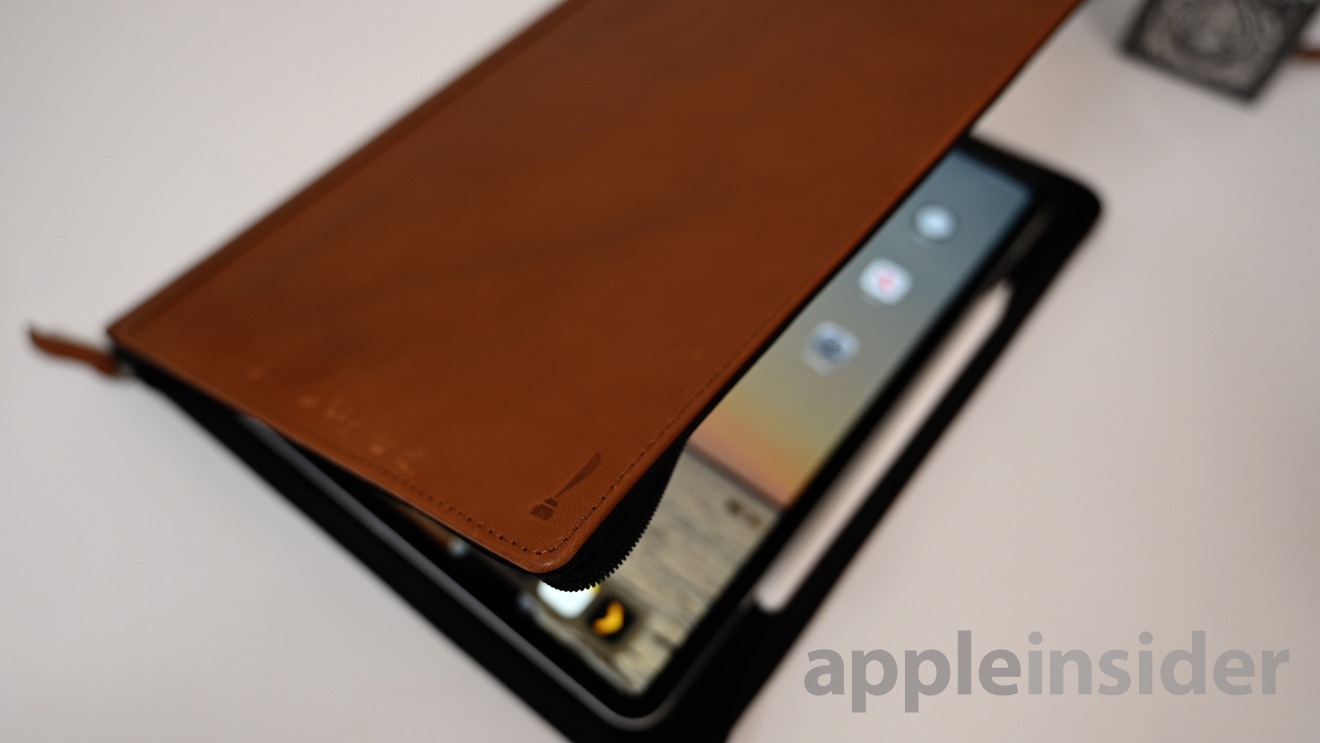
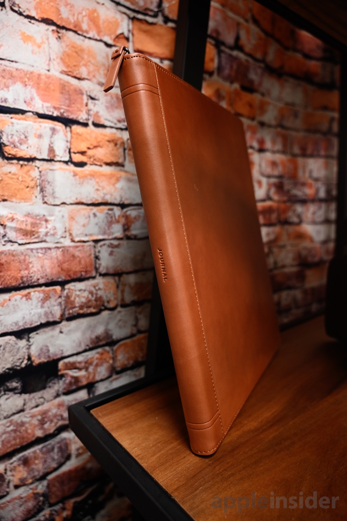
If you aren't familiar with the Twelve South Journal line, it consists of simple, modern, leather folios for a wide array of Apple products. Apple's entire iOS line all get the Journal treatment.
The Twelve South Journal cases are very similar to the iconic BookBook line, though they look more modern rather than vintage. This is a good choice for those that don't like the faux-book appearance.
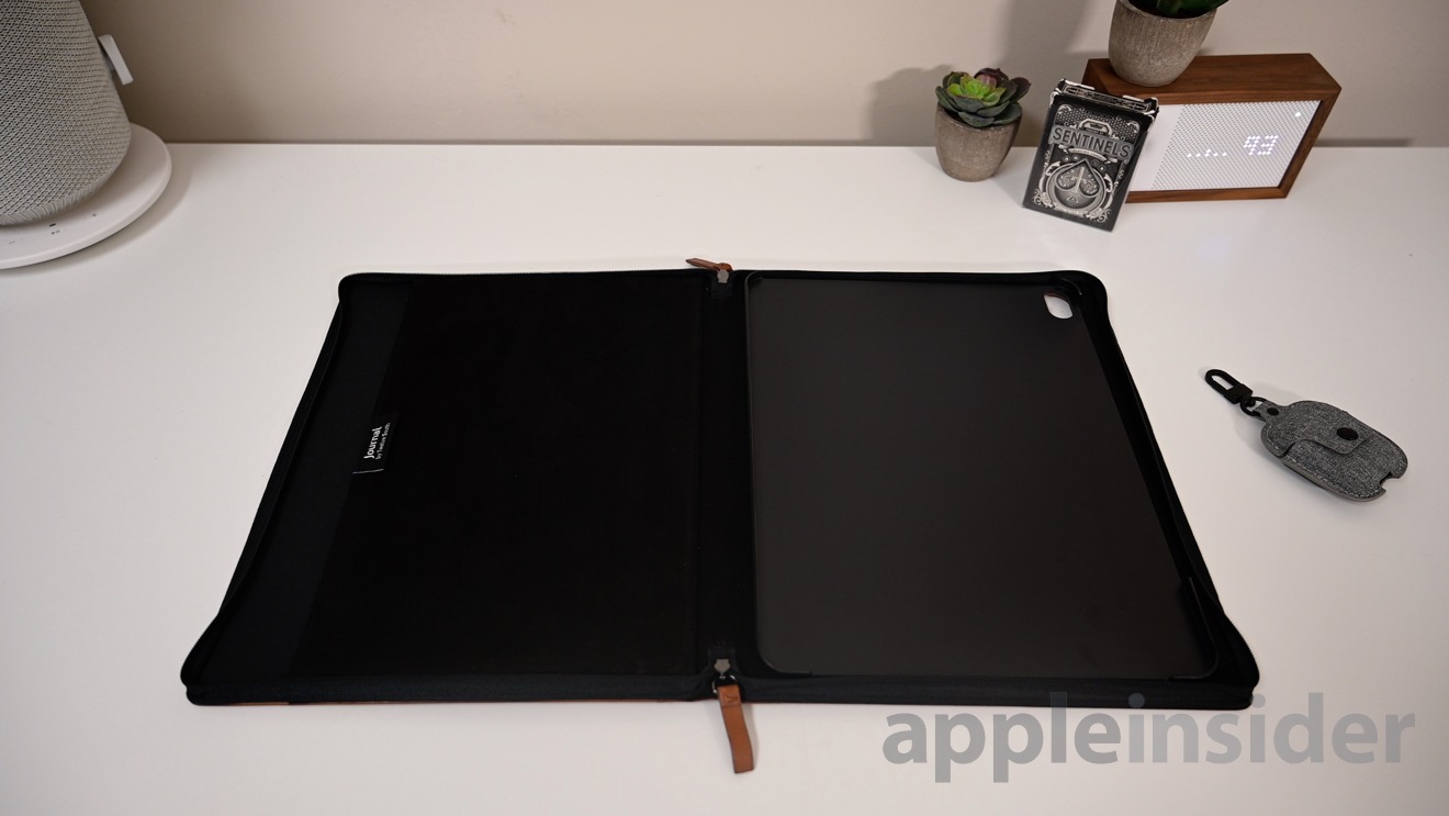
When you open Journal, there is a soft, microfiber pocket on the left-hand side. This pouch is ideal for common paperwork that you may carry with you — resumes, classwork, and the like.
The opposing side of Journal is where a plastic tray is attached. This is where your 11-inch or 12.9-inch iPad Pro will be situated. It snaps into place and can fairly easily be removed. There is ample room for the Apple Pencil to be magnetically attached on the right side so it can be protected and charged while zipped up.
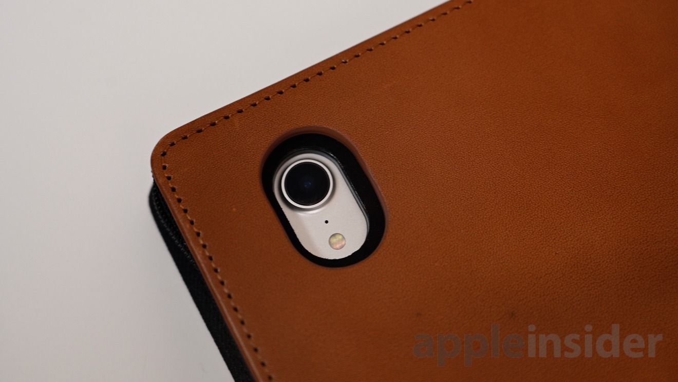
Those that like to use the iPad camera will also be happy to know the camera is unobscured with cutouts all the way through to the back. This can be used for any augmented reality features that work better on iPad than iPhone.
Multi-functional
Journal is much more than a standard folio, however. It also uses magnets and clever positioning to prop the iPad Pro up at different angles.
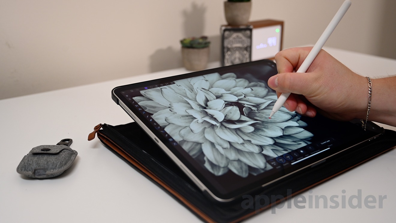
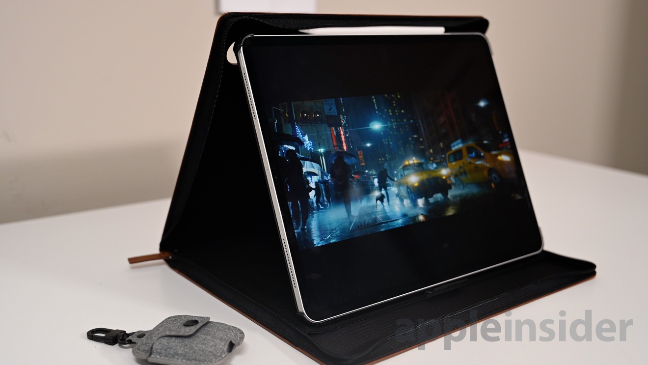
One positioning allows a shallow angle that is perfect for both typing, as well as sketching with Apple Pencil. A second is a more vertical setup that is perfect for acting as a display with the iPad Pro clipped between the two sides of the Journal.
Living with Journal for iPad Pro
We've used Journal for about a week or so and generally love the folio. Our problems stem mostly from the fact we generally prefer no case on our iPad, and the Journal adds significant bulk.
Typing on the iPad was good in the easel mode, feeling very sturdy under our tapping fingers. Sketching was also adequate, sitting at just the right angle.
Display mode was nice, though the footprint is quite big. I think we'd prefer using Twelve South Compass rather than the Journal for this because it is so much smaller, but if you have the space it will do just fine. We used it for kicking back and watching movies, though a mini-display for a presentation would also work well.
While in the vertical display mode, we didn't feel the iPad Pro was firmly planted enough either. It didn't seem it would fall, but very little seemed to be holding the iPad in position. It doesn't take much for the bottom to slide forward, at which point it would hit the zipper.
In the end, if you are hanging out with your iPad around the house or office, it may be a bit bulky. There you don't need a case to prop your iPad up to a display, nor do you need to tote around papers.
On the other hand, if you take your iPad Pro with you outside the house or office, Journal is great. It looks professional, allows you to store a few papers and the Apple Pencil, the camera can still be used, and is generally an outstanding folio for your iPad Pro.
Rating: 4 out of 5
Twelve South's updated Journal folio for iPad Pro is now available for $99 if you opt for the 11-inch and $119 if you have the 12.9.
 Andrew O'Hara





 Charles Martin

 Malcolm Owen
 William Gallagher
 Christine McKee

 Marko Zivkovic

 Mike Wuerthele






1 Comment