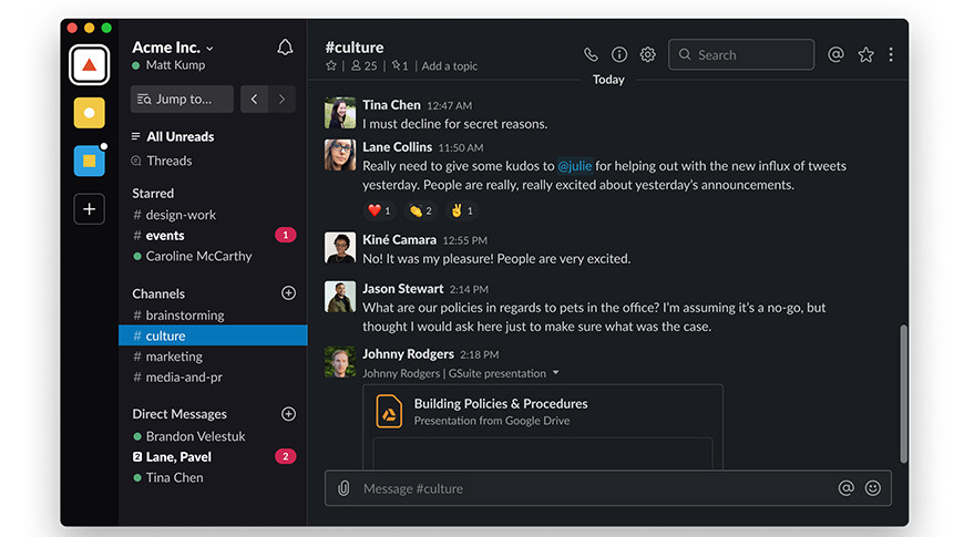
Much to the relief of night owls everywhere, Slack has finally released a dark mode for macOS, Windows, and Linux. Here's how to banish the white background, and head over to the dark.
If you're one of the people who have been holding their breath for a dark mode in Slack, it's time for you to breathe a little easier. Slack's HQ team has announced that dark mode has finally made an appearance on the desktop versions of the application.
If you use Slack on your Mac, you can try out dark mode today.
- Open Slack on your Mac
- Click on your name in the sidebar
- Select preferences
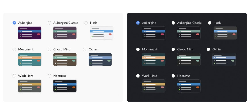
- Select themes
- Select a dark from the theme option
Slack has noted that you must be updated to version 4.0, and that you may need to restart the app a few times before the effects take place. All the old slack sidebar themes remain as well, but have been updated to work better with the new dark mode.
Dark mode is especially useful for those who work in low light or late at night. It is also beneficial to users with certain types of visual impairments.
In March of 2019, Slack released a dark mode for their iOS and Android apps, but tweeted "Dark mode isn't available on our desktop app right now, but we're working on it. Stay tuned for a brighter, darker future."
Six months later, Slack has finally given users the option to opt in to dark mode, should they want it. Responses from the community trend overwhelmingly positive.
SO! Finally! Here we have it: For those who need it, who want it, who have asked for it or who could just use it occasionally — dark mode is now available on the desktop app as well as mobile, for everyone. Read more: https://t.co/2KXjYlDWkU pic.twitter.com/OKZ0NfqybK
— Slack *does* have dark mode now, yes indeed. (@SlackHQ) September 12, 2019
Slack has also stated that in the near future users will be able to set Slack to comply with operating settings by clicking "sync with OS settings," but wished to roll out the dark mode update as soon as possible.
