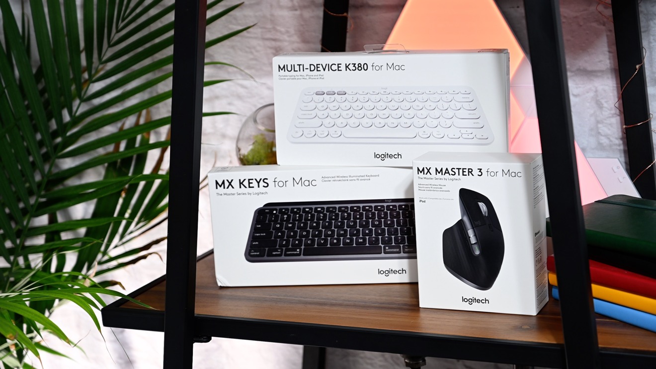
We check out Logitech's latest slate of peripherals designed for the Mac, including Apple-specific versions of the incredible MX Keys wireless keyboard and MX Master 3 wireless mouse.
Logitech released the products earlier this week and after we've had time to try them out, we are here with our impressions on Logitech's flagship devices for Mac.
Multi-device K380
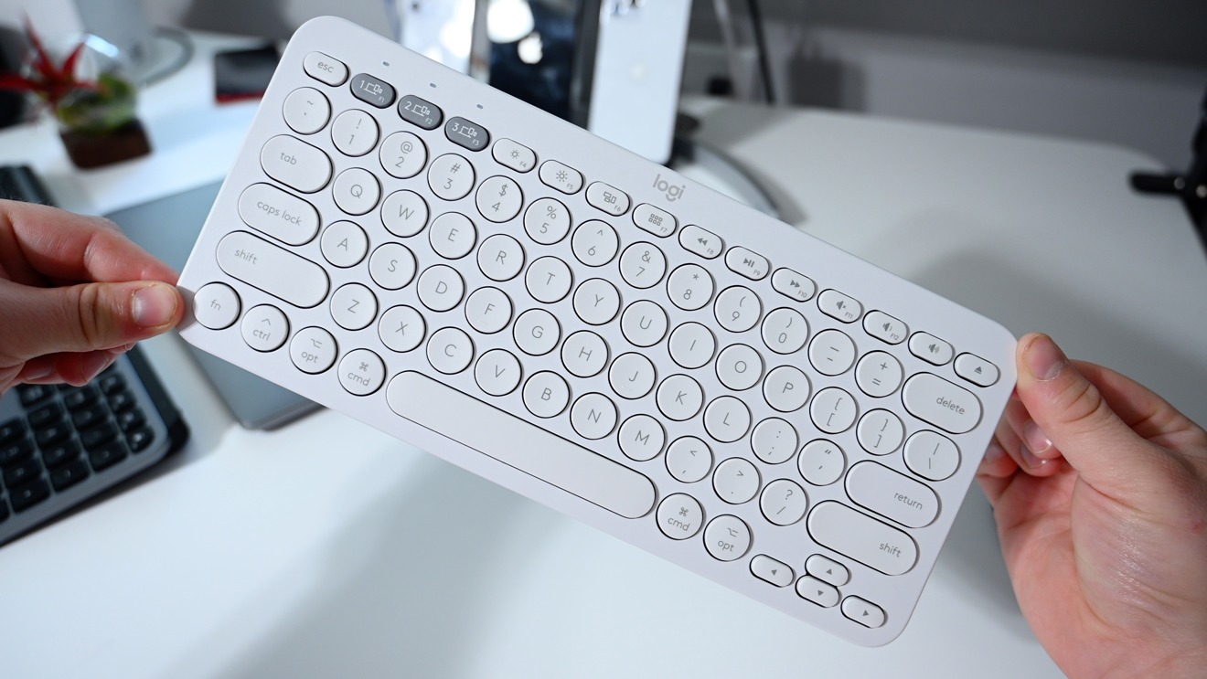
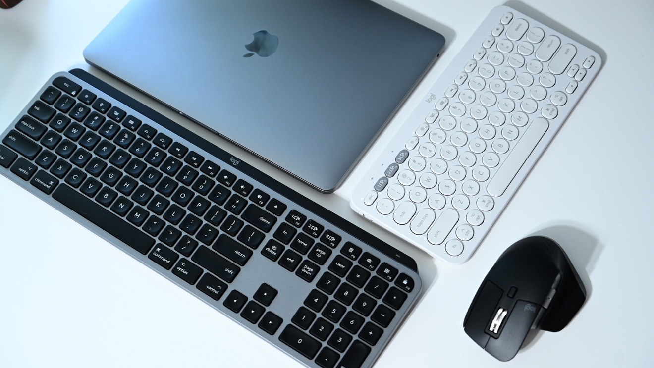
The most basic of the three devices is the K380. While the keyboard has been around for a while, but this white Mac-specific version is new.
This is a compact Mac keyboard that is similar in size to Apple's smaller Magic Keyboard. Its compact size lends itself well to smaller desks or a portable use case. Very easy to just toss in a bag.
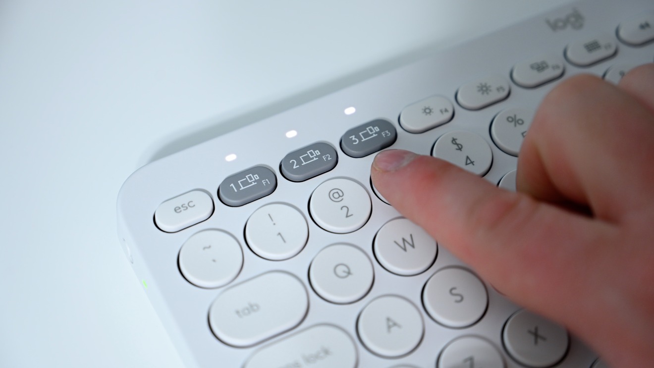
Unlike the two more-premium options below, the K380 runs on a pair of AAA batteries. There is an on/off toggle on the left side of the keyboard. It can connect to up to three devices, all of which are easily switched to with the light-grey device keys located on the left side of the function keys.
The keys are solid and tactile, though we aren't always fans of circular keycaps. If you have a tendency to hit toward the corners of the keys, you will miss them on these circular ones. Truth be told, though, a few days of typing and we adjusted quite quickly. It was only an issue when we went from a square keycap to these round ones constantly.
MX Keys for Mac
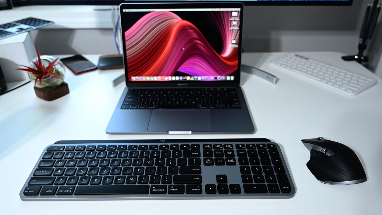
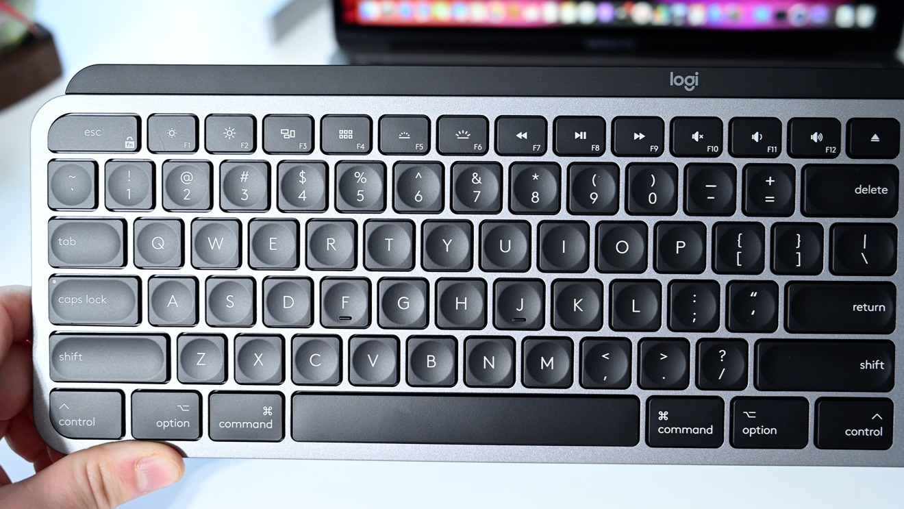
The new MX Keys for Mac is on another level, however. It builds in almost in every way on Apple's own Magic Keyboard. The only ways that Apple's keyboard wins out are in the solid tactile "click" when a key is pressed, the aluminum body, the Lightning connector, and the slim profile. But even those are up for debate.
The MX Keys for Mac keyboard is roughly the same size as Apple's but has an elevated back edge which can make it more ergonomic. We know there are those out there that think Apple's is too low and Logitech clearly agrees.
While Apple uses Lightning — which we like because we always have a Lightning cable on our desk for our iPhones — Logitech has gone with USB-C. USB-C is an excellent choice and we are thrilled to see that here.
MX Keys works over Bluetooth Low Energy or using Logitech's unifying receiver. The only problem we have is that Logitech continues to ship a USB-A version of its receiver. So if you want to use that, you need to have a dock or USB adapter to make it work with a modern Mac. Fortunately, Bluetooth is more than reliable and our connection method of choice. Still, Logitech needs to update its receiver.
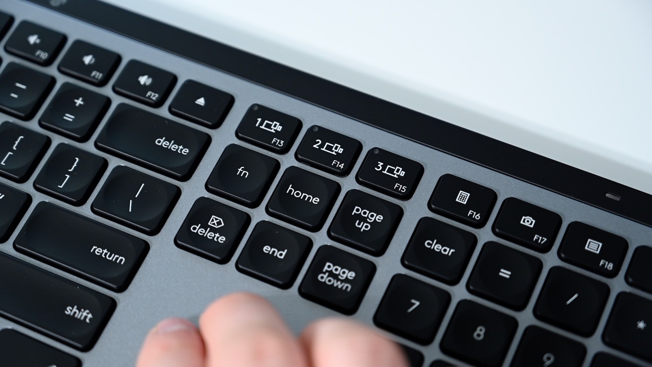
On top of the keyboard is a full row of function keys, dedicated to screen brightness, expose, app view, keyboard brightness, media controls, volume and eject. Apple's keyboard has basically all the same keys, except options for keyboard brightness and the mobile-specific shortcuts above the number pad for calculator, camera, and locking.
Speaking of the backlight, it is easily controlled from the function row, but it also adjusts automatically. The light will come on as your hands approach, creating a nice effect when in use.
If we could change something about the Logitech MX Keys for Mac, it would be to actually make it out of aluminum instead of just silver plastic. It still looks great and has a hefty weight, but it is clear that it isn't the same quality as Apple's true aluminum body.
MX Master 3
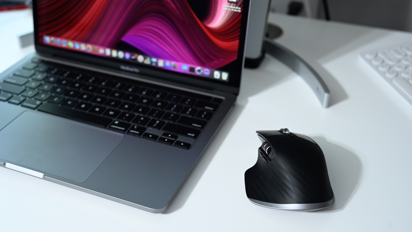
Our favorite of all of Logitech's new gear has to be the MX Master 3 for Mac. This mouse takes things to a new level with far more tricks up its sleeve than Apple's simple multi-touch Magic Mouse.
That isn't to say we aren't fans of Apple's Magic Mouse 2, but users have long debated the merits of its low profile as well as its poorly-positioned Lightning port. Users were required to turn the mouse on its side to connect it to a charger, making it unusable while being powered.
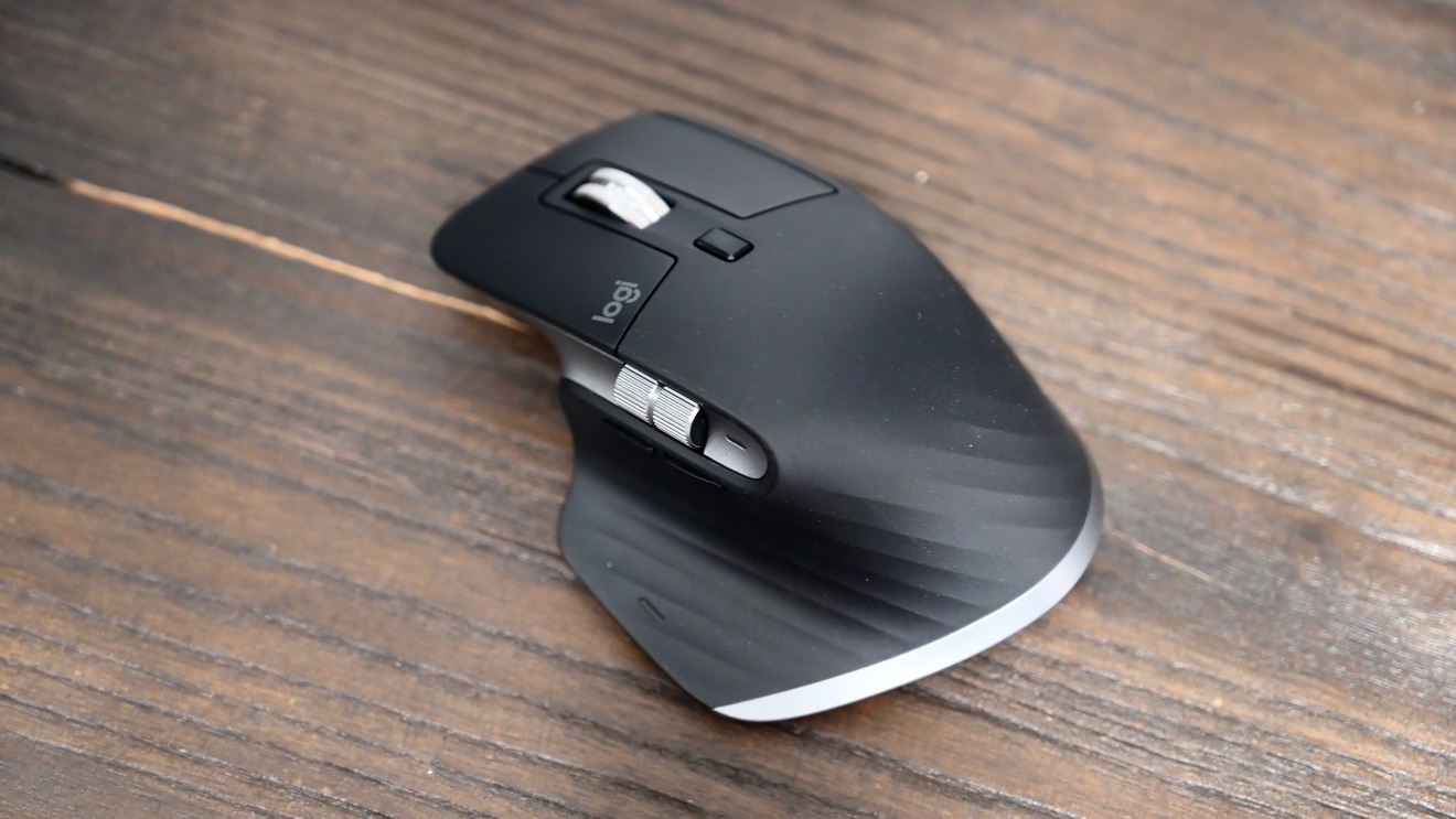
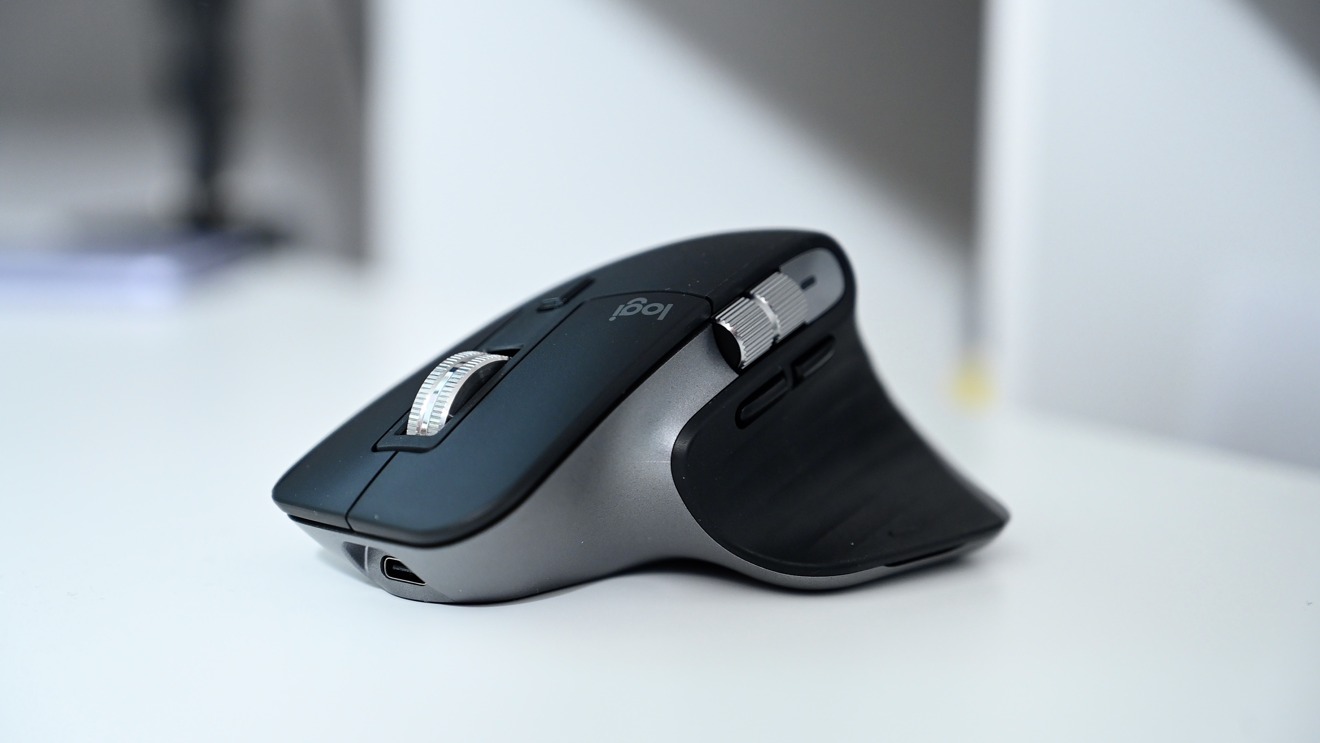
The MX Master 3 is again a familiar design, and very comfortable. It is much larger than the Magic Mouse 2, but it fills your hand and feels much more natural. It is outfitted with buttons and wheels on nearly every side, which all have different functions depending on the device and even the application that you are using.
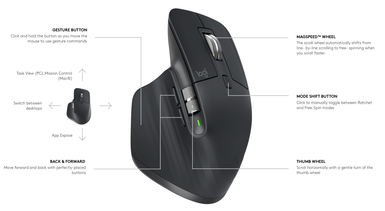
To start, the top has your standard left and right mouse buttons. We'd like it if these had a slight bit more tension to them as they click a bit too easily, but they are solid enough. Positioned between them is the scroll wheel. It is a new Magspeed wheel that is controlled by magnets.
The wheel is able to alternate between precision mode, where you can feel a solid *click* each time it moves, and free-spinning mode, where there is no resistance. In either mode you are able to spin the wheel and let it glide to a stop. The wheel is made of machined metal, which gives it a fantastic tactile feeling. To alternate between these modes, there is a small button just behind the wheel.
Along the left side is a metal horizontal scroll wheel. This has slightly more tension to it and can easily be controlled with your thumb. This scroll wheel is useful for a few purposes. If in Excel or Final Cut Pro X, it can act as a horizontal scroll wheel for your spreadsheet or timeline. If you are in Safari, it can act as the method to move between open tabs. Finally, within the operating system, it can be used as an easy way to switch between different desktops or full-screen apps.
The only issue is that we love using it to move between our full-screen apps, but whenever we are in an app like Safari or Final Cut, that function is overruled. We can disable those app-specific features but they are useful in their own right. It just gets confusing why sometimes it can jump between desktops and sometimes it can't and it takes a second for us to process that we are in a specific app.
Without the multi-touch feature of Apple's tracking products, it can be more difficult to move between these different desktops and apps. The wheel helps, but only sometimes.
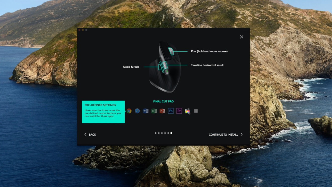
Below the wheel is another set of buttons. These too can be programmed. In Final Cut, they act as undo and redo buttons. In Safari, they can act as forward and back buttons.
Lastly, is the gesture button that rests below your thumb. Press this and slide the mouse to carry out a number of different functions. Hold and pull the mouse back to access app expose. Hold and push forward to open the different open desktops. And hold and move left or right to go between open apps. These can be customized and are very useful if properly utilized.
All of this can be controlled and configured with Logitech's simple utility. Without it, much of the mouse's features don't operate. It still acts as a mouse but the gestures and specialty buttons are less useful.
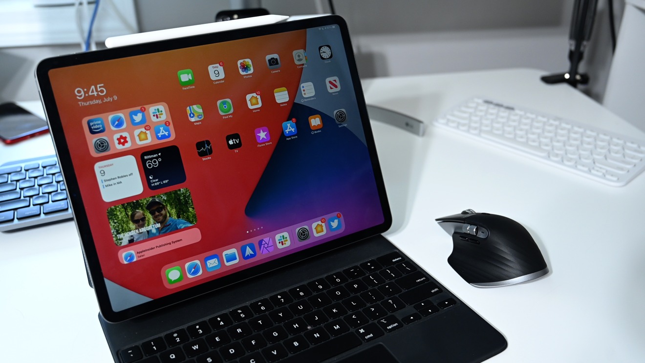
Logitech expressly advertises the MX Master 3 is designed for iPad as well, so obviously we had to put it to the test.
Once connected to our iPad Pro, the mouse was mostly smooth. It wasn't perfect and we did notice instances of it over-scrolling. It seems Apple's devices still are smoothest for tracking on iPad but this is likely the smoothest third-party one we've tried.
Of the additional buttons, only some work here on the iPad. The mouse is able to alternate between the two modes, right-click works, as does regular clicking. We were even surprised to see the gesture button worked, though not as powerfully as on the Mac. Which clicked, it will jump to your previous app, and if held, it opens the app switcher.
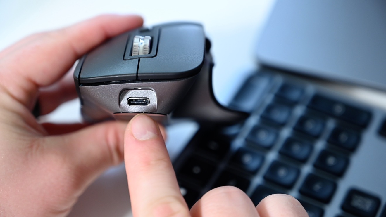
Other nice aspects of the Logitech MX Master 3 include USB-C charging, 4000DPI tracking, and support for tracking on any surface — including glass.
Rating: 4.5 out 5
Available now
All three of these new devices are available to order now and are perfect companions for your iPhone, iPad or Mac. They are cleanly designed to match Apple's aesthetic and all able to switch between any of the devices on the fly.
They build on what Apple already offered with more features, such as multi-device support, backlit keys, and a pile of customizable buttons.
We love that Logitech has brought these popular products with their own improvements to the Mac, specifically with Mac software and Apple's signature Command key.
Grab the MX Keys for Mac from Logitech for $99, the MX Master 3 for $99, and the K380 for $39.
