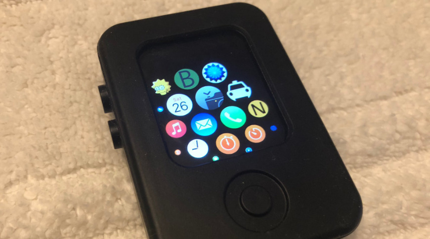
Images of an Apple Watch prototype inside a special security case have surfaced, showing pre-watchOS development software and a "Lisa Tester" app that shows how the finished springboard would look.
Apple tends to build prototype devices and disguise them in bulky cases to let testers use them without drawing unwanted eyes. The testing units are normally destroyed by Apple, but one has seemingly survived and images have been shared of the prototype running internal software.
The prototype in the images lacks a Digital Crown and runs internal testing software that existed pre-watchOS. 9to5Mac first reported the images, which were shared by Twitter user @AppleDemoYT.
Prototype Apple Watch with Security Case runs an Internal Pre-WatchOS 1.0 build, complete with internal testing apps and development settings. It's extremely amazing that something like this could still exist; without having been destroyed. #appleinternal pic.twitter.com/WDTWP0NpIp
— Apple Demo (@AppleDemoYT) December 27, 2020
One image displays a warning that the device had not been approved by the FCC and is not allowed to be sold. Some of the software is similar to the final watchOS 1.0 UI, but one app that stands out is an image of Lisa Simpson, a reference to the Apple Lisa Computer and an app used to test springboard and other functions.
Leaks from Apple's internal testing team rarely happen, as they are held under lock, key, and non-disclosure agreements. Another recent leak showed off Apple's 2007 iPhone assembly line which showed some of the quality assurance testing done on the new devices.


