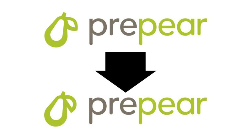
Prepear, which has been embroiled in a trademark dispute with Apple for nearly six months, on Tuesday said it settled the issue by changing the shape of a leaf in its logo.
Company co-founder and COO Russ Monson in a statement to iPhone in Canada said it had "amicably resolved its trademark issue with Apple." Monson said the company will "make a small change to our logo in the coming weeks," adding that Prepear is "happy" with the settlement terms.
The remedy, it seems, is a slightly tweaked logo. Prepear has adjusted the shape of a leaf in its pear emblem to make it visually distinct from Apple's iconic mark. The developer will use the revised symbol in its logo and app icon.
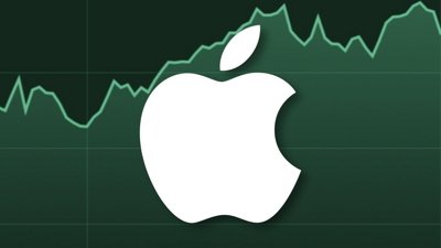
Apple first aired grievances over the app's logo when it formally objected to a trademark application from meal planning firm Super Healthy Kids last August. The mark is a simple outline of a pear with a singular almond-shaped leaf. Apple argued the design too closely resembled its "famous Apple Logo" and "creates a similar commercial impression."
Prepear later accused Apple of engaging in "bullying" tactics that cost the company "many thousands of dollars" and resulted in the layoff of at least one employee. Monson appealed to the public with a petition to "save the pear" and "end Apple's aggressive opposition of businesses with fruit logos."
"Apple has been opposing small businesses with fruit-related logos by starting expensive legal action even when those logos don't look anything like Apple's logo, or aren't in the same line of business as Apple at all," the petition read.
In December, Apple and Prepear entered settlement negotiations in the U.S.
 Mikey Campbell

 Charles Martin
 Mike Wuerthele
 Marko Zivkovic
 Malcolm Owen

 William Gallagher
 Amber Neely
-m.jpg)

24 Comments
It was already visually distinct.
Think of all the “free” publicity. Probably worth whatever their legal bill was.
Tell that to the employee who was laid off over such a ridiculous claim and minor change.
Remember how Apple records,… The record label for the Beatles… Made Apple computer and litter Apple Inc. jump through hoops in the past before they finally settled?
Are those two logos even from the same company? The top one is indistinguishable from the Apple logo and the bottom is something completely different. /s