Windows 11 will shake up its interface with a new Start menu and bring the taskbar toward the center of the screen, a move that echoes the positioning of the dock in macOS.
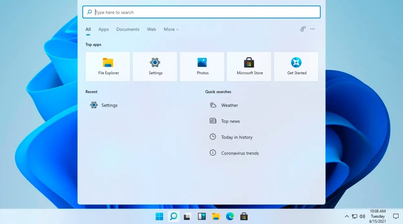
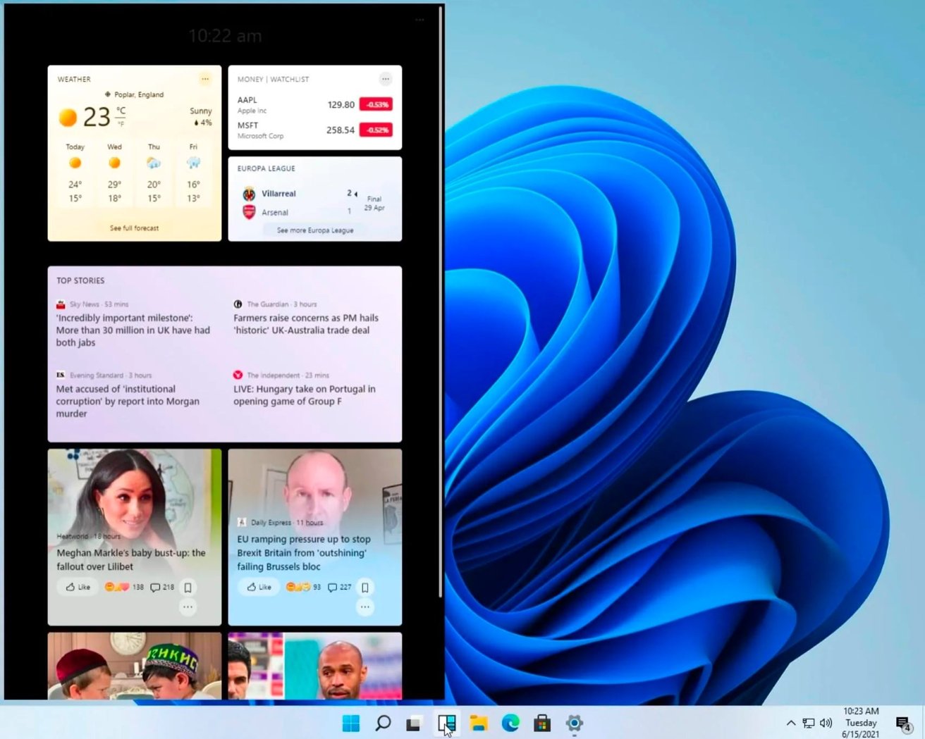
Microsoft's next iteration of Windows, Windows 11, may bring with it an overhauled interface, new images surfacing on Tuesday seem to indicate. Screenshots of the desktop allegedly show there are many small changes being brought into the operating system, which could simplify the interface from its current Windows 10 appearance.
First surfacing via Baidu before being more widely distributed, including images published by The Verge, Windows 11 combines many elements introduced with Windows 10X with some new ideas. One chief concept is the centralization of icons on the task bar.
Typically the apps in use appear next to the Start menu icon on the bottom left of the screen, but images show the row of icons are instead brought to the center of the bar itself. The Start icon is part of this new center-aligned group, while other elements such as volume controls and the clock, continue to reside in the bottom right corner.
The Start menu has been apparently simplified to what was previously shown in Windows 10X, losing the Live Tiles of Windows 10 in favor of pinned apps and recent files. Microsoft has also apparently gone for round corners throughout the interface, while widgets are appearing to make a comeback.
Among other changes are a new setup experience that takes users through the configuration process, and an improved Xbox app with deeper integration within Windows.
Microsoft is believed to be preparing to launch a new version of Windows, with executives teasing a "next generation of Windows" announcement for quite some time. A special event is expected to feature a preview of the next version of Windows on June 24.
Keep up with everything Apple in the weekly AppleInsider Podcast — and get a fast news update from AppleInsider Daily. Just say, "Hey, Siri," to your HomePod mini and ask for these podcasts, and our latest HomeKit Insider episode too.
If you want an ad-free main AppleInsider Podcast experience, you can support the AppleInsider podcast by subscribing for $5 per month through Apple's Podcasts app, or via Patreon if you prefer any other podcast player.
AppleInsider is also bringing you the best Apple-related deals for Amazon Prime Day 2021. There are bargains before, during, and even after Prime Day on June 21 and 22 — with every deal at your fingertips throughout the event.
 Malcolm Owen

-m.jpg)


 Thomas Sibilly

 Marko Zivkovic

 Wesley Hilliard

 Andrew Orr


-m.jpg)




30 Comments
Until they get rid of the old buggy code & the registry, what is the point? Windows is a shit show only due to their uncompromising backward compatibility stance. Instead just split it up into 2 lines. Make a version of Windows for people who need the old cruft & are still using applications written for DOS and make a version that is for normal people
Still 32-bit
It still looks kind of like it was designed by people who would really prefer if it was just a DOS prompt.
I hope that they unified the Setting and Control Panel, always baffled me why they have two locations/apps to change settings.
OMG it’s still happening. The microsoft Tick-Tock. Every other version of Windows is terrible. 10 was good, 8 was terrible, 7 was good, Vista was terrible, XP was good, ME was terrible.
From the looks of this interface it appears that Win 11 could well be a tock.