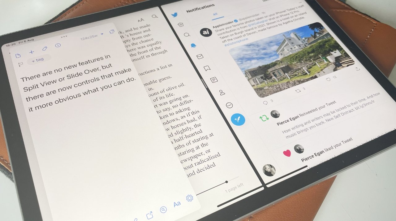
There's no change to how you can arrange iPad app windows in iPadOS-15, but there's a big improvement to the way you can do it.
Many of the updates in iPadOS 15 are small, but most are significant. For this latest release, Apple has retained all the previous features about splitting your screen between two or more apps, but it's made everything clearer.
So much clearer that you're more likely to use Split View and Slide Over. And then possibly because you're using them that often to show two apps on screen at once, you're going to wonder about showing two documents instead.
An evolution, not a revolution
If you're already used to using Split View, carry on. Nothing has been taken away, nothing has been changed — it's just been added to.
Specifically, what's been added is that there is now an on-screen control that appears in every app. It's a small ellipses icon at top center of the display, and just about the only time it doesn't appear is when you're at home screen.
Or in an app that still doesn't support Split View. There are a few.
For everything else, this one control makes splitting the screen between two apps, or arranging a third, a single tap away. Instead of having to know that this feature exists, you now get the control giving you a clue.
How to use the new control for Split View
- Open any app on your iPad
- Tap on the ellipses icon at the very top, center of the screen
- Three options are displayed as icons, tap on the center one
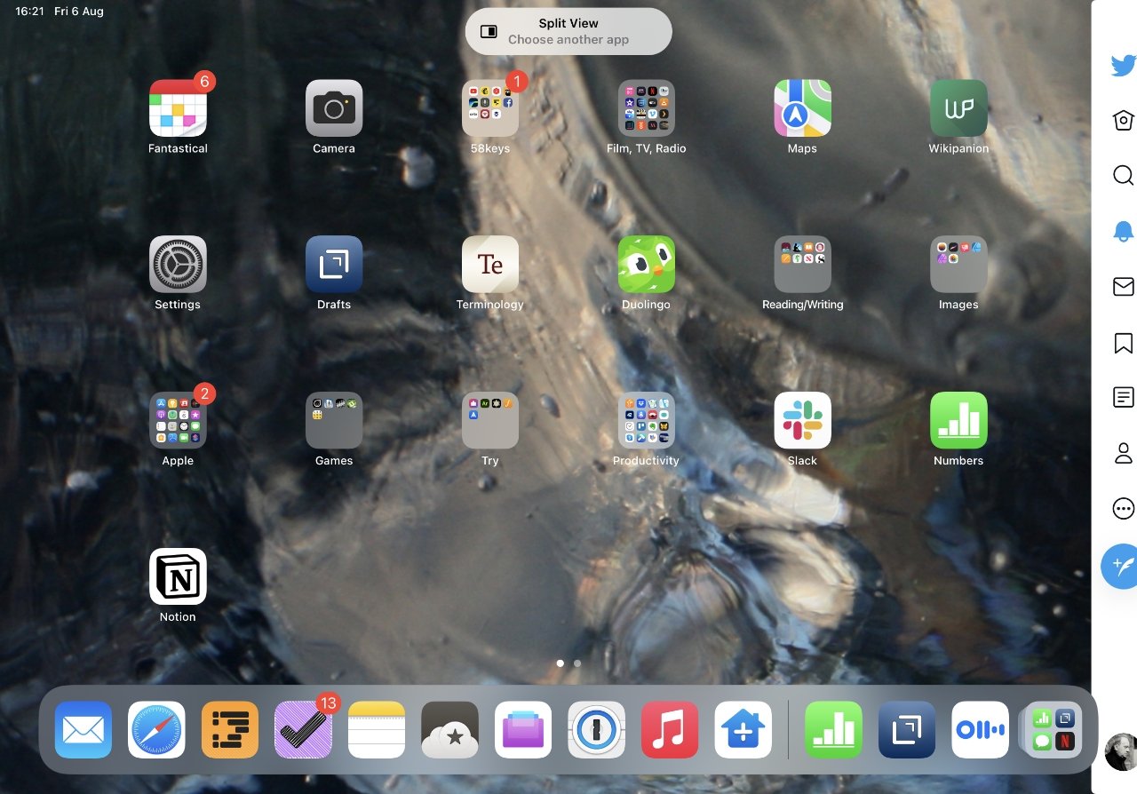
- Follow the prompt to pick another app
You've now got two apps open at once in Split View, each taking up half of the screen. Or rather, that's what you've got most of the time.
If the first app doesn't support Split View, you won't see the ellipses control. If the second app you want doesn't support it, you'll get a notification that you're out of luck.
It'll pop up a small panel with the name of that second app and the words "Split View not supported." You'll just have time to read that before it goes away, and this second app instead takes up the whole screen.
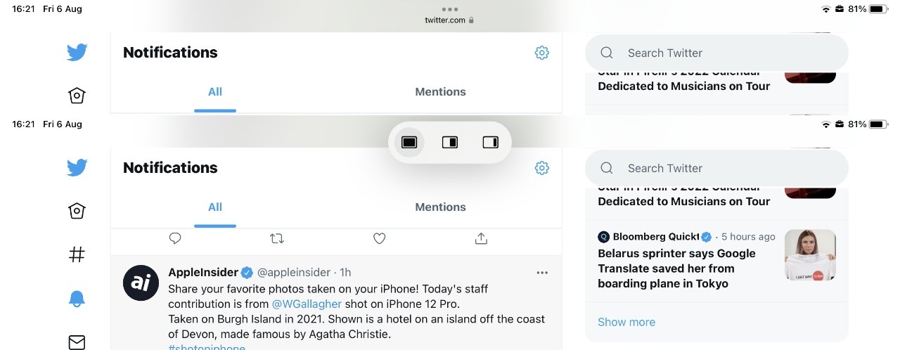
Practically every app has this ellipses icon at top center, and it expands out into these three controls
When that happens, you can't use Split View for these particular two apps, but you can still use Slide Over. It's not the same, you don't get both apps side by side, but you can tug one of them in from the side of the screen to do a little work on.
Then you can push it back out of the way. And as you're doing so, you can also work in the main app that's taking up full screen.
How to use Slide Over in iPadOS 15
- Open any app on your iPad
- Tap on the ellipses icon at the very top, center of the screen
- Three options are displayed as icons, but this time tap on the one at far right
- Follow the prompt to pick another app
Now you don't get any "unsupported" notifications, because your second app is full screen and not having to share the display side by side with anything. And your first app is now a Slide Over one.
Slide Over isn't just for when an app isn't playing nice. You can well choose to have an app be in Slide Over, if it's one you're only occasionally using in your work.
For when you do want to use it, there's a small grab handle that appears by the side of the display. Previously you just had to know that you had an app in Slide Over, now you get this visual indicator.
Tap or drag on that and you open up the Slide Over app. As before iPadOS 15, this app is shown in an iPhone-style and size window.
That just means it's got a small window, there's no limitation on what you can do with the app. It's still easier to use an app without pulling it on and pushing it off the screen, though, so make it an app that you are referring to, rather than concentrating on.
At some point, though, your needs change and now maybe that Slide Over app is the one you have to have your full attention on. And that's why there's a third option in the new control.
How to make a Slide Over or Split Screen app full screen
- Tap on the ellipses icon again
- Choose the first icon, which represents full screen
When you're using Slide Over, it's either because you just want to, or because at least one of the apps won't cope with Split View. In the former case, you'll again see the ellipses icon in both apps, and you can tap on either.
In the latter, when an app is stubbornly not supporting Split View, you'll only see the ellipses icon in the Slide Over app.
If you have two apps in Split View, each of them has this ellipses icon at the top center of their window. It doesn't matter which you tap on, they both bring up the control.
And once you've selected Full Screen in one of them, both apps are taken out of Split View. So tap on either, and you get the same effect.
It's when you don't tap the Full Screen icon that you see a difference. So far the Split View and Slide over icons in the ellipses tool have moved apps to the right of your screen.
When you've got two apps open full screen, the ellipses icon on the left app gives you controls for moving the app into Slide View on the left, not the right. It also gives you a button for moving a Split View app on the left into exactly the same place — and that control does nothing.
It doesn't react, doesn't let you change apps, it does nothing.
In Split View, both apps have the same ellipses tool at top center of their window and you can use either
That's confusing but it's part of making the ellipses control consistent, and practically training you to expect the options for full screen, Slide Over and Split View.
You can, though, still change which apps are open in Split View. You can also add an extra Slide Over app.
It's just that you can't use the ellipses control for them. Apple's new control is so much clearer than before because firstly it makes you aware of the options, then it lets you choose them.
Or most of them.
How to change one app in Split View
- With two apps open, swipe up from the bottom of the screen to bring up the dock
- Press and hold on an app in the dock, then drag it up
- Drop it over one window or the other, and that app will now be in Split View
Note that apps don't have to be permanently in your dock for this to work. If an app isn't in the dock already, launch it from the homescreen — and then it will appear in the dock's recent and current apps to the far right.
Be careful dragging the new app up onto an existing window. If you aim it just in the middle of the screen instead, you don't replace either of the Split View apps.
Instead, you make the new app into a Slide Over one.
How to open two Safari pages in Split View
With Safari, you can tap on a tab, and then drag it to the left or right to open it up in a new Split View. You've now got two copies of Safari and can use either or both of them, you can add or remove tabs in either, too.
If you are done with Split View, press and hold on the middle of the screen with the black divisor between the two apps. Swipe all the way to the left or right, and you stop Split View.
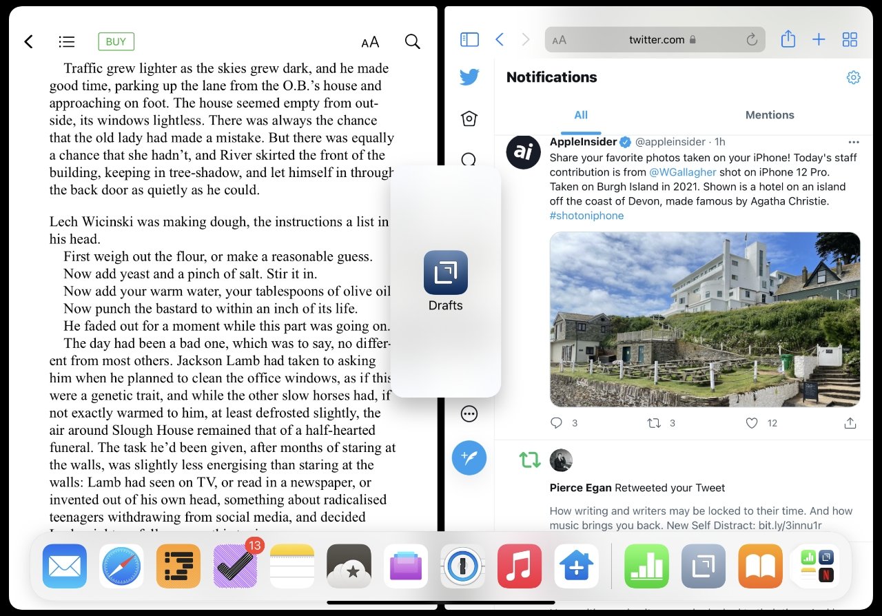
There's no control for this, but you can drag a third app onto the screen to make a new Slide Over one
How to open two documents side by side
- Open an app and a document
- Tap the ellipses and choose Split View
- When the homescreen is shown, tap on icon for the same app you're using
A second copy of the app, effectively, is opened and you can use both to open different apps.
The new control makes all the difference
So having two documents from the same app side by side is not obvious. But overall, the real benefit of iPadOS 15 in this line is that Apple has made it much, much more obvious what you can do — and how you can do it.
That alone is going to get more people trying out Split View, and Slide Over. And once you're used to it, you'll always use it.
