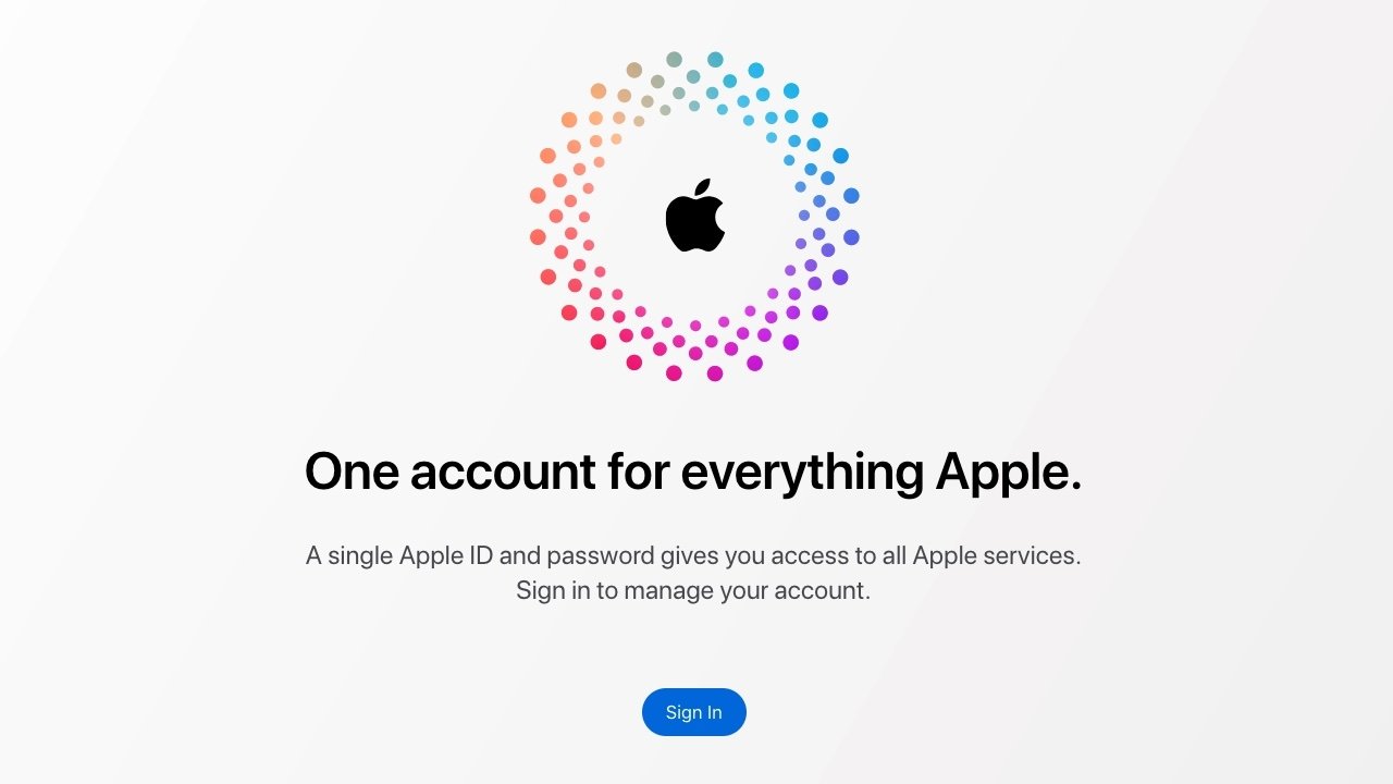
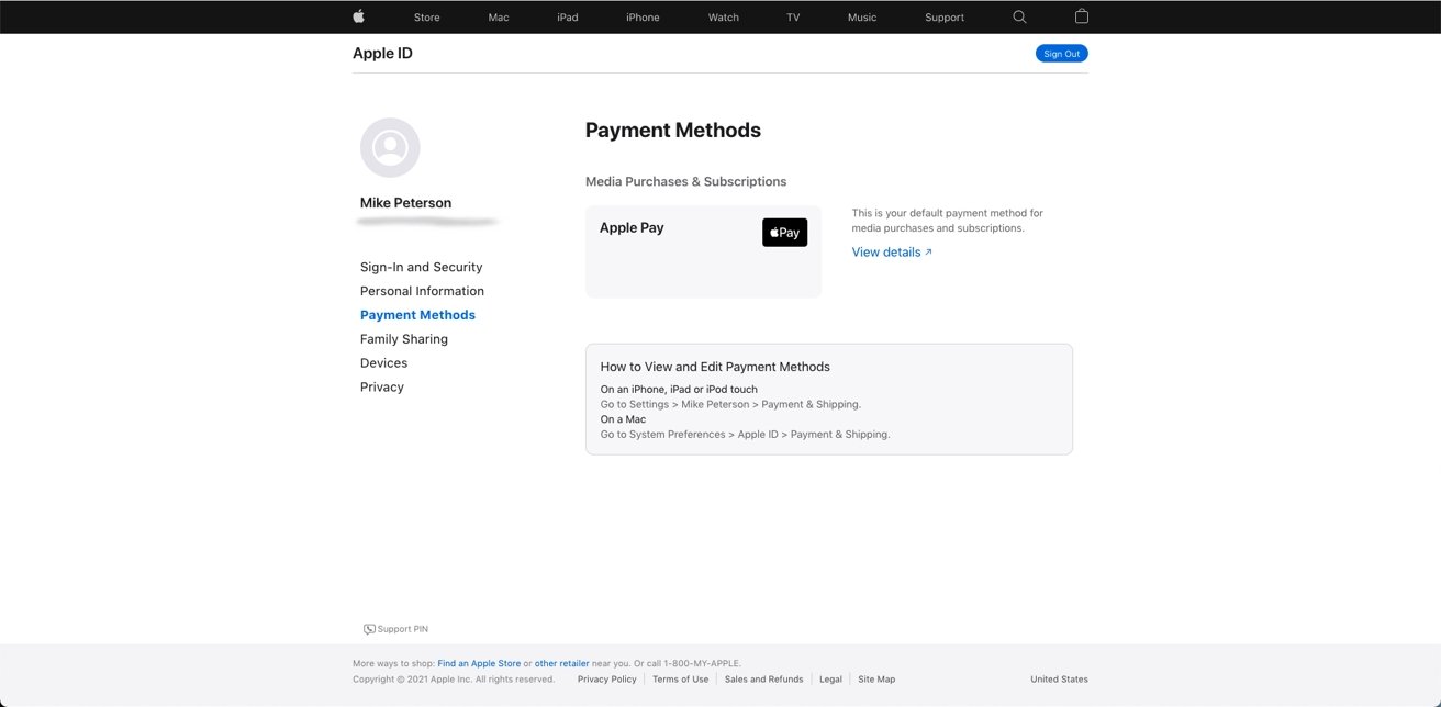
Apple has overhauled the design of its Apple ID website, giving the page an overall cleaner and more minimal aesthetic.
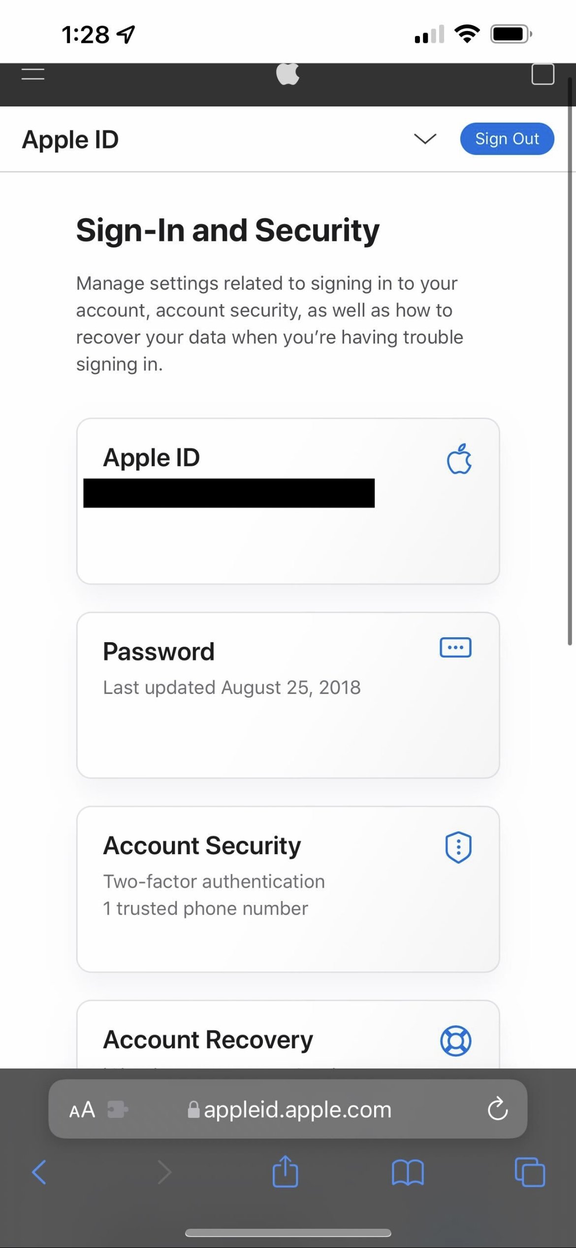
The new site, which allows users to manage various aspects of their Apple ID, features a new design based on cards for various features and abilities.
Users can also navigate through options on the left side, including Sign-In and Security, Personal Information, and Payment Methods. The card-based design is the same on mobile, although the left navigation options are available in dropdown menu.
In addition to the layout changes, the new site appears a bit faster since it's less graphically intensive as the prior design.
The Apple ID site contains a number of features for managing a user's Apple ecosystem, including all of a user's devices, their privacy settings, and Family Sharing options.
