Former Apple CDO Jony Ive's LoveFrom design studio on Wednesday unveiled the Terra Carta Seal, an award conferred upon companies that are leading efforts to create sustainable markets.
The Terra Carta, a charter that details a sustainable future through participation from private corporations, is part of Prince Charles' Sustainable Markets Initiative. The environmental enterprise focuses on climate change and was launched this year to "reunite people and planet, by giving fundamental rights and value to Nature."
This week, the inaugural Terra Carta Seal was awarded to 45 companies that have illustrated a commitment to limit global warming, reports Wallpaper. Recipients were announced at the start of the three-day Terra Carta Action Forum and include Amazon, Salesforce, HP, IBM and Apple chip partner TSMC, according to Forbes.
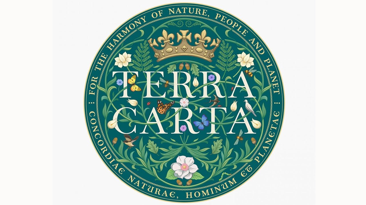
Wallpaper delves into the intricacies of LoveFrom's seal, which features a circular design that combines nature imagery with sacred geometry and a bespoke font. Inhabiting the central section of the seal are oak leaves, acorns, ferns, magnolia, phlox, ladybirds, monarch butterflies, birds and honey bees, elements that embody Terra Carta's green vision.
"We have reinforced the resilience and fertility of nature by allowing these natural elements to gently take control of the image," Ive said. "This is a visually lush celebration of the power of nature, and far from being superficial decoration, these natural forms are what gives the design life."
Vine-like elements outline seven overlapping circles and intertwine with "Terra Carta" lettering accomplished in a special LoveFrom Serif font developed by Ive. Inspired by the work of printer and type designer John Baskerville, the typeface is also used to reproduce the Terra Carta motto that surrounds the seal's graphic.
"We spent all this time creating a typeface that we would use for our identity: we didn't want a logo, we wanted something far more modest, more similar to a dialogue," Ive noted. "We thought we would use this typeface for our friends; we couldn't think of a better way to take advantage of a few years of work around the Terra Carta, and I think it works really quite well. You can see the typography is clearly central to the seal, but I was seduced by the gentle, slightly anarchic dominance of the natural references."
Ive and his team made multiple versions of the Terra Carta Seal, including digital representations and a paper seal that is printed on handmade paper produced by British paper mill James Cropper. The paper version, created through a laborious process of printing, embossing, die-cutting and micro-perforation, is attached to a commemorative summarium and presented to Terra Carta Seal winners.
In explaining the craftwork behind the seal, Ive said that his LoveFrom studio applies a design philosophy he cultivated while at Apple.
"For decades at Apple, one of my preoccupations has been this idea that if we have discipline in our thinking practice we hold ourselves accountable with our thinking, and the result is that we can be light with our implementation," Ive said. "This really has become such a central part to the way that we see problems and the way that we practice."
Ive is credited with designing the Terra Carta and in July launched the Terra Carta Design Lab, a competition that invited students from London's Royal College of Art to explore and create solutions for a sustainable future.
Ive departed Apple in 2019 to form his design consultancy and has since been contracted by the likes of Airbnb and Ferrari.
 AppleInsider Staff




-m.jpg)



 Christine McKee
 Malcolm Owen


 William Gallagher


 Mike Wuerthele
 Andrew Orr

-m.jpg)


26 Comments
Is this an exercise in heraldry, or is this supposed to be a recognizable logo, which companies can display to distinguish themselves in the marketplace?
If it’s supposed to be the latter, it’s a horrible design: much too intricate, too colorful => needs to much space, needs to be seen close up, etc.
Would have expected better logo design from such a famous company…
That’s just it. He isn’t doing what’s expected. The seal is a physical thing. And it has a digital one.
Jony is certainly capable of perfect symmetry, shape, and spacing as well as powerful simplicity. So I’m guessing it’s intentional.
This design is difficult to look at. It’s like he is trying so hard to distance himself from his Apple work that he has divorced himself from the qualities the made his work appealing. Even his company name LoveFrom fells nonsensical and contrived for no reason. LoveForm would have made sense and embraced his design Image.
The guy clearly likes the smell of his own farts.
If this doesn't represent how out of touch our elite class is, I don't know what does. Not to slam AI at all here, but this is a story about a former Apple design chief who "unveiled" a.....logo. But wait, it's better. It's a logo for an abstract "sustainability" initiative pushed by professional climate lunatic, hypocrite and royal bag of douche, Prince Chaahhles. I get why AI would cover it...Jonny Ive was responsible for such much that is Apple. But this guy seems to have become a caricature of himself. Remember the parodies about (fake) Apple product introductions? That's nearly what this is. I'd like it better if he, you know, designed a beautiful product that was functional and helped the environment.