Affiliate Disclosure
If you buy through our links, we may get a commission. Read our ethics policy.

Apple adds 123 new emoji in iOS 15.4 update

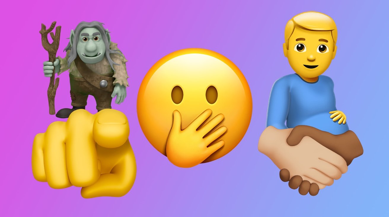
Apple's update to iOS 15.4 introduces 123 new emoji designs to the vast catalog of symbols, including "Melting Face," a "Troll," and the "Pregnant Man" icons.

Part of the Monday update to iOS 15.4, iPadOS 15.4, and Apple's other operating system updates, the influx of emoji consists of a total of 123 new designs. Of that group, the list includes all 112 that were approved for inclusion in Emoji 14.0 by the Unicode Consortium in September.

The group includes the largest number of smiley emojis introduced in an Apple update since iOS 11.1, reports Emojipedia. The group includes "Melting Face," "Face with Peeking Eye," and "Face Holding Back Tears."

"Face with Open Eyes and Hand Over Mouth," is a familiar symbol, as it is the same as "Face with Hand Over Mouth: from iOS 11.1. For iOS 15.4, "Face with Hand Over Mouth" was updated with closed eyes, to match an expression of amusement as used by Google and other emoji providers.

The list also includes two gender-neutral person emojis, including "Person with Crown" and the controversial "Pregnant Person" and "Pregnant Man." The Body Parts category has a "Biting Lip," and a new fantasy creature subcategory adds "Troll."

Seven new gesture emojis are in the batch, such as "Rightwards Hand" and "Leftwards Hand," "Heart Hands," and "Index Pointing at the Viewer." The "Handshake Emoji" has been updated with a selection of 25 new skin tone options.

The last 18 new emoji cover a variety of categories, and consist of elements such as "Empty Nest" and "Nest with Eggs," "Beans," "Jar," "Playground Buoy," and "Identity Card."

The new emoji are accessible by the software keyboard typically included in messaging apps, and can be used after completing the update to iOS 15.4.
8 Comments

mikethemartian 18 Years · 1493 comments

For a company whose design philosophy is minimalism they create a lot of garish emojis.

jimh2 8 Years · 670 comments

We have way too many emoji’s for them to remain useful. Too much of a good idea. 

baconstang 10 Years · 1160 comments

Too many.  I quit using them a couple of years ago.

StrangeDays 8 Years · 12986 comments

For a company whose design philosophy is minimalism they create a lot of garish emojis.

Incorrect. Apple doesn't create the new characters in the unicode emoji character set, it merely implements them. If they were to not implement them, users would get a broken character when another use sends one. 

As for the artistic merit of the characters themselves, IMO Apple's are among the most pleasant implementations, and likely most iconic. 

jimh2 said:
We have way too many emoji’s for them to remain useful. Too much of a good idea. 

Not really -- you aren't require to use every character all of the time. You can continue to use only the ones that are of frequent use to you, and others can do the same. It's much like color swatches at the paint store -- every shade is not for everybody. This is also how words work. Use what you like.

mikethemartian 18 Years · 1493 comments

For a company whose design philosophy is minimalism they create a lot of garish emojis.
Incorrect. Apple doesn't create the new characters in the unicode emoji character set, it merely implements them. If they were to not implement them, users would get a broken character when another use sends one. 

As for the artistic merit of the characters themselves, IMO Apple's are among the most pleasant implementations, and likely most iconic. 

jimh2 said:
We have way too many emoji’s for them to remain useful. Too much of a good idea. 
Not really -- you aren't require to use every character all of the time. You can continue to use only the ones that are of frequent use to you, and others can do the same. It's much like color swatches at the paint store -- every shade is not for everybody. This is also how words work. Use what you like.

How is that incorrect? I didn’t say that they shouldn’t implement them only that their implementations are garish and don’t coincide with their otherwise minimalist design language. Just because you like them doesn’t mean that statement isn’t true.