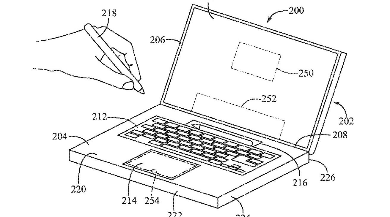
Apple keeps researching how to have the iPad-centric Apple Pencil do the work of the old Touch Bar on the surface of a future MacBook Pro.
It's just a patent application and not only may one of those not be granted, it may not ever lead to an actual product if it is. Except this patent application made public on May 9, 2024 is an expansion of a series of previous ones — including some that have actually been granted.
So this is not a skunkwork project by a few Apple people, it is a project that at least was under continuous development. Mildly hidden under the dull title of "Mountable tool computer input," it's really about how an Apple Pencil could be used with a MacBook Pro.
That sounds as if it obviously means how it could be used to draw and write on a MacBook Pro screen. But perhaps with a mind to Steve Jobs's famous criticism of how "you have to get 'em, put 'em away, you lose 'em, yuck," it is more about storing the Apple Pencil.
There's a chance that Apple is only thinking of a MacBook Pro for very tidy people, as just like the previous versions of the patent application, this new one talks of people having a separate device for drawing on.
"[Some] computing devices, such as laptop computers, can have a touch screen positioned in or adjacent to a keyboard of the device that can be configured to provide many more functions than a set of traditional keys," begins the patent.
"However, an ancillary touch screen can be difficult to use in some cases," it continues. "Touch typists may dislike using the touch screen because it lacks tactile feedback as compared to a set of mechanical, moving keys."
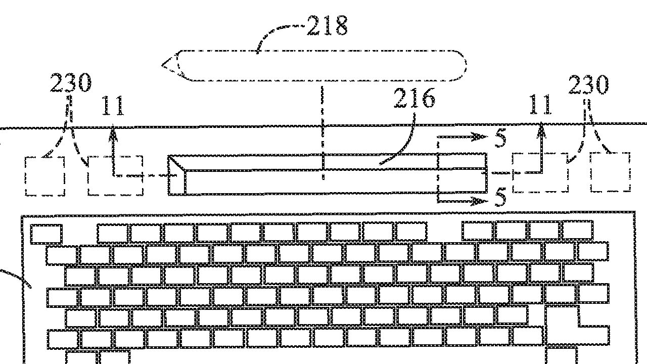
Specifically, that they use the Pencil in at least roughly the area where Apple used to include a Touch Bar.
"The touch screen is also generally positioned near the user's hands and therefore may be prone to being obscured from the user's vision by their own hands," says the patent. "Also, even when the user looks at the touch screen, it is positioned at a different focal distance from the user as compared to the main display, so the user must readjust their head or eyes to effectively read and interact with the touch screen..."
It's a wonder Apple ever bothered with a Touch Bar. Yet the company wants to do something with that space, and it persists. The Bar may be replaced by a touch panel.
"The touch panel may include a touch-sensitive surface that, in response to detecting a touch event, generates a signal that can be processed and used by other components of the electronic device," continues Apple. "A display component of the electronic device may display textual and/or graphical display elements representing selectable virtual buttons or icons, and the touch sensitive surface may allow a user to navigate and change the content displayed on the display screen."
None of this would immediately seem to fix Apple's criticisms of the Touch Bar. A user would have to break off typing, look for the Pencil to pick it up out of the holder, then write or tap with it on the touch sensitive strip.
A stylus may be more natural than a Touch Bar
Yet that is more natural than the Touch Bar. While it stops the user typing, it feels more natural to look away from the screen to find the Pencil.
And rather than trying to remember a control that is a small spot on the Touch Bar — which also moves — then picking up a Pencil is a lot easier.
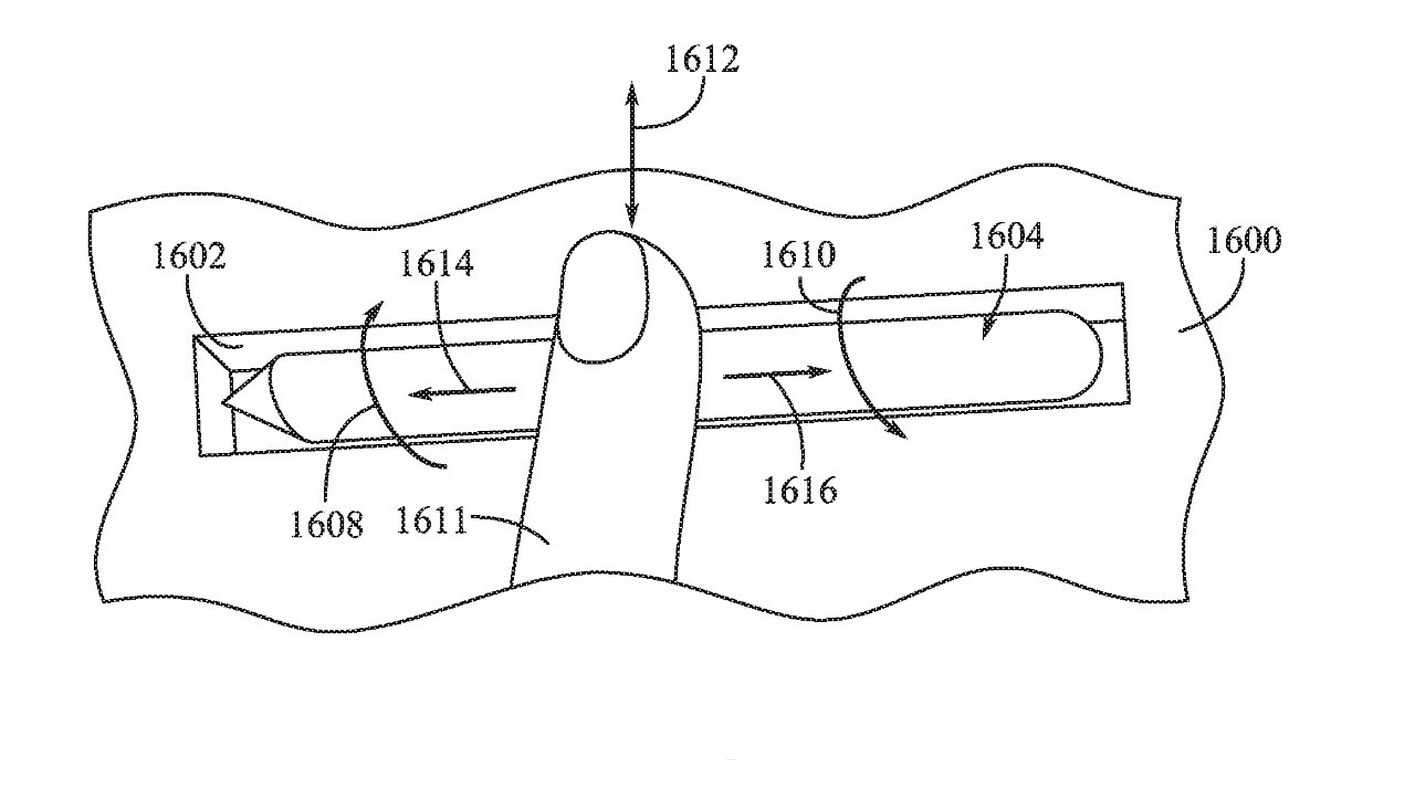
There is one more thing, though. In a few patent drawings, a user is shown tapping on the Pencil, or touching it, or swiping across it.
The Apple Pencil could then show Touch Bar-like controls while it's in the holder.
This patent application, like its previous granted versions, is credited to Paul X. Wang, Dinesh C. Mathew, and John S. Camp. Wang is listed on many previous patents for Apple, including more on user input devices.
