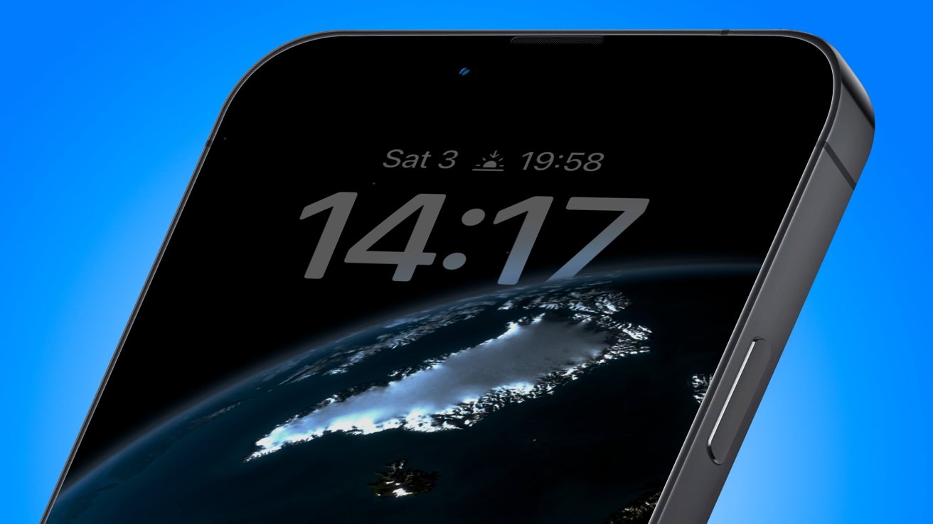
More details of how the always-on display of the iPhone 14 Pro could work have surfaced, with the new iOS 16 lock screen deeply integrating with the hardware feature.
There have long been rumors that the next generation of iPhone will offer some form of always-on display, but not much on how it will actually appear to users. In new details leaked days before Apple's special event, it seems that the lock screen will be catered for with the new releases.
The new lock screen in iOS 16 includes new widgets and a customizable clock, which can float behind the subject of the wallpaper. In a leak to MacRumors, the depth effect could play a part in the always-on element.
Rather than displaying the entire wallpaper, it is claimed that the subject will still be visible, but the background behind them will be dark, to save on power. The foreground elements will be dimmed, but can also be tinted with color and feature edge highlights, varying based on the user's customization.
Elements such as widgets will be visible, but they will fade in and out on a timer, so it doesn't burn into the OLED panel. These configurable elements will appear the same way in both fully-illuminated and always-on states, so you can't have a different wallpaper for each, for example.
Notifications, as it appears in iOS 16's beta, will appear at the bottom of the display, but will be visible for about 10 second before disappearing. On wake-up, the notifications will animate and appear as normal.
Users may also be able to set a counter for notifications at the bottom of the display when in the always-on mode.
At the top of the display, the signal and power indicators will disappear from view.


