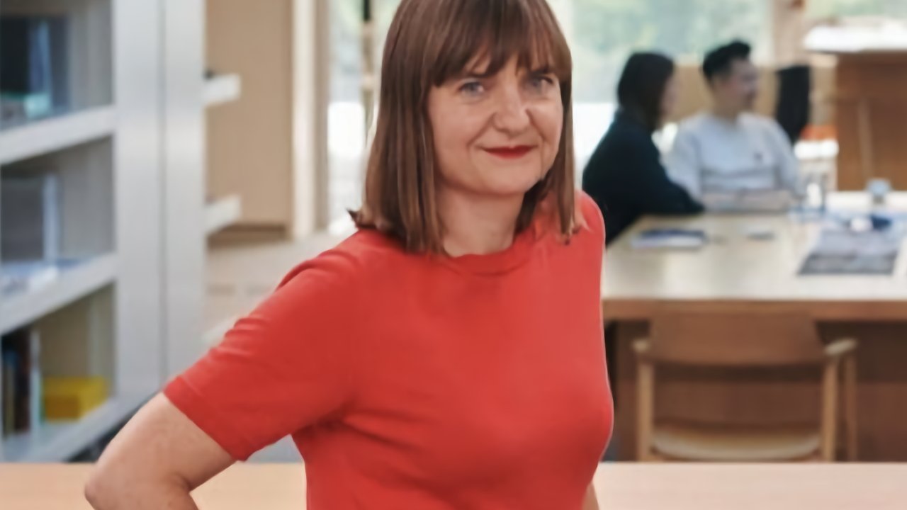
Apple's vice president of industrial design, Evans Hankey, is leaving the company three years after she was appointed Jony Ive's replacement.
After Ive left, Hankey was made the head of hardware design while Alan Dye was design lead for software and user interfaces. Hankey had already been with Apple and in the design team for many years before stepping up to lead it, and her departure creates a major gap for Apple.
According to Bloomberg, Hankey has told colleagues that she will remain in post for the next six months. No details have been given of what she is leaving to do, nor of whether there is a succession plan.
"Apple's design team brings together expert creatives from around the world and across many disciplines to imagine products that are undeniably Apple," an Apple spokesperson said in a statement to Bloomberg. "The senior design team has strong leaders with decades of experience."
"Evans plans to stay on as we work through the transition," continued the spokesperson. "We'd like to thank her for her leadership and contributions."
Evans has become a more public figure since taking over the hardware design team, including speaking to publications such as Wallpaper* about the team's moving in to Apple Park.
"It's just so quiet and calming," Hankey told the magazine. "We never really understood what that would mean for us until we'd been here for a while. It's been designed for serendipitous meetings as well as collaboration."
Hankey's counterpart in software, Alan Dye, is reportedly staying with Apple.
37 Comments
I think I would have preferred Alan Dye to depart over Evans Hankey.
The industrial design of the MBP14/16 and M2 MBA are great. I've been using a work issued M1 Pro MBP16 for the past that month, and it's probably the best Mac laptop ever. It finally looks and feels like a workstation laptop. Always cool to the touch. Incredibly quiet. It leaves an impression of dependability, performance, and robustness that prior Mac laptops have not. It has its quirks that I'd like to change, but overall quite impressed. That's Evans Hankey leading the design team. The iMac 24? I'm neutral on, and I haven't used it.
I'm not sure if Alan Dye is a net positive. The dynamic island looks to be promising, but I haven't used it, and may not even get the chance by the time I have a new iPhone. The GUI designs have been treading water at best? He seems to like dynamic UI elements but hasn't learned where and when dynamic UI elements should be used. The Safari UI has dynamically scaling browser tabs. They widen or shorten depending on input focus. Then, Stage Manager applied that to the app views.
Users do not like things that dynamically change without their input. Perhaps I'm speaking two generally here, and it's just me, but this type of dynamism is disorienting to users. As soon as I saw them demo Stage Manager where windows were moving and changing sizes without user input, I immediately knew people were going to have problems with that, and Apple would have to at least have a Setting to turn off auto-sizing, auto-placement in Stage Manager. A person at Dye's level should have learned that when he was in his 20s, perhaps even earlier. It's an affectation that he really needs to learn when to apply it.
Edit: The iPad UI team should really thinking of the UI as a direct manipulation UI. Users are moving and touching physical objects. There's a bit of gesture input UI in iPadOS that makes it harder or unpleasant to use. Been waiting for them to understand this for the longest time.
She’s awesome. This sucks. She did great keeping the Ive aesthetic while expanding possibilities. The new MacBooks and iPads look and perform better than ever.
this sucks really bad.