Following months in beta testing, Apple has now officially released macOS Sonoma, which brings dozens of small yet significant updates to the Mac.
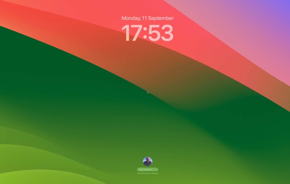
The most visible change comes when you install macOS Sonoma and then restart. Alongside the new and half-muted, half-garish green and pink wallpaper, there is a new Lock Screen.
It looks very similar to the Lock Screen on an iPhone or iPad, with a prominent clock at the top. There's also a more neatly and even artistically done option at the bottom for switching between different users of the Mac.
Widgets
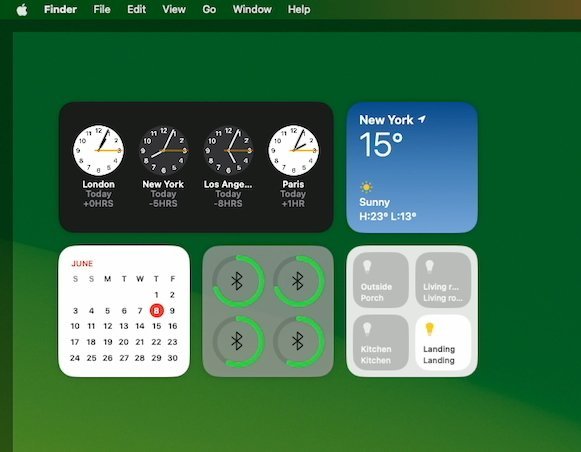
Unlocking the Mac and going to the Desktop, there is initially no obvious change beyond the wallpaper. However, you can right click and choose Edit Widgets to change that.
When you do so, a rather wide and squat-looking box pops up from the dock. It's too large to be called a pop-up, yet too flat-looking to be a regular window, but it does contain all of your widgets.
Previously widgets were accessed via the strip of them that can pop out from the right side of your Mac screen. They still can — all of that old widget functionality is still here.
But the drawer that pops up with widgets is definitely an improvement because it presents more widgets, and does so more clearly. It's quick to search for ones, or to just scroll to them.
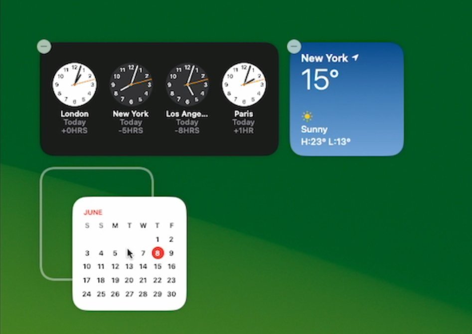
Then when you've chosen a widget, rather than them just appearing in that side panel, you drag them out to anywhere on your desktop.
Or almost anywhere. Widgets can in theory be positioned at any point, but Apple does have one restriction.
While the very first widget can truly be positioned at any point on the screen whatsoever, any subsequent widget that you try to place close to it, can't be. You can drag a widget to another point across the screen and there position it to the pixel you choose, but if a new widget is close to an old one, it's different.
Drag one widget near another and you get a white outline of where that widget can go that will make it look neat beside another. More than guidelines, they are snap-to guides, and your widget jumps to them.
It means you will always keep your widgets neat, and can't ever have overlapping ones.
Interactive widgets — or not
But regardless of where they are on the screen, widgets in macOS Sonoma are now interactive. So if you have the Home widget and a set of smart lights, you can click right on the widget and control those lights without ever opening the Home app.
Plus, the widgets are full color when you're intentionally using them, but they fade rather gorgeously into the background when you are in another app.
Then that drawer of widgets holds a surprise. Every widget on your iPhone is also in that drawer on your Mac, even if you don't have the equivalent macOS app.
Only, you're still better off getting the Mac equivalent. All a lot of these iPhone widgets can do is tell you to open the iPhone app.
Safari
Safari always feels like an app that is separate from macOS, but it isn't. Key to the macOS Sonoma updates are what that brings to Apple's browser.
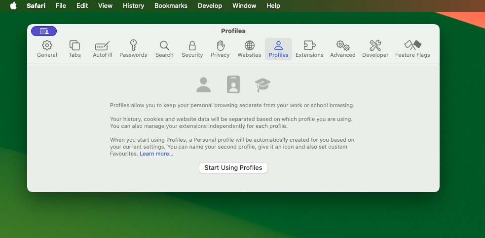
Previously you've had the ability to create Tab Groups, and so click between sets of website tabs you need for your different roles. Now you can go further and create Profiles.
It's a similar idea to Tab Groups in that once you've set up a Work profile, you can switch to it and see just what you need for work. But you still set up and use Tab Groups the same way.
What Profiles do is let you be one person on this site, and another on another. For instance, maybe you have to use X/Twitter on behalf of your company during the day, but somehow you still like it there for yourself in the evening.
Set up a Work and a Home profile, and switch between them as you need. Then when you're in the Work profile and you go to Twitter to log in, automatically log in under your company account.
Then in the evening, without closing that Work profile, you can click to open a window in your Personal profile. And now just going to Twitter, you are automatically logged in as yourself.
Privacy and Sharing in Safari
Safari also now automatically locks private browsing windows after a while. The idea is that if you're not actively using the private window you've set up to see, say, your banking details, then you've probably walked away from the Mac and the window should lock.
That's not the Mac, not the screen, and not even all of Safari. Only the private browsing window will lock.
It's supposed to happen when that Safari window hasn't been used for a while. In practice, sometimes it wouldn't seem to automatically lock, but you can set a keystroke to do it manually.
Rather than hiding everything away, though, Safari now also lets you share your passwords directly with whomever you choose. It's done using exactly the same principle as collaboration in Pages — you invite whoever you want to share with, and later you can decide to remove them.
Productivity apps
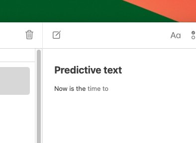
Coming to all apps as and when they update to support it, macOS Sonoma includes an excellently improved predictive text service. Instead of just offering to autocomplete the current word you're struggling to spell, apps on the Mac can now propose short phrases.
It's a feature that you will take time to use, not because it's unusual or needs any effort, but because the Mac will learn from what you write. During testing, the most AppleInsider ever saw of this new predictive text was the current word plus two more.
But it's enough. If you ignore the suggested phrase and keep typing, the phrase goes away.
If you instead just tap the space bar, you accept the suggestion, it's entered into your text, and your cursor is at the other side of the words, ready for you to continue typing.
It's surprisingly not distracting, it's surprisingly good.
Except when you see a single letter you want to change in a word you've accepted. If you press the Delete key to remove the last letter of a suggested word, the Mac assumes you mean the whole word was rubbish and it deletes the lot.
Apple Notes brings linking and better PDF support
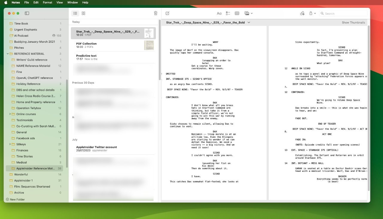
This is going to turn Apple Notes into a useful repository for PDFs. Previously you could drag any PDF into an Apple Note, but to read it, you had to double click and wait as it launched Apple Preview.
Now the full, readable PDF is displayed only slightly reduced in size, right there in the Note. Apple positions you about half way through the PDF, which is irritating since you usually want to read from the start.
But that's done so that you get how it's now possible to slide back and forth along all of the PDF's pages.
Apple Notes also now lets you very quickly enter a link to another note. Start a link, then start typing the name of a note, and Notes will narrow down your choice to the one you want.
Thereafter, you can click on that link to open that note. It's a way to create a table of contents for a large collection of notes, for instance.
Reminders updates
Reminders in macOS Sonoma still looks like a very basic task manager app but, yet again, it has introduced some power features. Just as happened with location reminders where it introduced this idea that you could be prompted when you get to the grocery store, now it's got automatic sorting.
This only works in a list you specify is a Shopping one. But add "Apples" to your list and suddenly Reminders has a heading called "Produce."
Then if you type "Shampoo", it goes under another new heading, but "Oranges" will shift to right beside apples.
The idea is that this way you will see everything you need to get, when you are at the right spot in the store.
Apple's Reminders has also introduced a Kanban or more visual view of your tasks, but that's an unusual disappointment. It works, but it's clunky.
Video conferencing improvements
Updates to video conferencing were also a little clunky at the start of the beta, but now they're good and straightforward.
In FaceTime calls, Zoom and more, you can choose to put yourself in front of slides that you're presenting on a call. So rather than switching between you and the slides, you're together and can act like a weather presenter, pointing to elements on the screen.
If your colleagues on the call like what you're doing, they can hold up two thumbs — and the Mac will start showing fireworks behind their heads.
There are many more such reactions, like balloons, and alongside certain gestures, you can directly choose what you want from a menubar app that appears during video calls.
It's more fiddly to reach up, click that app and then find the fireworks. But sometimes the Mac seems to like leaving you with your thumbs up just long enough that you feel silly.
When and whether to update to macOS Sonoma
Don't do it the instant Apple says that it's available, but if a few days have gone by and no one's complaining of terrible problems, go for it.
You have to have one of these Macs:
- iMac (2019 or later)
- iMac Pro (2017)
- MacBook Air (2018 or later)
- MacBook Pro (2018 or later)
- Mac Mini (2018 or later)
- Mac Pro (2019 or later)
- Mac Studio (all models)
Some of those Macs are four years old, some are five, and the iMac Pro is six years ago. It's impressive that a six-year-old Mac can still run the latest macOS update.
But be aware that not all of those Macs can run all of the new features. Until macOS Sonoma is out in the wild, it won't be clear just who is missing out on what.
If you have an Apple Silicon Mac, though, you're fine.
Apple always keeps macOS running as far back as it can. But then Apple also does this — it makes it hard to willingly go back to an old release.
Alongside new features and changes and performance improvements, one measure of a new macOS is how it makes all previous ones seem unusably old.
The new macOS Sonoma is a free download, and AppleInsider has confirmed its availability. When your local CDN populates, you can either wait for your Mac to prompt you, or go to System Settings, General, and Software Update to start upgrading manually.
