 Katie Marsal
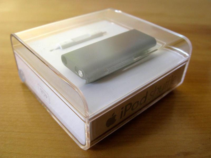
The iPod shuffle has taken on an unusual role in Apple's lineup both as its price leader and as an example of the company's efficiency in design. But with its third version now out the door, there may be signs Apple isn't sure of where to go next with its least expensive media player.
When Apple first unveiled the iPod shuffle in January 2005, it was half inspired by the nature of digital music. Most people had always assumed that any digital music player had to have a screen, and this had led to a rash of very low-cost players that often had only two- or three-line displays and tiny controls. But by taking a gamble and assuming people wouldn't mind playing music at random, mimicking a radio station, Apple had managed to create a device that had full-sized (if limited) controls without pushing up the size or the price.
As a result, the tiniest of iPods has, from its launch, always had at least a mild amount of success. It became a sometimes ideal choice for the gym or for a run; a device small enough to be almost unnoticeable and without a screen to break has had an unexpected but sustained appeal for the past four years.
The second-generation iPod shuffle of September 2006 has an at times almost cult-like following. While it was still unlikely to sway those who demanded a display, it was what you might call functionally "perfect:" it accomplished the goal of having a very compact, screenless, wearable player in style. That the company and its audience liked it was likely borne out by Apple leaving the design virtually unmodified for two and a half years. Aside from increasing the capacity and changing the color mix, what could Apple realistically do without breaking the formula?
And it's here that the other half of the iPod shuffle's reason for being becomes clear: it was also a calculated marketing decision. Apple chief Steve Jobs mentioned in the iPod shuffle's Macworld keynote introduction that needed a player to conquer the low-end flash player market, and from then on the shuffle's design has always been partly dictated by its role as the simplest and least expensive iPod available. Cynically, one could argue that it exists chiefly to upsell buyers to the iPod nano, where competition on price is less necessary and where it's easier to entice customers with iTunes Store music and video purchases.
Accordingly, the third-generation iPod shuffle was virtually destined to pose a problem for Apple before the first concept sketch was ever finished. When you've largely mastered a design but are forced to refresh it with something new and cheap to maintain interest, where do you go? For a company lately guided by "less is more," the answer is minimalism; and as we'll soon see, that guides every facet of the new iPod, for better or for worse.
Starting from the MacBook Air, Apple has lately been on a quest to see how much it can strip from a design's shape, features and controls without compromising what makes it work. Many thought that the unibody MacBooks were the culmination of this process: not only had Apple excised FireWire in the name of thinness and chassis strength, but it had actually found a way to remove all buttons from the trackpad when some critics had been arguing for more.
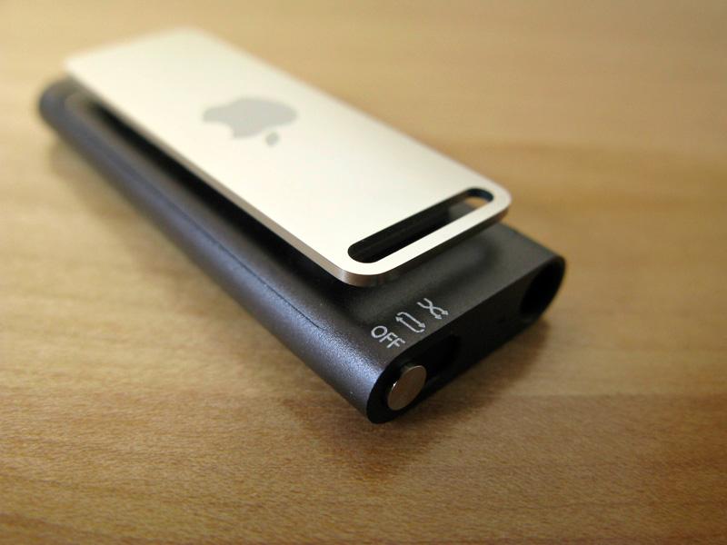
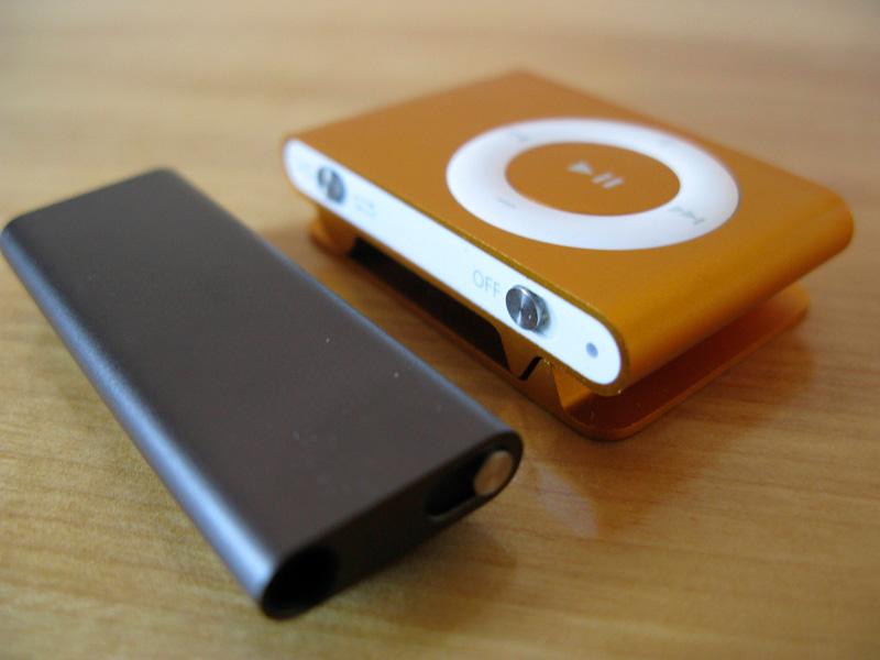
The new iPod shuffle, however, takes this progression one step further. Since Apple now has a headphone remote that can perform nearly all the tasks the on-device buttons would normally handle, it has used this advancement to remove nearly all the controls from the iPod itself. In a sense, it's the logical extreme of Apple's distaste for cluttered design.
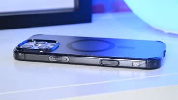
That provides mixed blessings for actually using the iPod. Since the player is even smaller than before, especially in width, it fits into even tighter spaces and is even less intrusive. It also has the unusual effect of being the first truly understated iPod; because the player itself is virtually featureless, it can be clipped to a coat, pocket or shirt and blend in. If you're prone to wearing black or gray, the two introductory models will practically be camouflaged.
Simultaneously, that change also makes it the first out-and-out dull iPod design in some respects, and very occasionally less practical. The blank front side practically begs for a control, or at least some artwork, to liven it up. The shrink has also produced a smaller, thinner clip that, while it has space for a lanyard and fits in more spaces, is slightly harder to open. Also, Apple as always has found away to try and slip chrome back into its designs when users have complained that it's too easily scratched. The second-generation's all-aluminum back was more resilient against wear and tear.
But again, it's the controls that have seen the greatest overhaul, and it's in that area that Apple has stirred up one of the greatest controversies in its recent history.
Interface: two steps forward, two steps back
More often than not, it's exercisers that most often call out for remote controls for their music players, but Apple has always approached this in a roundabout way with the iPod shuffle. Instead of producing a remote, it just made the player small and wearable enough that it could sit where the remote would have been.
With the third-generation model, Apple made the remote necessary, but didn't really need to do much homework as to what it would use. Minus the obviously rather unnecessary microphone, the new iPod's default controls are a near-exact duplicate of the in-line remote that comes part of official, optional replacement sets, including the high-end iPod In-Ear Headphones. They even share the same controls: a single click plays or pauses, two and three clicks skip forward and back, while dedicated volume buttons sit on either side. A slight change is the addition of fast-forward and rewind by holding the clicker at the end of the forward and back commands.
If nothing else, it's extremely convenient. The iPod no longer has to sit in an easily reached location, and it's less likely to disorient listeners who may find the controls upside-down if the player is worn differently than usual.
The new iPod's centerpiece, though, is the addition of an additional control scheme dubbed VoiceOver. A single click-and-hold will speak out the track title, while holding it down until a tone is played lets you pick from playlists as their names are read aloud. It's an odd choice, but it does make for the first screenless music player that can still hold multiple playlists, podcasts and even audiobooks. That's more than a little relieving to owners of previous-generation models (yours truly included) who've been forced to change sync preferences every time they want a different mix or to listen to spoken-word audio.
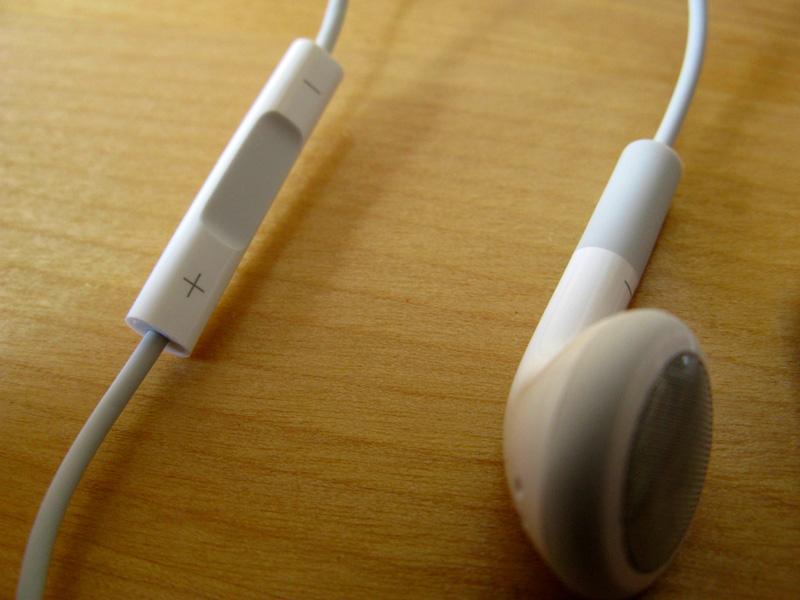
Even so, it quickly becomes evident that the remote-only and VoiceOver controls together feel as much like regressions as they do steps forward. Bluntly stated, the remote actually makes things more complex, not simpler: what almost always took one click with the second-generation model now takes two or three clicks. Using these controls will be familiar to most any iPhone owner or to anyone who's bought one of Apple's newer headphone sets since September, but Apple's own elaborate control map shows that its attempt to be clever has partly backfired.
VoiceOver is also awkwardly implemented. Since Apple insists that the iPod say the complete track title before switching to playlists, you're forced to wait longer than you'd usually like. It simply feels arbitrary. Most users already know what songs they have on their iPods; why feel compelled to remind them every time they want to hear an exercise mix or a favorite album?
Moreover, the interface as created isn't very intelligent in coping with podcasts. Rather than give each podcast its own virtual playlist, Apple lumps all of them into a single "podcasts" section and treats them like songs; you either play them in the order established during sync or play them shuffled. The system makes it impossible to hold more than one episode of a given podcast and discourages placing any more than one podcast on the iPod at a time. The software designers didn't even have the courtesy of stopping playback outright at the end of a podcast, as it invariably loops back to the beginning of the first podcast stored on the player.
As such, the iPod shuffle still ultimately feels like a simple, all-or-nothing music-oriented player first. While it provides some relief for those with more complex listening tastes than "completely random," it introduces a significant (if sometimes forgivable) nuisance and still doesn't really solve the problem of juggling multiple listening formats. Those most likely to enjoy it the most are those who use it like the random jukebox first- and second-generation players, which somewhat defeats the point.
Thankfully, there does appear to have been a boost in the iPod shuffle's audio fidelity with this third iteration. The slight background hiss during quiet moments appears to be gone. Whether or not the intended output has improved is harder to determine and may vary from user to user, but in testing it seemed like the new shuffle was above the second-run model in quality but below high-end devices like the iPhone. Bass and treble are a bit more distinct.
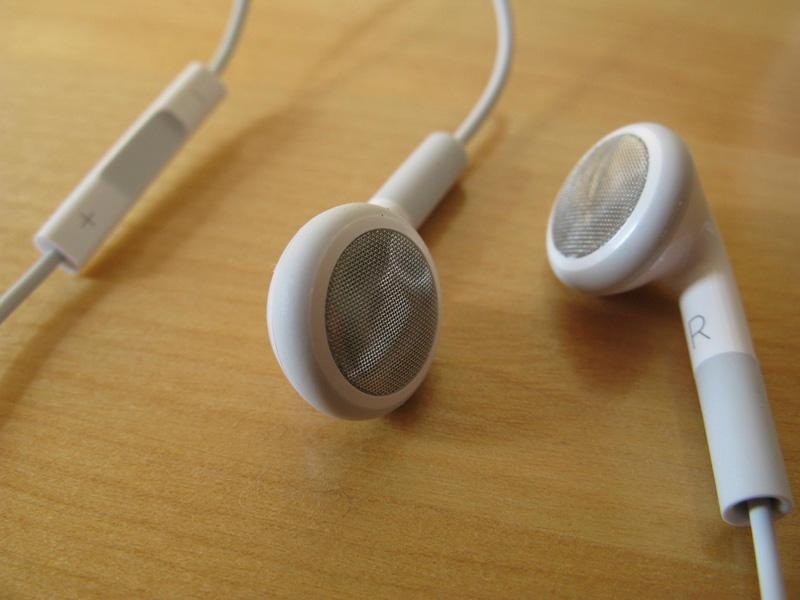
This may latter less to most owners than what the move to put the controls on the remote has done. By requiring a remote just to use the shuffle beyond starting or stopping playback, Apple has effectively shoehorned most users into sticking with Apple's pack-in earbuds. For many, this is a quirk they'll never notice: when even cheaper steps up in audio quality cost nearly as much as the iPod in question, it doesn't usually make economic sense to buy a new pair of headphones.
Given that Apple's stock headphones aren't exactly known for their fidelity or their ability to remain in place on some ears, though, a significant portion of Apple's audience is likely to be frustrated. If you prefer the comfort of in-ears or simply want better listening, you'll either have to opt for Apple's iPod In-Ear Headphones — which, at $79, cost as much as the iPod shuffle — or else wait until either an adapter is available or an integrated third-party headphone set comes along with the price and features you want. It's good to know that Apple isn't using DRM to require its own remote control chips, but that fact is also small comfort to those who already own better-sounding third-party equipment than what Apple provides.
Additionally, it's now just about impossible to use the shuffle with anything beyond headphones. Until an adapter exists, the device can't be plugged into the aux-in jack of a car stereo or bookshelf speakers. Even then, VoiceOver is decidedly less appealing when everyone in earshot can hear your current track and your playlist choices.
Battery life and iTunes sync
One consequence of a smaller player is smaller space for a battery, and that's immediately apparent. The iPod shuffle officially nets about 10 hours of battery life and is the first iPod to sink below 12 hours of estimated runtime since the third-generation, scroll wheel iPod from 2003. Of all the iPods, a long battery life is least essential on the shuffle, but that's still disappointing when the previous shuffle claimed 12 hours.
In practice, Apple has been known to deliberately underestimate its battery life and does manage to claw back some of what it's lost. A test of near-uninterrupted playback managed 11 hours and 52 minutes despite holding mostly 256Kbps and 320Kbps songs. While certainly a relief, the older model also easily outran its official benchmark. Don't expect the newest shuffle to last a cross-border trip as well as its predecessor.
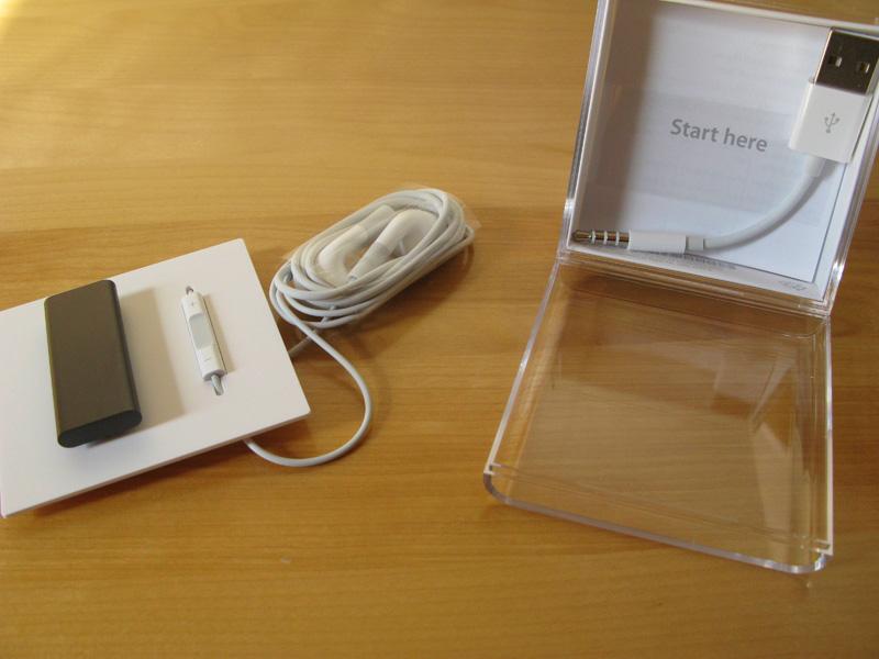
Connecting the player has at once become easier and harder. Gone is the proprietary dock that always made owners play a small guessing game as they flipped the player upside-down and tried to align it properly. Instead, owners get a simple cable that leads from the iPod's combo headphone and data port to a standard USB connection. It's as quick as plugging in any set of headphones, but the absence of a dock option (as of this writing) and the extremely short cable also means the iPod sometimes has to sit in a less-than-ideal spot while it charges or syncs. Users without USB ports on their keyboard or on the front of their computer may find themselves reaching around to attach or disconnect an iPod dangling in mid-air.
Syncing has become more complex, though this is easier to understand than for the iPod's own interface. Since the first- and second-generation iPod shuffles were extremely simple, loading them was just as easy; users had only to plug the iPod in and hit the "autofill" button to get as much random music as the device would hold. Support for multiple playlists, audiobooks and podcasts has pushed Apple to require checkmarking manual sync and highlighting "music" in the device contents before it becomes an option. While it would likely still have been possible to make autofill a one-click affair, this new option does let owners add as many playlists or other audio before they fill the rest with music.
Speed, unfortunately, remains something of a liability. Apple has always used slower flash memory for the iPod shuffle than for the iPod nano, iPod touch and iPhone. That wasn't an issue when 1GB was the most an iPod shuffle could hold, but with 4GB of memory onboard the latest version, the impact of that cost-cutting has been magnified that much more. Loading the iPod with almost exactly 3GB of music took a painfully long 14 minutes; if it had been filled to its maximum, formatted 3.8GB limit, it would have taken nearly 18 minutes. That's not pick-up-and-go speed, and while multi-playlist support means you don't have to reload the entire player to keep the music fresh, many users will almost dread clicking the "autofill" button unless they can afford to wait.
For all the criticism of the new iPod shuffle, it's likely to remain in use here at AppleInsider and is hard not to like on at least some levels. Outside of a slightly more complicated sync process, it's still the quintessential exercise iPod and the most likely to be a companion to an iPhone or one of Apple's larger iPods. The addition of playlists alone may tip the balance for those who wanted more diversity in what they could play, and the remote-borne input is easier to manage in mid-run than a player bouncing and jiggling on your clothes.
Also, those with most existing iPod shuffles who wanted an upgrade in capacity will no doubt be happy. As much as the slow transfer speeds make syncing an exercise in patience, 4GB allows for much more diversity in music than the 1GB of space most iPod shuffles have had in the past.
However, this is the first iPod in recent memory that would give prospective buyers a serious reason to pause. Are you willing to tie yourself into buying only certain kinds of headphones or using only certain accessories? Do you have enough patience to wait several seconds to switch playlists, or a quarter of an hour to completely refill your music selection? Many aren't and don't, and asking them to make this choice where they didn't have to before is unfortunate, to say the least.
It's increasingly clear that Apple has run into the limits of what the iPod shuffle can do, not to mention its own design aesthetic. A redesign for its own sake is rarely likely to impress someone; and pulling out genuinely handy controls to satisfy a disdain for buttons or bulk is a help to no one. Apple either needs to consider a return to the iPod shuffle's roots for its fourth outing or, finally, acknowledge that it may need a player with a screen at or below the $100 mark. Just making a device smaller doesn't make it better.
Rating 3 out of 5
Pros:
Smaller, more upscale design
Remote convenient in at least some cases
Support for audiobooks, playlists and podcasts
Improved audio quality
Better-than-estimated battery life
Cons:
Too heavily dependent on remote; change is arbitary
Locks users into special headphones or adapters
VoiceOver forces too much waiting
Shorter battery life than 2G
Transfer speeds too slow


 Christine McKee
 AppleInsider Staff
 Chip Loder
 Malcolm Owen
 William Gallagher


128 Comments
Wow, what a long-winded review! I'm sure you'll start a long flame war with this post and I don't want to really get into it in as much detail as you have here, but I have to say I disagree with almost every aspect of this review. It's not so much a review as a self-fulfilling prophecy. It trips all over itself and contradicts itself at times also. You say the new controls are more handy and intuitive at times but then at other times that the new shuffle has pulled out "genuinely handy" controls (the old ones) for reasons (you assume), that are strictly superficial (even though you present no proof that the reason for the decision was in fact that).
It's as if you really hate the thing, but realise that there isn't really that much to hate and that the design reasoning behind it is actually rather sound, but you still just don't like it. So you dance around for three or four pages trying to justify your dislike, even though you sort of can't.
Overall, this is like a review of a burger shack, treated as if you were eating at a five star restaurant. I can't help but continually come back to the fact that this is a super cheap low end PMP that is only intended to shuffle music for grandma when she goes to the gym, but you review it as if it's the latest Porsche that isn't quite up to your standards.
It's a shuffle dammit! It has higher capacity for less cost than the previous model, better sound, easier to use controls and is smaller, easier to clip to things, has a lanyard etc. etc. etc. Give it a rest why don't you and just say it's a better product all around but if you don't like it the old one is still available?
Many (many, many) people don't like the new Shuffle.
But at least Apple have the guts to try something new and since I own the new In-ear headphones, I don't care about the lack of buttons on the device!
It wouldn't be surprising if this design is short-lived, rather like the fat Nano. Like the article alluded to, it may primarily be an industrial-design-led refresh (meant to buy time until a more significant update), rather than a functionality-led refresh. We might just see a return to past model/controls, but with much improved functionality, in two years or so (which would mean it's already on the roadmap, obviously). Or do you guys (readers/responders) believe the clickwheel is gone from the Shuffle for good?
Has the reviewer ever actually ran?
Nothing bounces or jiggles more than headphone wires. A player snapped to your waistband doesn't move at all and the 2G controls were entirely intuitive unlike this shuffle.
I'm going to go ahead and preface this whole comment with the statement that I have no need for a shuffle, and will never be the target audience for this device. That said, I really like the direction of this shuffle.
In my opinion, the shuffle is clearly not designed for true audiophiles, they are expected to go for a combination of a classic/ipod touch/iphone and a nano. Personally, I think the nano's are more than small enough to work out with, and so the shuffle is only if you really wanted a completely stripped down experience for working out with or something, or you're simply not that in love with music.
People using the shuffle just want a streamlined experience for working out, or are curious about the ipod/apple platform and are using it as a cheap way to jump in and test it out. These are not the people owning $200 Shure's and so they aren't going to mind as much using the stock ipod headphones. While I admit that I personally will never ever touch those low fidelity pieces of junk again, I know many many people who never notice a difference. For these people, the newly designed shuffle is a great concept, giving them complete control without moving/looking at the device.
It seems like software updates are necessary for the voice over interface, maybe a way to toggle it on/off easily, so that at times where you don't need the device telling you the name of songs you know by heart it wont be wasting your time. However, in theory, this is a wonderful interface for a device which has needed something in this vein for years.
I think apple is, properly, truly separating the nano from the shuffle and making it quite obvious to potential buyers which one will be worth it for them. If you want any sort of easy direct control over the device, the shuffle is not for you, but if want no hassle plug in and play then this is nearly a culmination of engineering.