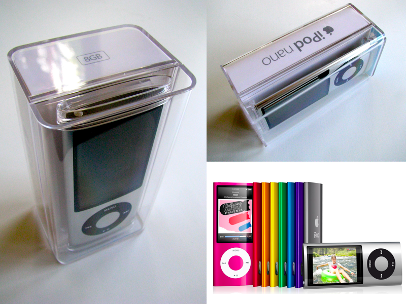
You might not guess much has changed just by looking at the outside, which remains largely identical apart from being offered in a new palette of nine colors.
The device also still ships in the now familiar, small glass coffin packaging, in a choice of 8GB ($149) or 16GB ($179) versions.
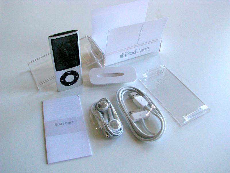
Inside the small box, Apple includes a dock adapter, USB cable, and stereo headphones, although the included earbuds lack both integrated playback controls and an integrated mic. The nano still works with iPhone-style integrated mic headphones, but you'll need to buy a pair separately (or use the ones you already have).
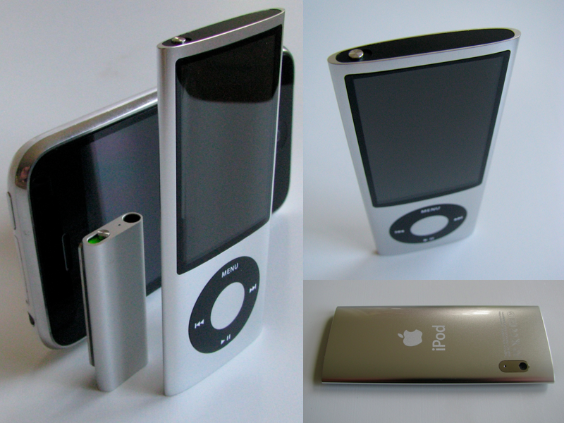
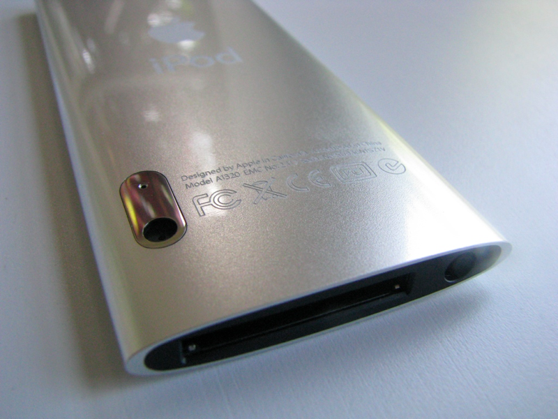
The only marked visible change is the new video camera and mic, which along with an invisible speaker, support the unit's new video recording and playback features. Despite the new camera hardware, the device remains about as thick in the middle as the tiny iPod shuffle.
The lens and mic are framed in a polished metal window in the nano's case.The camera appears on the dock connector end of the nano, making it tricky to hold the device without blocking either the screen or the lens with your hand. You'll either need to grasp the nano by its edges or pinch it on the left side between your thumb and finger.
A full review of the new 2009 iPod nano will appear tomorrow.
 Prince McLean






 William Gallagher

 Christine McKee
 AppleInsider Staff
 Chip Loder

 Malcolm Owen






46 Comments
looks nice, but nothing special probably because i wanted the iTouch to have a camera and undertake video recording. damn you APPLE.
But I still love ya.
looks nice, but nothing special probably because i wanted the iTouch to have a camera and undertake video recording. damn you APPLE.
But I still love ya.
You should learn the names of the Apple products that you discuss:
iPod Touch.
You should learn the names of the Apple products that you discuss:
iPod Touch.
That looks like a very bad place to put the camera. It's positioned where someone would naturally be holding the device. I suppose they couldn't fit it at the top where it should be because of the screen, but it really seems like a poor design decision.
That looks like a very bad place to put the camera. It's positioned where someone would naturally be holding the device. I suppose they couldn't fit it at the top where it should be because of the screen, but it really seems like a poor design decision.
It's for that extra-smudge effect!
That looks like a very bad place to put the camera. It's positioned where someone would naturally be holding the device. I suppose they couldn't fit it at the top where it should be because of the screen, but it really seems like a poor design decision.
No, you were right the first time. It's not a "poor design decision". It was a design necessity.