Apple designers reportedly divided over use of skeuomorphic UIs
 Mikey Campbell
Apple's slow push toward skeuomorphic interfaces in its iOS and OS X platforms is reportedly a polarizing topic within the halls of One Infinite Loop, and a new report claims company cofounder Steve Jobs was one of the first proponents of the controversial design scheme.
An in-depth report from Fast Company says that while Apple's products have enjoyed consistent critical acclaim, an undercurrent of discontent has been slowly gaining momentum regarding the company's design direction, namely the inclusion of skeuomorphic interfaces.
Skeuomorphism, as it applies to computer software, is the use of ornamental design elements that represent familiar objects in the digital realm. The technique was first implemented by software designers to help ease users into the unfamiliar world of computing. For example, digital folders are represented by folder icons and contacts lists can be displayed in a virtual agenda.
Some say the ornamental flourishes have become a non-functional extra that merely adds clutter to an otherwise clean interface, something that is necessary especially for small-screened devices like the iPhone.
"It’s visual masturbation," said a former senior UI designer at Apple, who reportedly worked closely with cofounder Steve Jobs. "It’s like the designers are flexing their muscles to show you how good of a visual rendering they can do of a physical object. Who cares?"
Critics say Apple's use of skeuomorphic design is too pervasive, overstepping its intended purpose to simplify a user's experience and in some cases actually causes confusion. The Notes app's yellow sketchpad and the stitched-leather theme found in a number of newer iOS apps are examples of non-functional design.
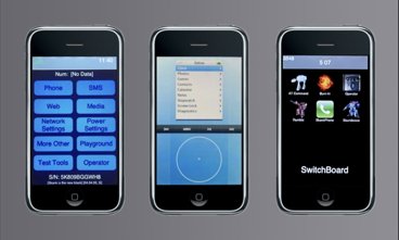
Internally, higher ups like SVP of Industrial Design Jony Ive are said to oppose the push toward skeuomorphic design, while the movement supposedly has the support of iOS chief Scott Forstall. Apple cofounder Steve Jobs is thought to be one of the first proponents of the design change, evidenced in the Game Center app.
"Steve pushed very hard to have everything— the felt-cloth table, the game chips— look like they would in real life," said another former Apple designer. "Internally, a lot of people were shocked by the richness. Many think it’s gone too far."
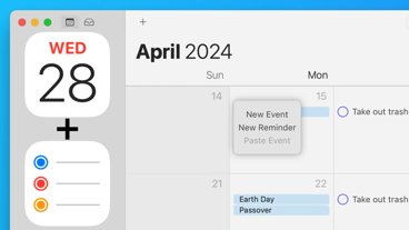
One app in particular shows how the move to skeumorphic interfaces affects an app's usability. Calendar for the iPhone employs a clean, no-frills UI that easy to navigate with one hand. The OS X and iPad counterparts, however, implement skeuomorphic elements resembling a classic wall-hanging calendar. While easily recognizable, it can be argued the interface is somewhat clunky.
"iCal’s leather-stitching was literally based on a texture in his Gulfstream jet," the former designer said. "There was lots of internal email among UI designers at Apple saying this was just embarrassing, just terrible."

When such an interface is used, designers are restricted by the limitations of that medium and in the case of iCal, that means turning pages and having traditional year, month, week and day views. If a completely new system is developed, much like the iPhone's simple yet intuitive Calendar app, designers are free to explore and invent new ways of presenting data.

As consumers become increasingly tech-savvy, skeumorphism has in many instances been replaced with abstract icons, examples of which can be found in Apple's own iOS. Instead of the familiar folders, the mobile operating system allows developers to create their own iconography, usually taking the form of a company logo or cartoon illustration. Skeuomorphism is seen by some as a regression to the advancements made in UI design.
"I’ve come to absolutely dislike this trend in user interface toward skeuomorphism," said noted designer Yves Béhar. "Using reality as a visual metaphor for the user interface rather than make the UI function on its own terms is something that has irked me for quite a while."
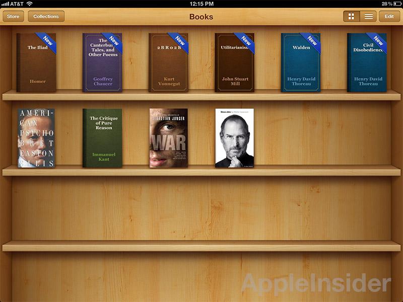
Behar takes particular issue with the wooden bookshelves in Apple's iBooks and Newsstand apps.
"The digital bookshelf doesn’t really work like a bookshelf," Behar said. "You’re throwing all this extraneous visual noise at me and it’s confusing. My brain, which is used to the physical bookshelf, is confused because of the differences in usability. It’s cute, but not particularly useful."
Apple will debut a number of new skeuomorphic features when it launches the next-generation iOS 6, including a virtual paper shredder built in to the Passbook digital coupon organization app.
"I feel like [Apple] has concentrated too much on mimicking the visual skeuomorphic approach rather than concentrating on the actual functionality," said the former Apple designer. "To me, it’s lipstick on a pig. There’s no need to add glitter if the product can stand on its own."
Versions of Apple's iOS 6 for iDevices are expected to debut alongside a next-generation iPhone at a special event on Wednesday.


 William Gallagher

 David Schloss
 Andrew Orr

 Marko Zivkovic
 Wesley Hilliard
 Andrew O'Hara


122 Comments
I think it depends on what the software is and it doesn't need to be system wide. I think the bookshelf in iBooks looks great. I think the leather effect in the calendar looks shit. When all is said and done, all this comes down to personal preference.
Sure know how to pick articles that'll get the most comments, don't they…
Pretty sure he means the opposite.
Another negative point is that it also bloats apps because they need to include multiple versions all those texture images for different resolution displays.
Man AI is stretching here yet again for artificial news. Just because it is a slow news day doesn't mean you have to create news out of nothing. Sure the NY Times does it, but realize they serve a stupid population.
The whole article is a bit one sided here. You didn't have enough space to even mention the positive side of skeuomorphism? No time for background on the reasons why Jobs thought this was a good idea?
Personally a lot of it gets to me also, but the many many articles on how "bad" it is, penned by tech-heads who don't actually have any of the problems that this kind of design tries to solve are starting to be a bit of a pain in the ass also.
How about a reasoned discussion of the pros and cons as well as some acknowledgement of the fact that a great deal of the audience for Apple's iOS products is actually not a bunch of computer nerds (or design nerds for that matter), but in fact people who have never, ever, used a computer before?
I also find it interesting that while the most egregious examples of it are probably the yellow paper in Notepad and the shelves in the book apps, no one ever complains about that. All we get is endless complaints about the calendar app. Why? Because nerds use calendars a lot.