Apple's new Maps in iOS 6 certainly has some significant flaws, but its real problems have been overshadowed by a small number of reports calling attention to minor glitches that are relatively insignificant.
There are multiple components to Apple's new iOS 6 Maps: the iOS app itself, including its user interface and APIs; the cloud service providing 2D maps and satellite/aerial imagery that Apple has assembled under in a series of licensing deals and customized for its own use; the 3D modeling Apple has commissioned to create standard 3D mode and Flyover (currently limited to specific areas); the directions and live traffic information used to provide driving and walking directions; and the integration with third parties that Apple is leaning on to provide missing elements such as transit maps and local search.
What's wrong with iOS 6 Maps: The App
Looking at the current status of Maps, it's pretty easy to identify the errors that are being discussed. Most of these are not really intrinsic to the design of the Maps app itself, which is (unsurprisingly) very similar in layout and functionality to Apple's original Maps app.
There are two significant features that are missing in the new Maps app however: Google's Street View and Transit directions. Flyover provides a partial alternative to Street View, but it's not available in nearly as many areas (currently it is limited primarily to select, larger urban U.S. areas).
Because Google's web Street View is implemented via Adobe Flash, there isn't currently any way to access it from iOS 6. So if you're outside the limited coverage of Flyover, your only real option to preview a particular destination is to download Google Earth (which provides a lower quality alternative to Flyover but with more coverage) or another third party app or website providing similar birds-eye views.
Apple could have conceptually addressed this by releasing a secondary or helper app to pull up Street View of a given location. However, the story of Google Maps and iOS 6 isn't limited to Apple seeking to complete with Google, as is described later in our historical overview of the two companies' maps.
Google is now charging users of its Maps service, meaning that to offer Street View, Apple would have to ink a licensing deal, likely with unpleasant terms, given the circumstances. So Apple isn't the only party that took action to remove Street View from iOS Maps.
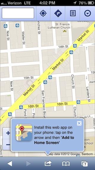
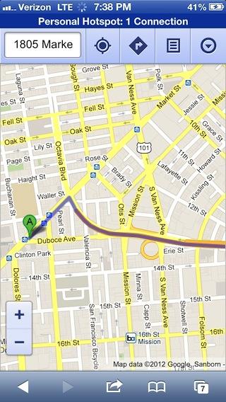
There are three solutions to the missing Transit directions. The first is maps.google.com, the web version of Google Maps. In addition to transit directions, it will also provide Google's flavor of driving directions, walking directions, and biking routes, something that iOS hasn't every natively provided. The web app version is not fun nor very easy to use, however, and suffers in many usability respects for being a web app. It also doesn't show traffic.
[Correction: Google's live traffic information is available through the web app, through enabling it as an optional layer, as reader @Tom tweeted.]
The second solution to getting transit directions is to use an existing third party app such as the excellent Routesy. The third solution is Apple's primary one: wait for third parties to release integration with iOS 6's new routing APIs, where the app adds new features to Maps by simply advising iOS of its capabilities and what geographies it covers.
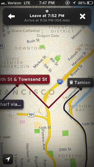
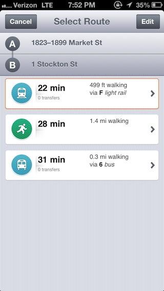
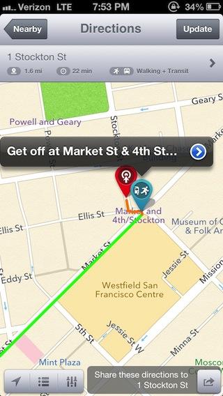
It initially seemed that Apple should have taken more initiative to make sure there were at least some helper apps available at launch. Fortunately, there are now a lot of apps showing up to offer directions. When you enter a start and end point in Maps and hit the transit button for directions, iOS now pulls up a series of apps that can help.
If you've already installed one of these helper apps, you can pick which of the installed apps you'd like to use. Each specifies the type of routing it knows how to calculate: bus, bike, car, subway, train, ferry, pedestrian and so on.
I tried a couple of different transit apps for San Francisco, including Transit and City Maps, each of which offered its own style of directions, from graphical instructions overlaid on the map to detailed procedural directions.
I also tried out the novel SideCar, a real-time ride sharing service that lets you request a nearby driver (in general, or somebody specific) to take you to your location, with an estimated cost and the kind of car they're driving.
Apple's market based solution to providing the type and style of directions you personally prefer (leaving the door wide open for innovative new types of rides and directions) seems like a huge improvement over the hardwired link to Google's often inaccurate transit information. Curiously, it seems to be the "free and open" advocates who are grumbling about this change.
What's wrong with iOS 6 Maps: The Cloud
Outside of missing a dedicated link to Google's transit directions, the primary complaints about iOS 6 Maps seem to be aimed at Apple's servers, not the new iOS 6 Maps app itself. This includes spurious or inaccurate place labels and incorrectly located features, including being unable to find a given location by address or name.
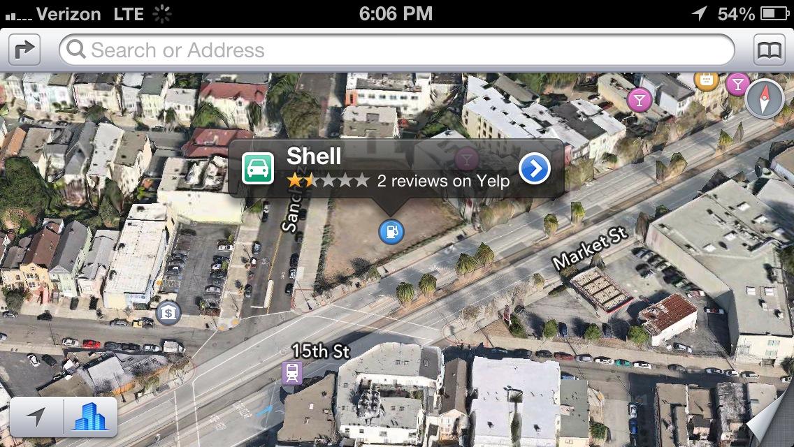
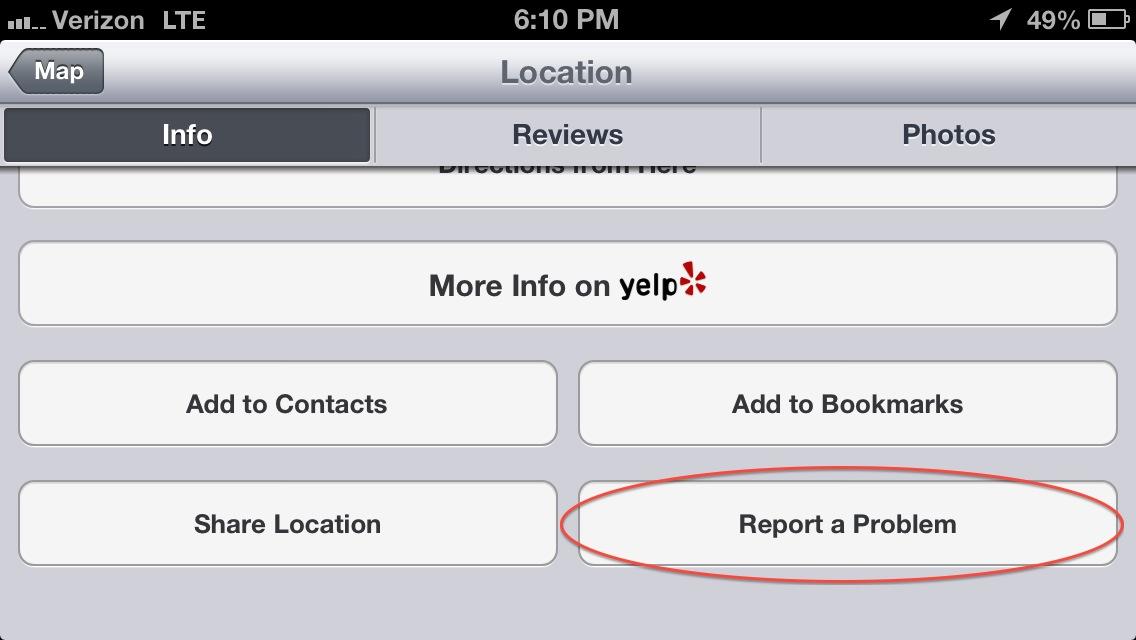
Some of these errors are significant, while others are typos or minor quibbles related to official name changes. In the case of typos, Apple offers a way to report problems, but hides this under the location's Info tab in a "report a problem" button. For example, this Shell gas station on Market Street hasn't been there for a long time, as the dirt lot visible in Flyover indicates.
Because the "report a problem" button appears in the context of Yelp local search information, it's not readily obvious that this button is for reporting map errors rather than filing a grievance against a business or Yelp's data.
Perhaps Apple should have used the obvious "bug" icon it debuted alongside the first versions of Safari, and made the same case to new users that it did when launching the new browser: that this is a complex new product with some known issues, and that users are empowered to improve things by reporting issues they come across.
Once you know the button is there, you can report a problem with a location's information (such as its name, exact address, phone number and so on).
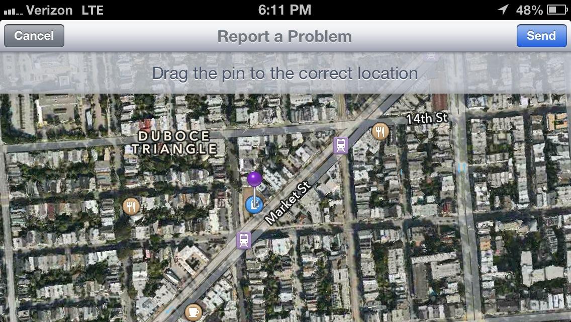
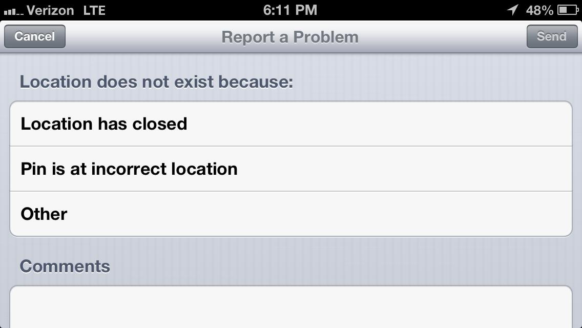
You can also drag the location pin to a new spot, or note that a business not longer exists, but if you just want to highlight a visual error you have to pick "my problem isn't listed" and leave a comment.
What's wrong with iOS 6 Maps: Flyover
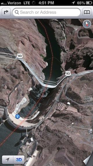
The majority of bugs identified in the new iOS 6 Maps, due to the entertainment value in pointing them out, are oddities related to Flyover rendering errors, including bridges that appear to be melting into the earth (like at Hoover Dam, below) or half collapsed looking buildings. These are unlikely to actually cause problems for people who are looking up a location or directions in maps.
Flyover errors can be easily fixed by Apple. When Google launched Earth, it invited users to map out building models for it. Apple needs to identify and fix Flyover errors, and to extend Flyover models to more areas, but these are not serious bugs and certainly not a "downgrade" from iOS 5, which never offered a Flyover mode.
If you want to "revert" to the flat satellite imagery of Google's maps, just turn 3D off and the rippling bridges fall back into 2D photos. Outside of Flyover-ready areas, satellite images are the same flat pictures they were in iOS 5 when Google was supplying them. And Google supplies plenty of areas with low resolution images with mismatched color regions, making it particularly odd that bloggers are dutifully cataloging errors in the new Maps that have long been in the old Maps.
More critical are the errors in 2D maps of areas where roads or rivers are missing or have changed, or location errors where looking up an address drops you a pin in the wrong location. The accuracy of maps is greatly dependent upon the source material and when they were last updated.
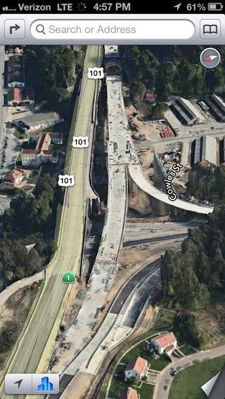
In looking up Flyover images for the Presidio in San Francisco, I saw that Apple is using an outdated model of Doyle Drive (the 101 approach highway to the Golden Gate Bridge). Earlier this year, traffic on the old highway was routed to a new path and the old roadway is now being torn down.
In Flyover, it still looks like traffic is running on the old segment and that the new bridges and tunnels that replace it have not yet been finished.
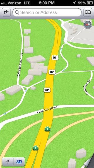
If you switch to 2D mode however, the simplified route depicted is correct. There is no real world option to drive off the highway onto the old structure. Additionally, the replacement onramp connection between Lincoln Boulevard and 101 is not yet opened (you can see it under construction in Flyover), and is correctly not shown as a passible route on the map.
So again, Flyover images are likely to be as out of data at Google's own satellite imagery, but that doesn't mean that the more critical routing information is also wrong.
Being able to switch back and forth between the two views is just as useful as it was under Google's maps; it's just that Apple's iOS 6 Maps additionally allows you to see and navigate around the new 3D renderings of both standard and aerial images, too.
Thinking outside the US
Apple lists support for 2D Maps and satellite images in 181 countries, driving directions for 96, and turn by turn navigation for 56, with another nine scheduled to be added next month.
Flyover 3D buildings are limited to US cities outside of a few other places, live traffic is limited to 23 nations, local search is limited to 49, and business reviews and photos are limited to 15 countries.
In contrast, Google lists some level of maps for 209 countries, support for driving directions for 162, Street View images for 23 countries, business listings in 37, and live traffic in 22.
Those numbers aren't directly comparable because they're accounted for differently, and Apple also supplies limited street details for maps in some countries that it counts as supported.
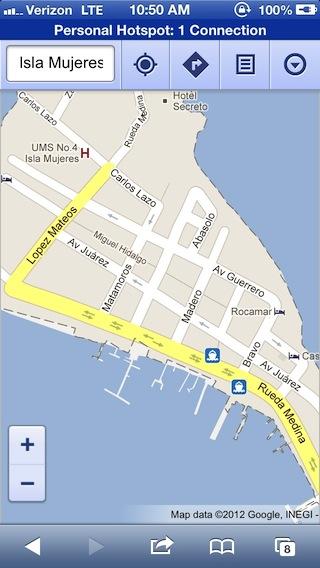
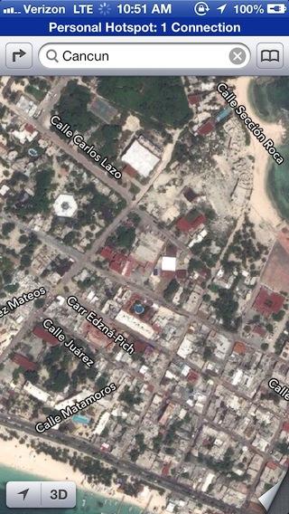
There are islands I've personally navigated via Google's accurate map renderings (like Isla Mujeres off the coast of Cancun, Mexico, or the U.S. Virgin Islands) where there are only limited roads in iOS 6 Maps (and they don't line up with the land properly, as shown below).
Switching to satellite images isn't super helpful because they are very low resolution.
There are also apparently a lot of places in the UK where place names are particularly aggrieved, according to the BBC. In the other direction, blogger Anthony Drendel recently noted that Apple's new maps for China are "a huge improvement over Google Maps" in that country.
It shouldn't be surprising that Apple is prioritizing its iOS 6 Maps rollout to favor huge markets like the U.S. and China over remote islands, at least in its first few weeks on the market.
Additionally, as frequent travelers are aware, having nice looking maps doesn't mean you can necessarily look up addresses in foreign countries like you can at home.
Google Maps was helpful in trekking around in urban Cancun, but not very helpful in finding addresses there. In part, that's because addresses there (as in many places outside the U.S.) don't follow orderly numbers along a street name, but are instead a recipe that specifies an area, a neighborhood within it, and the block it's on.
I've also run into trouble navigating unfamiliar languages in Tel Aviv, Israel, where Google commonly responds to English queries with Hebrew and sometimes Arabic. In traveling in Japan this summer, I found that stating your default language in Google Maps doesn't stop it from rendering place names and streets in Kanji instead.
Revisiting these places in Apple's new Maps made it seem like I'd have an equally tough time in Mexico, perhaps an easier time in Israel, and somewhere in the middle in Japan, where Apple's Maps seem to never show street names in anything but Kanji, and could not correctly locate my hotels using their addresses in Japanese or in English (the incorrect pin, below, is a few blocks north).
At the same time, while I can't read enough Kanji to find my Sapporo hotel in Apple's iOS 6 Maps, it's responsiveness, 3D perspectives and additional 2D clarity and detail coverage when operating outside of data coverage would have been much more helpful than Google Maps when exploring the surrounding countryside, or when simply exploring around using GPS.
Apple isn't slavishly copying Google
Comparing static images of iOS 6 Maps against the familiar Google Maps isn't very useful because the two go about providing information differently. Google puts more labels on the map because its labels are actually part of the pre-rendered map tiles, so you can't see anything else until you zoom in enough to hit a new layer of detail, which usually requires downloading a second set of map tiles.
Apple, in contrast, shows street, station, park, landmark and other label details dynamically, so when you zoom out you see outlines of where things are, and when you zoom in you see the details. This happens quickly and without needing to download new data, so Apple's approach results in a minimal, uncluttered look that some reviewers have mistaken for simply offering less information.
Apple's new vector based maps mean you can navigate around using GPS on the map, and stray further from mobile service than you can with Google's all-or-nothing map images in iOS 5 and earlier.
This Google map of Shinjuku Park in Tokyo shows every subway station and lots of other details, while an Apple map at the same zoom level shows nearly nothing but neighborhood labels. But that makes sense because when zoomed out that far, I really just want to find the general area names.
Once I know what I'm looking at, I can zoom in and see more detail, including building and block outlines. The vast Shinjuku Station emerges from a blank area to show a much more useful layout of the area than Google Maps' one flat image does, but you'd only really know that if you were familiar with the area.
Looking at a familiar Google map next to a Spartan zoom level from iOS 6 Maps doesn't really tell you anything, apart from the fact that somebody is setting up a false comparison.
You can also put Apple's map into perspective view and rotate it in any direction, another handy feature in Japan, where public maps rarely point north. If you're comparing a Japanese information sign with Google Maps, trying to orient both in the same direction is a lot harder.
At the same time, while the structure and features of Apple's Maps are smarter, the detail information is not. I found (and reported) a series of incorrect place names, and I've only briefly visited the area once.
Additionally, in some cases Google shows more useful details, such as in assigning Tokyo's various subway stations logos that match the different systems that use them. There's not just one metro operator. This is also the case in San Francisco. Examples like this show that Apple has plenty of nuance to add to its map product, literally a world full of details.
Google still superior at search
Apple also seems to lack the same sophistication in suggestions that Google offers when you type a name in wrong. iOS 6 isn't the first time Apple has messed up something related to maps. International travelers have long dealt with iOS appending an incorrect country to contacts, for no apparent reason. Try searching for an address in another country on any map server after Contacts has decided to append "United States" to the end of it.
Apple looks up place names for phone numbers, so it should be able to cross reference zip codes and other clues to deduce the correct country when searching. Similar errors can occur when looking up an address in a specific state.
Apple built extensive geolocation and reverse lookup features for iPhoto just to organize pictures, so it should be at least a little better at figuring out where things are than it appears to be in the new Maps. But again, these are problems that can be solved in the cloud by massaging the data, not inherent flaws in Map's technical foundation.
Additionally, note that in all of these cases of map quality, location search or directions, one can always also consult Google's web app if necessary, making all the chatter of a maps-apocalypse particularly silly.
It seems like it will be a lot easier for Apple to fix place name details and international address locations than for competitors to woo away Maps users with a cartography app that does everything Apple's new one can. What Google, Microsoft and other map vendors will deliver next remains to be seen, but Apple's injection of fresh thinking in Maps is nothing but good for competition.
iLost: GPS is not flawless outside of Apple
Of course, many of the comical to misleading errors in iOS 6 are also present in Google Maps or other GPS systems. There are also places Apple gets directions right and others recommend the wrong path.
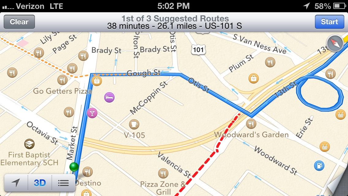
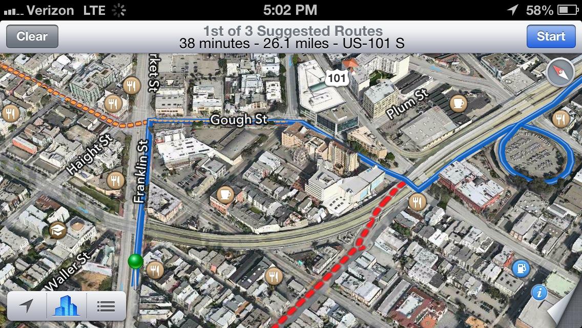
For example, when comparing iOS 6 Map's driving directions against a new BMW iDrive navigation system and Google Maps, both Google and BMW recommended a right turn from San Francisco's Market Street onto the Central Freeway.
Apple's Maps recommend the correct and legal route, as right turns across the bike path at that intersection have always been forbidden ever since the rebuilt freeway was first planned in 2004, before Google Maps even existed.
To anyone unfamiliar with the area, this isn't obvious just from looking at a map. Apple's route even looks like a suspiciously complicated way to get on the freeway in satellite view.
While Google is great at search, its directions are pretty basic. This particular intersection is perhaps the most famous bike vs. car intersection in the city of San Francisco, and has involved 17 enhancements over the past several years, each designed to make it more obviously illegal and increasingly impossible to turn here instead of continuing on to the proper freeway onramp around the corner on Van Ness.
Despite prominent cone barriers and the installation of a concrete curbed island in 2007 designed to physically stop right turns (like the one involved in this accident predating cones), it has continued to be the site of a series of serious bicycle accidents. Google and BMW are currently both still recommending that users turn right here to head south, a route that is both clearly illegal and dangerous.
There are two prominently posted sets of oversized "no right turn" sign paired with signs threatening a $250 fine. These are even visible in Street View, although Google's privacy software has automatically blurred out the $250 warning on the signs.
There are innumerable places on earth where it is less than obvious that some quirk in road design or road closure or turn prohibition might get you in trouble if you rely on a GPS to do all your thinking for you. But this particular example is a rather breathtaking error in Google's own backyard. It's a route direction that a lot of Google employees living in San Francisco would actually take to go to work, and yet the company's maps and directions are dead wrong here.
Google should really rethink its "iLost" efforts to denigrate Apple's Maps for potentially offering bad routes.
All Google needs to do in this particular case is enter the route prohibition in its database (making it truly amazing that this hasn't happened at some point in the last seven years of Google Maps). Similarly, Apple also has Flyover bugs, routing errors and location mistakes it needs to flush out of the data it has.
What's more difficult to understand is how the tech media has pounced upon the errors in iOS 6's Maps as if Apple invented map mistakes. Google has worked for years to enhance its Maps offerings. However, Apple doesn't need the same amount of time or staffing to catch up or surpass Google's existing accuracy.
Faster fix for Flyover and flaws
Unlike the incrementally resource intensive task of photographing the world one road at a time for Street View, Apple's Flyover approach allows it to build models of entire cities in weeks, remotely, without burning gasoline to travel down every alley with a camera car.
It's less clear how the company has managed to mangle so many obvious landmarks (New York's Statue of Liberty is still completely flat, while as pictured earlier, Hoover Dam's highway collapses into the spillway valley). You'd think the company would prioritize the accurate modeling of famous landmark sites that curious users would likely check out first.
But if you compare the initial cities Apple started Flyover work on and how quickly it added support for new cities throughout the development process, it appears it can rapidly finish Flyover in major cities and quickly expand the feature, if it makes doing so a priority.
Apple also needs to make it easier and more obvious for users to flag other problems, and it should communicate its plans for adding and enhancing global coverage at least as well as it articulates its support for iTunes Store and Siri support in other countries.
But make no mistake, iOS 6's Maps sit on a technically superior foundation with forward thinking connections to third party apps that open up the complex task of routing to enterprising experts. Maps is also tied into Apple's very serious Siri strategy, making it a clear priority for the company.
Now that nearly a quarter of the installed base of iOS users have upgraded to iOS 6, Apple will be getting more traffic data, more bug reports, and more technical feedback about how users search, all of which it can use to rapidly improve the Maps experience.
It should also come as no surprise that competitors like Google and Nokia are diligently working to denigrate Apple's efforts. But as much fun as it is to taunt Apple, both companies should keep in mind that nobody got much competitive traction from trying to pin Antennagate on iPhone 4, or in trying to vilify Siri on last year's iPhone 4S. And users don't seem to be all that concerned about the initial growing pains related to iOS 6 Maps, either, according to the backlog of orders for iPhone 5.
Understanding the history behind maps development at Apple and Google provides clear insight into not just why Apple created its own Maps for iOS 6, but also how likely the new app will be able to solve its various outstanding Maps issues. The next article segment looks at how Apple and Google have built their mapping products.
